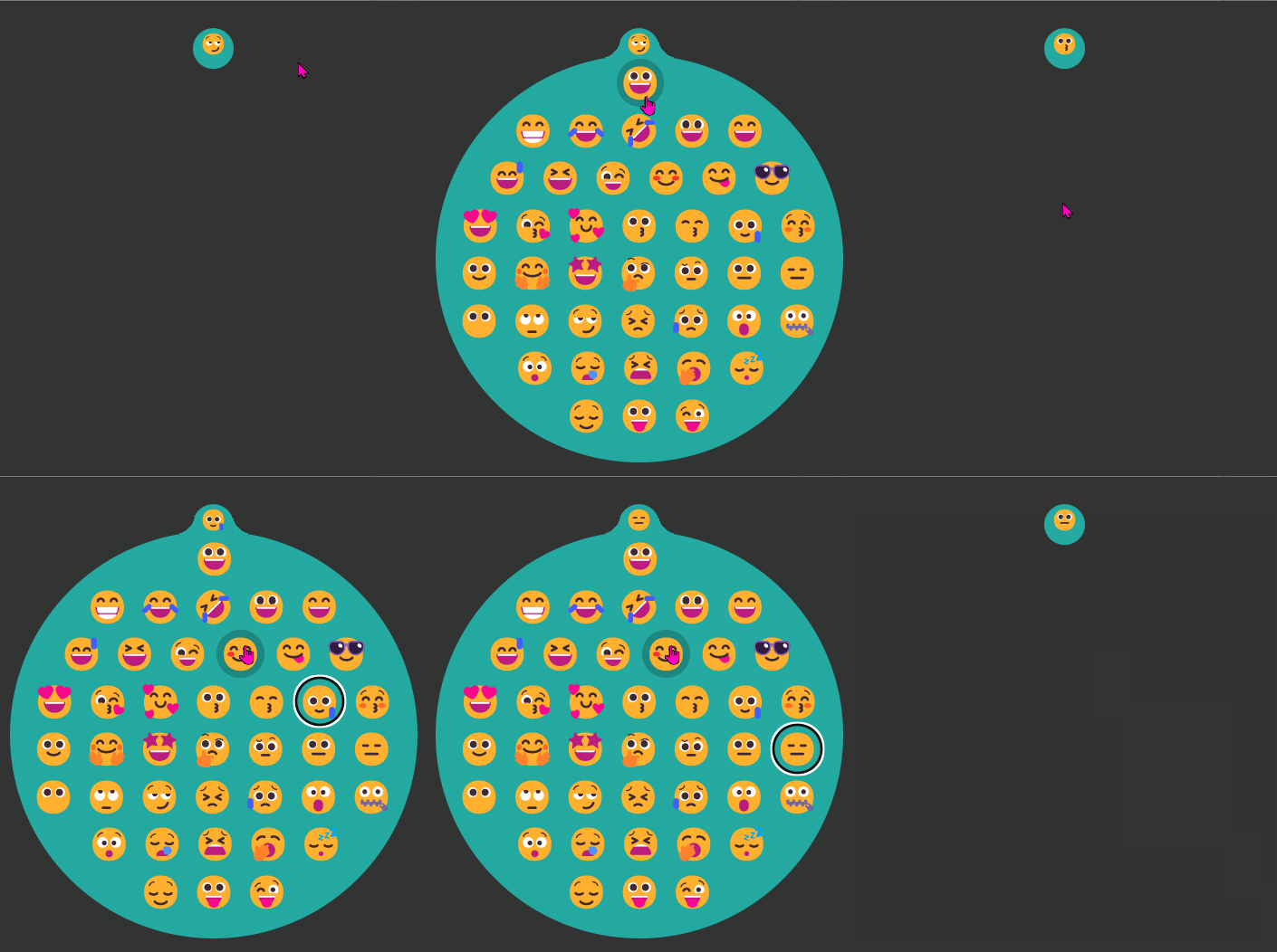
The folks over at Formidable have been experimenting with Houdini and WebGL/Three.js to create futuristic UIs
Futuristic sci-fi UIs in movies often support a story where humans, computers, and interfaces are far more advanced than today, often mixed with things like super powers, warp drives, and holograms. What is it about these UIs that feel so futuristic and appealing? Can we build some of these with the web technologies we have today?
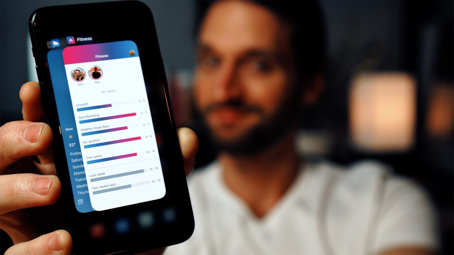
Very nice video by Sam Selikoff in which he sets up a web manifest to make his site feel more app-like. Great production quality.
There are some tweaks I’d suggest though:
Fixate the header using position: sticky; instead of position: fixed;. No need for that extra margin on the content then. Update: See note below
Don’t set the header height to a fixed number, as not all devices have (equally sized) notches. Use the User Agent Variable safe-area-inset-top instead, and apply it as the top padding:
header {
padding-top: env(safe-area-inset-top);
}
Don’t disable scaling in case your app does not follow the system font sizing — which it does not by default. To make it do follow the system font sizing, use this snippet:
@supports (font: -apple-system-body) {
html {
font: -apple-system-body;
}
}
💡 You can still override the font-family after that. That way you can have your custom font and also follow the preferred system Text Size
As an extra: to prevent that long-press behavior when the app is not added to the home screen, set -webkit-touch-callout: none; on the links.
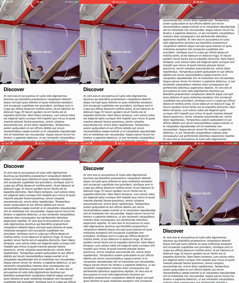
On Twitter Sam pointed me out that when using position: sticky; there’s an issue with overscroll/bounce: The header will shift down along with the body as you do so.
A common pattern in Mobile Apps is to have a Bottom Sheet / Slide Up Panel. React Native Slack Bottom Sheet is a wrapper around Slack’s native PanModal component for iOS.
💁♂️ If you’re looking for a slide up panel that also works on Android check out rn-sliding-up-panel, a pure JS implementation.
Note that it will require some tweaking before you get a somewhat similar result like its native counterpart. — I remember it took me quite some time to get everything right while working on the EV-Point App.
😅 Still an Ionic 1 Developer? I once created a similar component for it. It didn’t feel natural at all because the gestures weren’t implemented properly (because: Deadlines™). Eventually we implemented in the project I was then working on, but without the ability to manually drag it.
If you’ve ever implemented a design with a fixed header, you’ve surely had this problem:
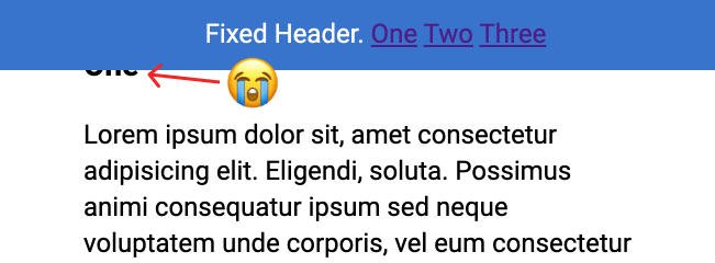
You click a jump link like <a href="#header-3">Jump</a> which links to something like <h3 id="header-3">Header</h3>. That's totally fine, until you have a position: fixed; header at the top of the page obscuring the h3 you're trying to link to!
Fixed headers have a nasty habit of hiding the element you’re trying to link to.
Thankfully Chris Coyier from CSS-Tricks found and shared the straightforward solution:
h3 {
scroll-margin-top: 5rem; /* whatever is a nice number that gets you past the header */
}
🐛 As noted in the comments below this doesn’t work Safari. In that browser you’ll need to use scroll-snap-margin-top. All other modern browsers do have excellent support for scroll-margin-top and play nice.
~
To not have to apply the CSS rule to too many elements, I’d adjust the snippet to use the :target selector.
The :target CSS pseudo-class represents a unique element (the target element) with an id matching the URL’s fragment.
That way it will work with any internally linked thing (headers in all their sizes, anchors, etc):
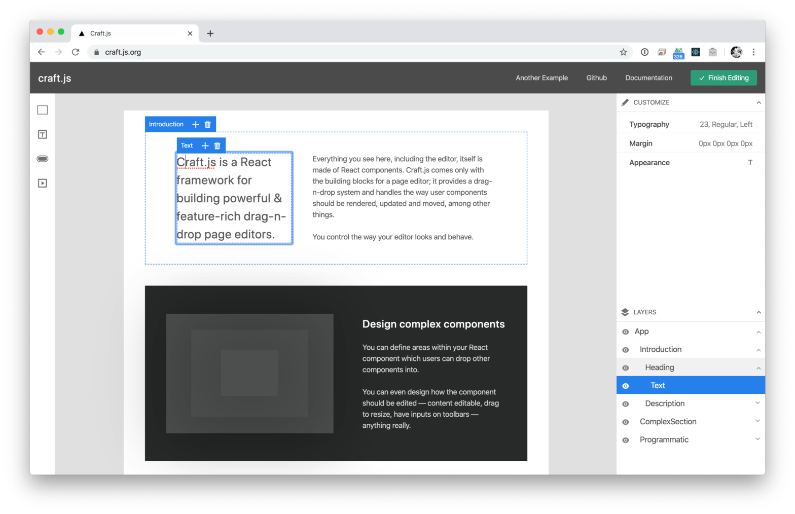
Page editors are a great way to provide an excellent user experience. However, to build one is often a pretty dreadful task.
Craft.js solves this problem by modularising the building blocks of a page editor. It provides a drag-n-drop system and handles the way user components should be rendered, updated and moved – among other things. With this, you’ll be able to focus on building the page editor according to your own specifications and needs.
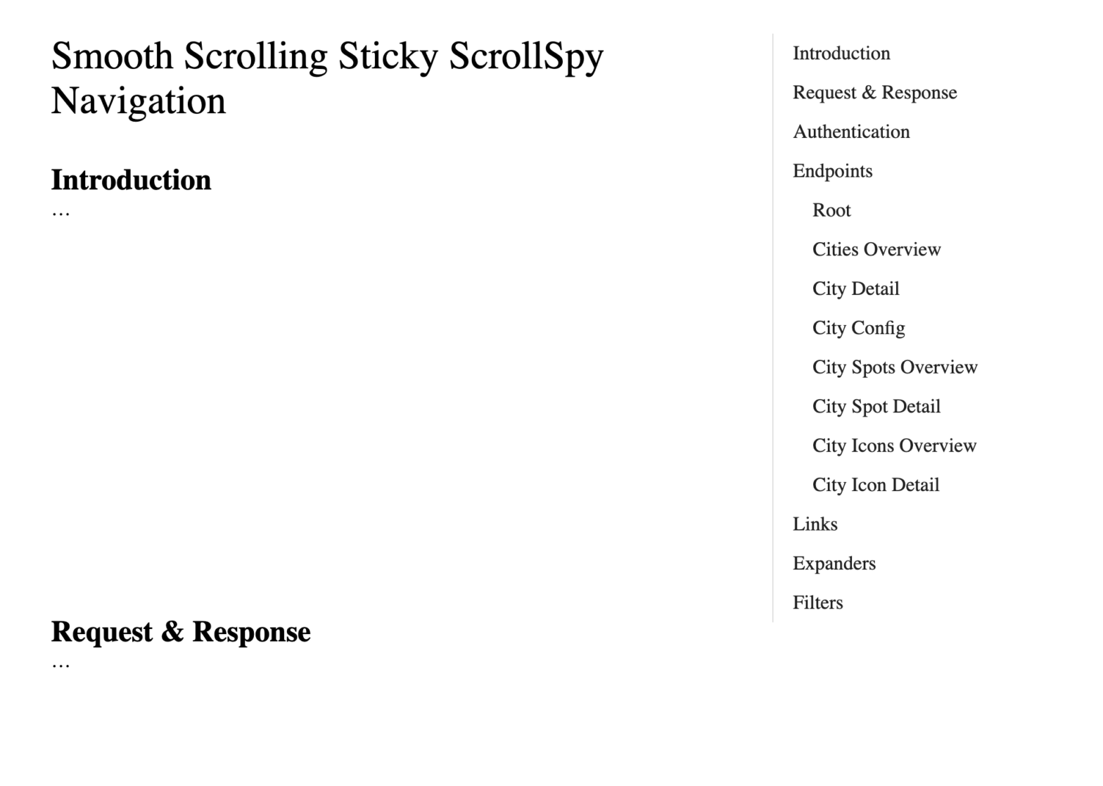
Yesterday evening I was working on a documentation page. The page layout is quite classic, as it consists of a content pane on the left and a sidebar navigation on the right. Looking for a way to make the page less dull I decided to add a few small things to it:
Smooth Scrolling when clicking internal links
A Sticky Navigation, so that the sidebar navigation always stays in view
A “ScrollSpy” to update the active state of the navigation
These three additions make the page more delightful, and best of all is: they’re really easy to implement!
To make the navigation stay in place as you scroll we can rely on position: sticky;. As with Smooth Scrolling, this is a really simple CSS addition:
main > nav {
position: sticky;
top: 2rem;
align-self: start;
}
💁♂️ Since we’re using CSS Grid to lay out the children of <main>, adding align-self: start; to <nav> is an important one here. If we would omit it, the nav element would be as high as the enclosing main element. If that were the case, then nav would never be able to stick.
In the demo embedded below, click any of the links in the nav and see how the nav now also stays in view while the rest of the page scrolls:
Thanks to the almighty IntersectionObserver we can implement a ScrollSpy. Basically we use it to watch all section["id"] elements. If they are intersecting, we add the .active class to any link that links to it. For styling purposes we don’t add .active to the link itself, but to its surrounding li element.
In code, that becomes this little snippet:
window.addEventListener('DOMContentLoaded', () => {
const observer = new IntersectionObserver(entries => {
entries.forEach(entry => {
const id = entry.target.getAttribute('id');
if (entry.intersectionRatio > 0) {
document.querySelector(`nav li a[href="#${id}"]`).parentElement.classList.add('active');
} else {
document.querySelector(`nav li a[href="#${id}"]`).parentElement.classList.remove('active');
}
});
});
// Track all sections that have an `id` applied
document.querySelectorAll('section[id]').forEach((section) => {
observer.observe(section);
});
});
💡 To make the transition to and from .active not too abrupt, add a little blob of CSS to ease things:
.section-nav a {
transition: all 100ms ease-in-out;
}
Visual hierarchy is the order in which the user process information by importance. In interface design, like in any other form of design, this concept is necessary to be functional at sight. With the correct use of hierarchy, the mind can group and prioritize elements to give them a specific order, which facilitates the understanding of what you want to communicate and the sense of achievement by the user.
Talks about seven resources to take into account to create a correct hierarchy:
Size: The larger the element, the more it will attract attention.
Color: Bright colors stand out more than muted tones.
Proximity: Elements close to each other attract more attention than distant elements.
Alignment: Any element that separates from the alignment of the others will attract attention.
Repetition: Repeated styles give the impression that the elements are related.
Negative Space: The more space around the element, the more attention it generates.
Texture: Varied and complex textures attract more attention than flat ones.
When done well, dark themes have many benefits. They reduce eyestrain. They are easier to read in low light. And, depending on the screen, they can greatly reduce battery consumption.
However, it is difficult to create a delightful dark theme. We cannot simply reuse our colors or invert our shades. If we do, we will achieve the opposite of what we want: we will increase eyestrain and make it harder to read in low light. We may even break our information hierarchy.
The stuff mentioned should help you to create readable, balanced, and delightful “Dark Mode” themes.
🔥 If you’re wondering how to easily implement these in your JavaScript application, I’ve done an extensive writeup on the subject. All major frameworks (React, Vue, Angular, etc.) are covered!
A JSX-based page builder for creating beautiful websites without writing code. Blocks comes with built-in components that are carefully designed and implemented with Theme UI.