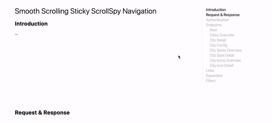
I tried this on a table before and would swear it didn’t work back then. Perhaps I did something wrong, because it’s quite tricky as Chris details:
The “trick” at play here is partially the position: sticky; usage, but moreso to me, how you have to handle overlapping elements. A table cell that is sticky needs to have a background, because otherwise we’ll see overlapping content. It also needs proper z-index handling so that when it sticks in place, it’ll be on top of what it is supposed to be on top of.
If you’ve ever tried to put a sticky item in a grid layout and watched the item scroll away with the rest of the content, you might have come to the conclusion that position: sticky doesn’t work with CSS Grid. Fear not! It is possible to get these two layout concepts working together. All you likely need is one more line of CSS.
Yesterday evening I was working on a documentation page. The page layout is quite classic, as it consists of a content pane on the left and a sidebar navigation on the right. Looking for a way to make the page less dull I decided to add a few small things to it:
Smooth Scrolling when clicking internal links
A Sticky Navigation, so that the sidebar navigation always stays in view
A “ScrollSpy” to update the active state of the navigation
These three additions make the page more delightful, and best of all is: they’re really easy to implement!
To make the navigation stay in place as you scroll we can rely on position: sticky;. As with Smooth Scrolling, this is a really simple CSS addition:
main > nav {
position: sticky;
top: 2rem;
align-self: start;
}
💁♂️ Since we’re using CSS Grid to lay out the children of <main>, adding align-self: start; to <nav> is an important one here. If we would omit it, the nav element would be as high as the enclosing main element. If that were the case, then nav would never be able to stick.
In the demo embedded below, click any of the links in the nav and see how the nav now also stays in view while the rest of the page scrolls:
Thanks to the almighty IntersectionObserver we can implement a ScrollSpy. Basically we use it to watch all section["id"] elements. If they are intersecting, we add the .active class to any link that links to it. For styling purposes we don’t add .active to the link itself, but to its surrounding li element.
In code, that becomes this little snippet:
window.addEventListener('DOMContentLoaded', () => {
const observer = new IntersectionObserver(entries => {
entries.forEach(entry => {
const id = entry.target.getAttribute('id');
if (entry.intersectionRatio > 0) {
document.querySelector(`nav li a[href="#${id}"]`).parentElement.classList.add('active');
} else {
document.querySelector(`nav li a[href="#${id}"]`).parentElement.classList.remove('active');
}
});
});
// Track all sections that have an `id` applied
document.querySelectorAll('section[id]').forEach((section) => {
observer.observe(section);
});
});
💡 To make the transition to and from .active not too abrupt, add a little blob of CSS to ease things:
.section-nav a {
transition: all 100ms ease-in-out;
}
Figure: position: sticky; and overflow: scroll;, a quirky combination … but it can be fixed!
Dannie Vinther:
Say we want an overflowing table of columns and rows with sticky headings on a page. We want the headings to stick while scrolling on the document window, and we want to be able to scroll horizontally within the overflowing container.
When working with overflows you might find that your sticky element isn’t so sticky after all, which may cause some frustration. The browser doesn’t seem to be respecting position: sticky; once we add overflow to the mix.
The solution is to use two scroll containers and sync up their scrolling position using a tad of JavaScript:
Sticky Events is a library that can listen for events on elements that have position: sticky; applied. It’s an abstraction built on top of the IntersectionObserver, and provides one with three types of events:
StickyEvent.CHANGE: Fired when an element becomes stuck or unstuck
StickyEvent.STUCK: Fired only when an element becomes stuck
StickyEvent.UNSTUCK: Fired only when an element becomes unstuck
Usage is quite simple: set up it once, and then add event listeners to the elements:
import { observeStickyEvents, StickyEvent } from "sticky-events";
// Add listeners to all `.sticky-events` elements on the page
observeStickyEvents();
// Events are dispatched on elements with the `.sticky-events` class
const stickies = Array.from(document.querySelectorAll('.sticky-events'));
stickies.forEach((sticky) => {
sticky.addEventListener(StickyEvent.CHANGE, (event) => {
sticky.classList.toggle('bg-dark', event.detail.isSticky);
});
sticky.addEventListener(StickyEvent.STUCK, (event) => {
console.log('stuck');
});
sticky.addEventListener(StickyEvent.UNSTUCK, (event) => {
console.log('unstuck');
});
});
CSS position: sticky; is really in its infancy in terms of browser support. In stock browsers, it is currently only available in iOS 6. In Chrome it is locked behind a chrome://flags setting. Fixed-sticky is a polyfill to enabling this in browsers that don’t support it yet.
position: sticky; is one very handy addition to CSS, paving the cowpaths.
jQuery plugin to mimic the new and upcoming CSS position: sticky;
position: sticky is a new way to position elements and is conceptually similar to position: fixed. The difference is that an element with position: sticky behaves like position: relative within its parent, until a given offset threshold is met in the viewport.