rci — A clever React Component for One-Time Passwords (OTP)

rci is a React component that ask for a one time password, in a pretty clever way. rci uses a single DOM input element, overlayed on top of plain divs for styling. Most other implementations of this pattern are based on multiple inputs. Using multiple inputs gives out-of-the-box style consistency, but comes with the disadvantage …

Fixing the Drift in Shape Rotations

Steve Ruiz recently noted that in many design tools a group of shapes would end up at a different position after you rotate them and then successively rotate them back. The problem here is that the average center of the group — the point on which the group rotates — changes after the first rotation. …

:focus-visible Is Here

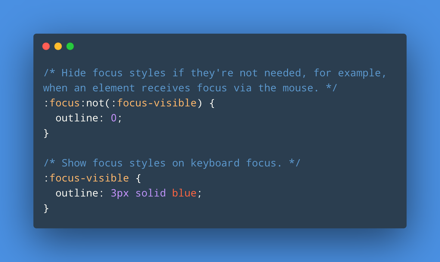
With Chromium 86 and now recently Firefox 85 supporting :focus-visible, it’s a good time to refer to this post by Matthias Ott: The :focus-visible pseudo-class lets you show focus styles only when they are needed, using the same heuristic that the browser uses to decide whether to show the default focus indicator. You use :focus-visible …

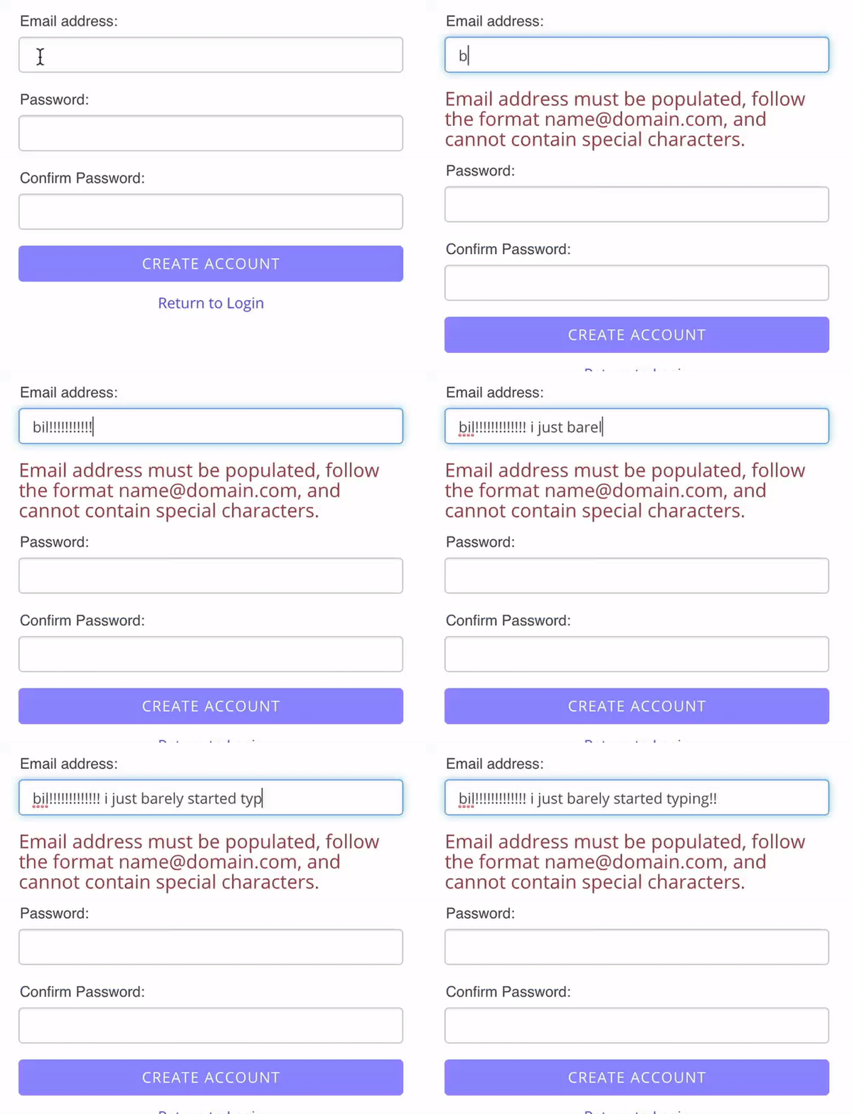
Form Validation: You want :not(:focus):not(:placeholder-shown):invalid, not :invalid

The built-in browser form validation mechanism can be frustrating as it will mark fields invalid while still entering text. Using only CSS this can be circumvented, so that validations happen afterwards.

“Yes or No?” — One Checkbox vs Two Radio Buttons

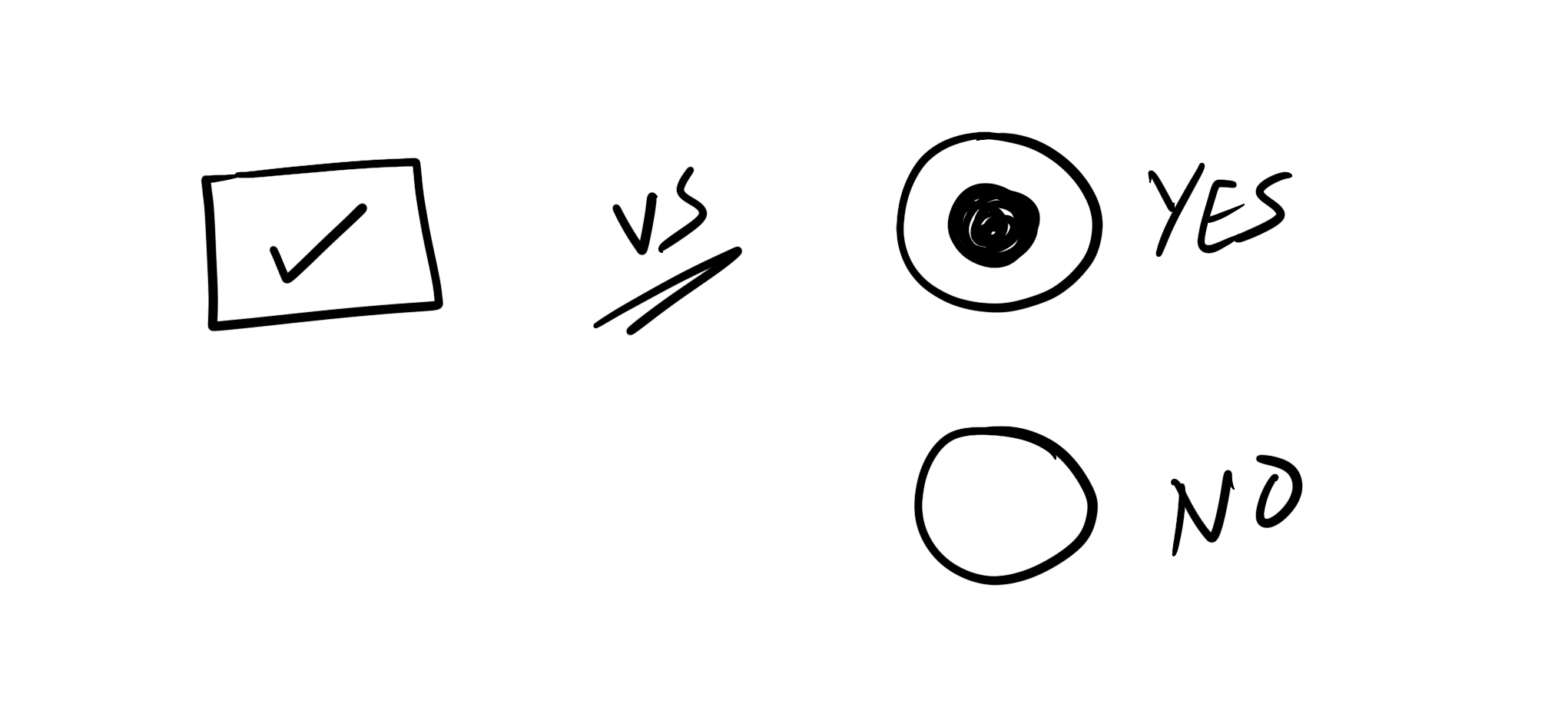
Great research by Sara Soueidan: If you have a question with a binary Yes/No answer, is it better to use one checkbox or two radio buttons? As per usual: It Depends™. The consensus however seems to be that requiring an explicit “No” is the determining factor to avoid the simple checkbox. Over at CSS-Tricks Chris …

Avoiding tab styles for navigation

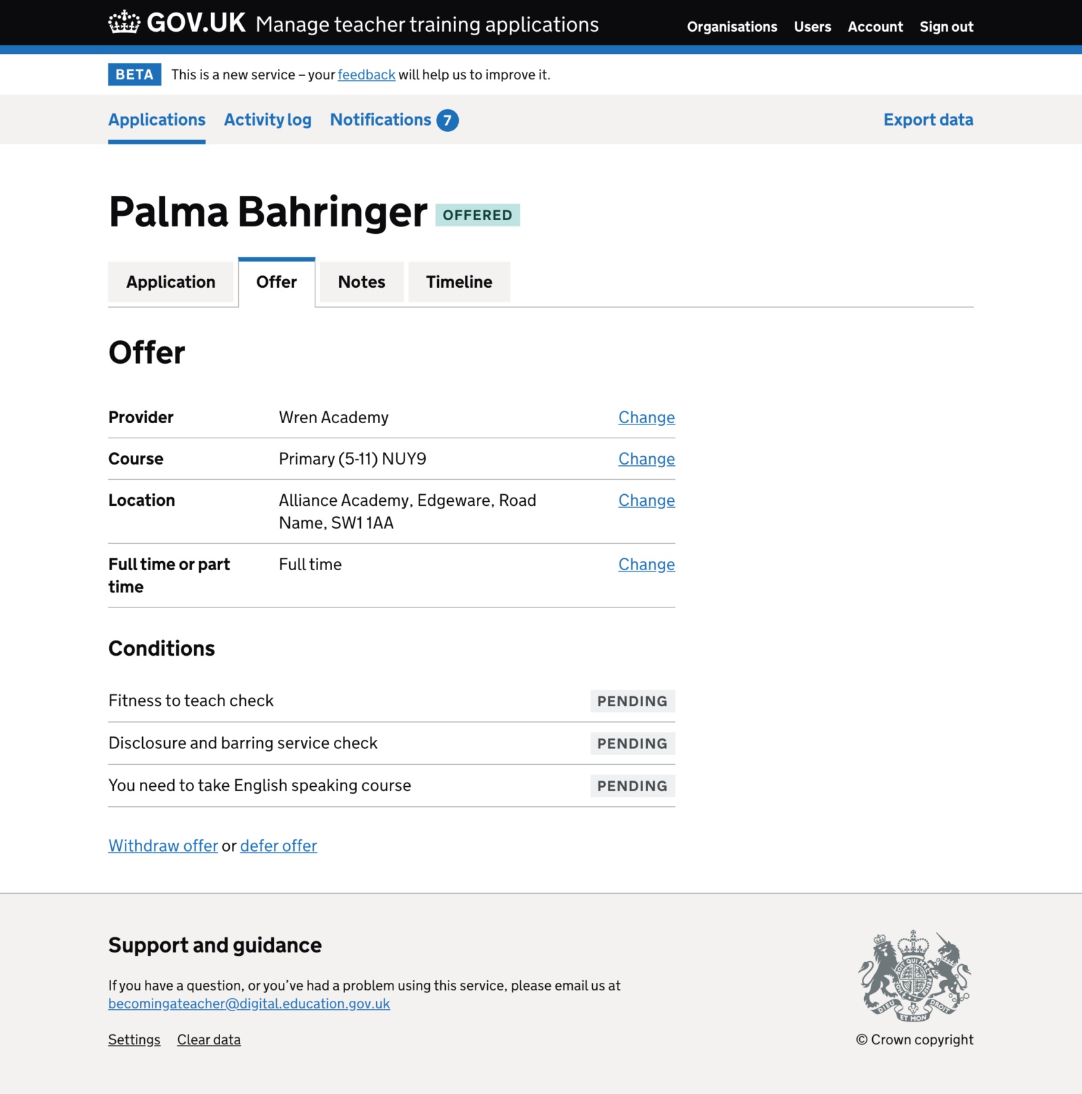
Adam Silver, who works at/with the fine folks at GOV.UK: Tabs should only look like tabs if they behave like tabs otherwise it can be in disorienting and confusing for users. Shown above is the old layout that featured the tabs (which are actually links, here). The new version still has the links in place …

8 Tips to Make Your Website Feel Like an iOS App

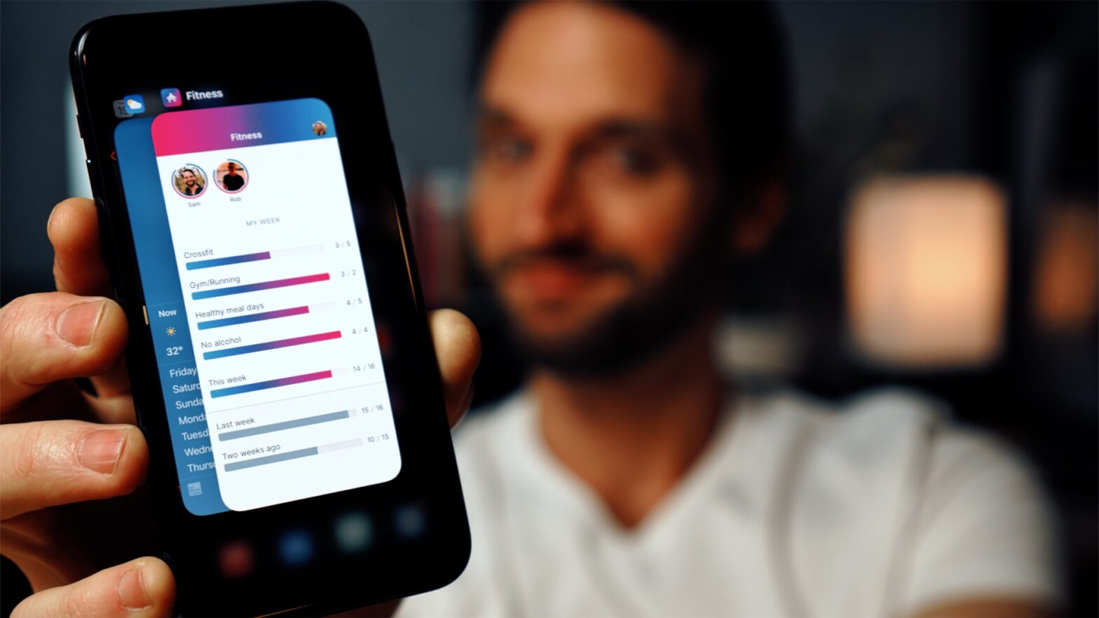
Very nice video by Sam Selikoff in which he sets up a web manifest to make his site feel more app-like. Great production quality. There are some tweaks I’d suggest though: Fixate the header using position: sticky; instead of position: fixed;. No need for that extra margin on the content then. Update: See note below …

Enhancing User Experience With CSS Animations

Great talk by Stéphanie Walter (starting at 39:00): With practical examples, I show why certain animations work better than others and how to find the best timing and duration to build UI animations that “feel right”. I explain how our brain works, why and how animations contribute to improving user experience. And what you need …

The UX of LEGO Interface Panels

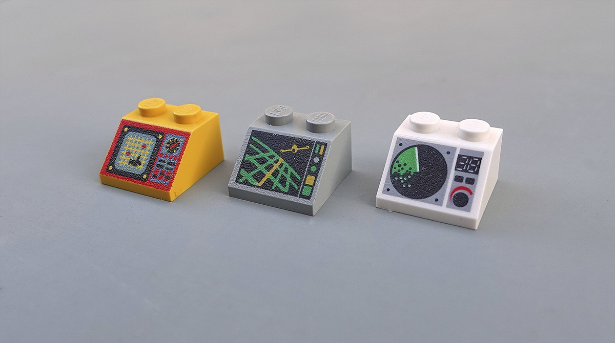
George Cave takes a look at the UX of the LEGO Interface Panels These iconic, low-resolution designs are the perfect tool to learn the basics of physical interface design. Armed with 52 different bricks, let’s see what they can teach us about the design, layout and organisation of complex interfaces. The UX of LEGO Interface …