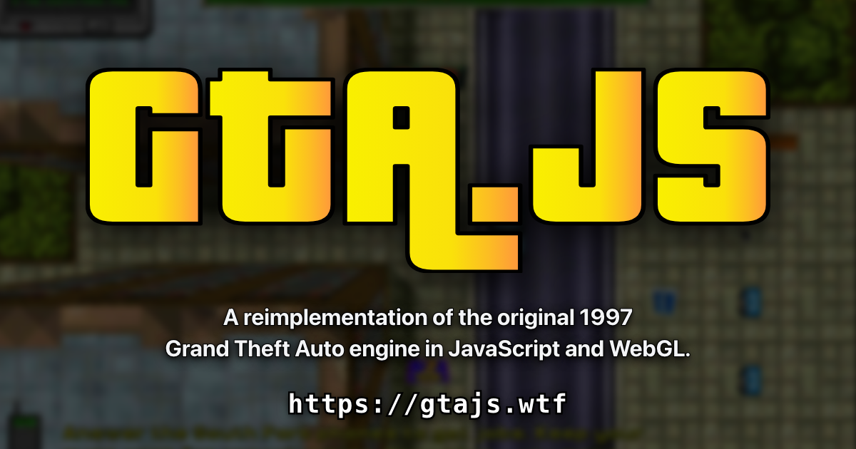
Here’s a little sideproject I’ve been spending my tokens on: https://gtajs.wtf/
It’s a reimplementation of the 1997 Grand Theft Auto engine in JavaScript and WebGL.
A rather geeky/technical weblog, est. 2001, by Bramus
Here’s a little sideproject I’ve been spending my tokens on: https://gtajs.wtf/
It’s a reimplementation of the 1997 Grand Theft Auto engine in JavaScript and WebGL.
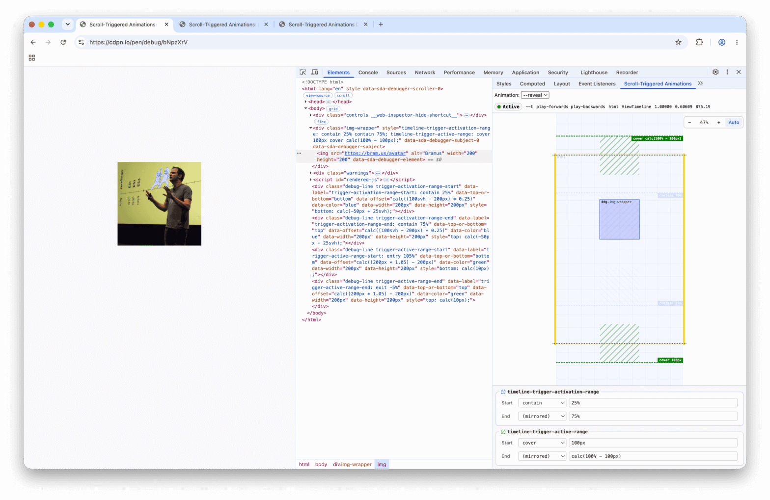
I’m extremely pleased to announce the release of Scroll-Triggered Animations Debugger, a DevTools extension to visualize and debug CSS Scroll-Triggered Animations.
css-typed-om, a complete and WPT-tested polyfill for CSS Typed OM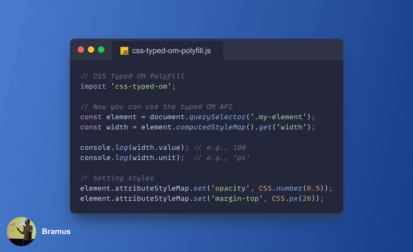
Being a big fan of the CSS Typed OM, I’ve wanted a proper polyfill for it for years. Just before my summer vacation back in July, with the help of Gemini/Antigravity, I finally built one: css-typed-om.
<calc-input>, a custom input element that accepts mathematical formulas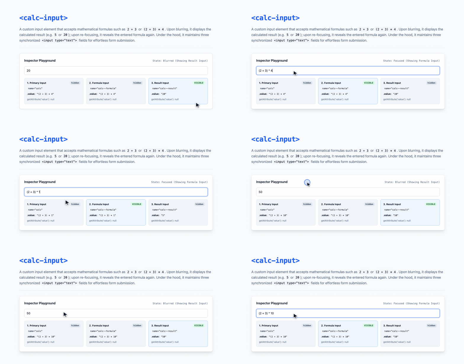
Continuing my streak of small form-related Custom Elements (like <rich-input>), I built <calc-input>. It’s a custom input element that accepts mathematical formulas — such as 2 + 3 or (2 + 3) * 4 — and automatically toggles between showing the formula on focus and the calculated result on blur.
caniname: CLI tool to check project name availability across Netlify and NPM (and other sources)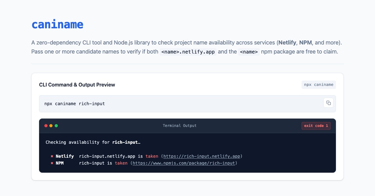
Whenever I build a new tool or custom element (like <show-keystrokes> or <rich-input>), I always end up doing the same manual dance: checking if the package name is still free on NPM and if the matching <name>.netlify.app subdomain is still unclaimed on Netlify. To automate that check, I built caniname.
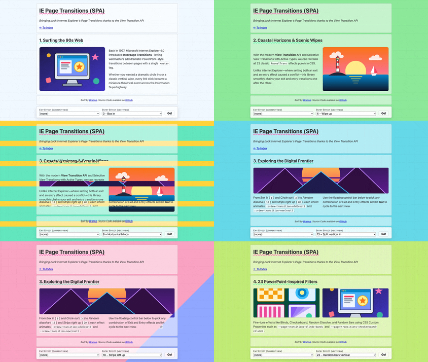
Back in late 2024, I started working on a fun end-of-year side project named ie-page-transitions. It”s a CSS + JS library that brings back Microsoft Internet Explorer’s proprietary “Interpage Transitions” to modern browsers, powered by the View Transition API. After sitting unfinished for a while, I finally got all 23 classic effects over the finish line and published the project on page-transitions.style.
<show-keystrokes> custom element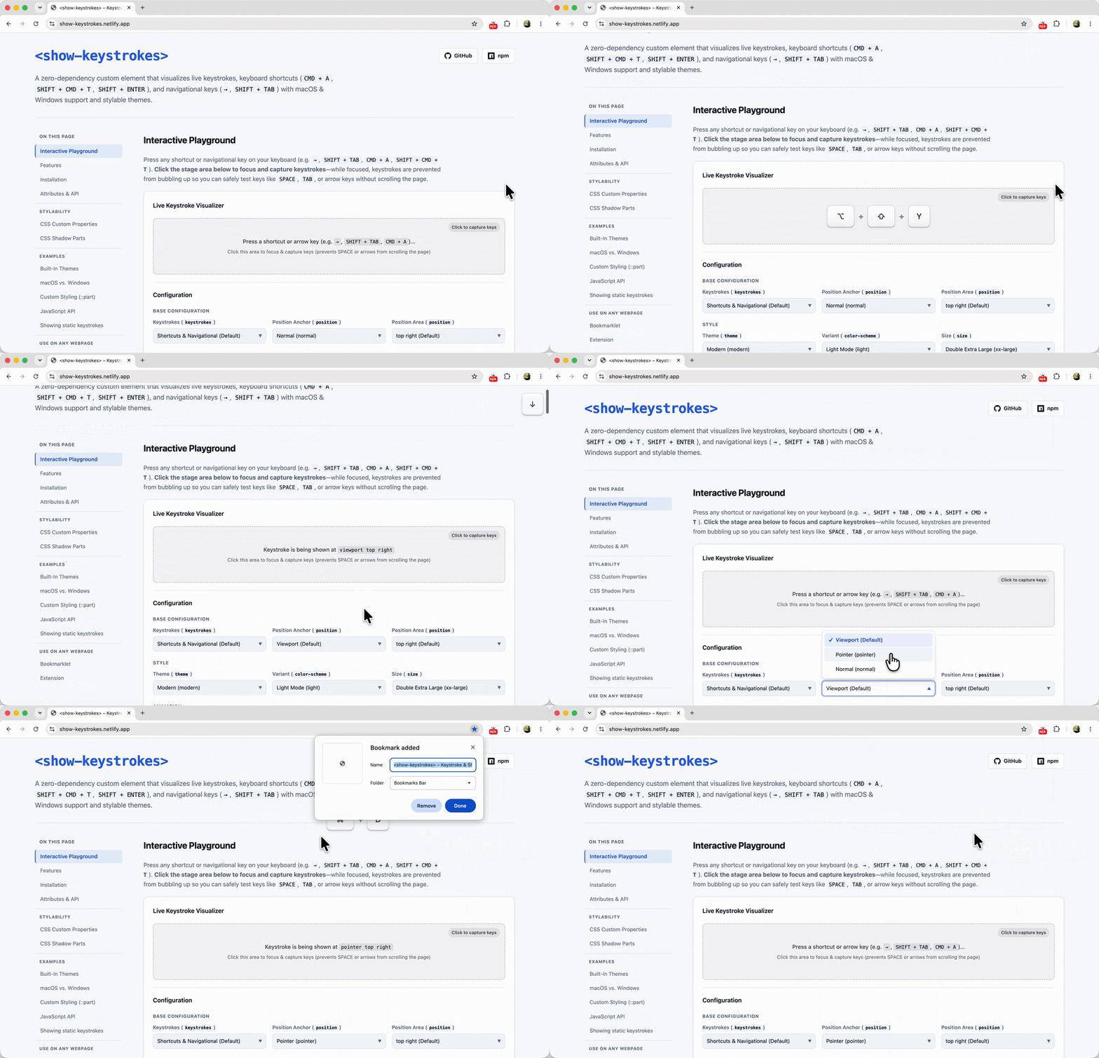
When recording screen casts or doing live demos, I typically rely on a native macOS app to visualize my keystrokes on screen. Recently, however, that app got blocked on my work machine by a corporate security policy. Additionally, the keystrokes visualized through that app don’t show up when screen sharing a specific window or tab.
Because I needed to demo a website that relies heavily on keyboard navigation — and thus really needed those keystrokes to be visible to the audience — I found myself in a bit of a pickle. So with the help of Gemini, I decided to build a web-native solution to fill that gap: <show-keystrokes>
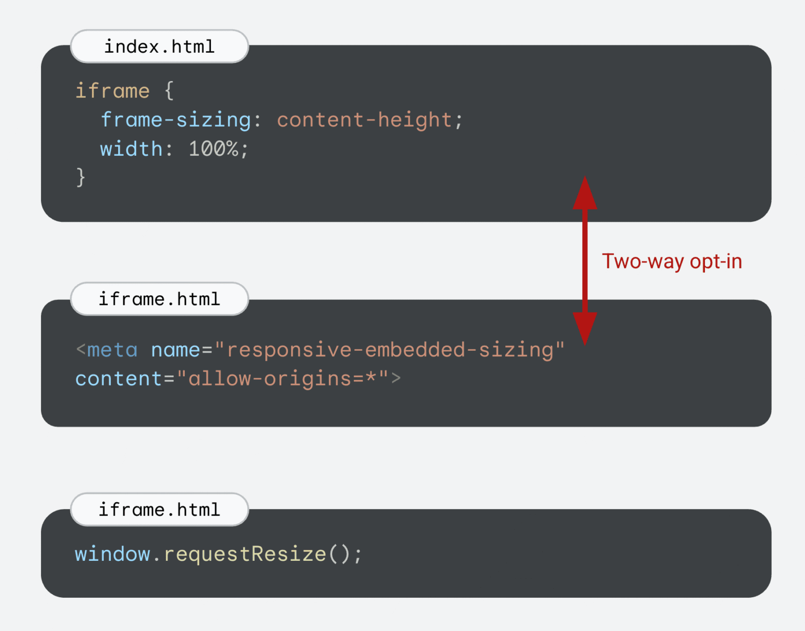
Chrome 154 adds support for responsively-sized iframes, letting an <iframe> size itself based on the intrinsic size of its embedded document. This is perfect for seamlessly embedding third-party comment widgets, varying-height social media embeds, or any other type of embed that uses an <iframe>.
./dist or ./src folder) by publishing a subfolder to NPM
One detail that has always bugged me about publishing a package to NPM is how build output paths like dist/ can leak into the public API.
Turns out, npm publish can do it, but to make it work seamlessly in a real-world project, you need a few extra pieces in place. Let me walk you through how it works.
<rich-input>, a GitHub-like search/filter text input to embed on your site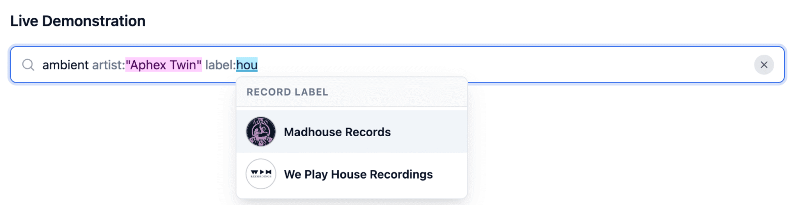
While working on a side-project to better navigate and search through my record collection, I found myself in need of a rich search input: one that accepts free-form text alongside structured filters like artist:“Aphex Twin” or label:“Warp Records” — You know, like the one you see on GitHub when searching/filtering issues.
When I quickly realized a standalone custom element for this didn’t exist yet, I nerd sniped myself into building curating one.