Modern CSS grid solutions to common layout problems

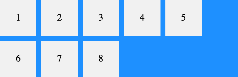
Kevin Pennekamp (Vycke): With the addition of grids, we can overcome media-query fatigue. Not only make our CSS more maintainable, but they also improve the user experience. We can let CSS handle the available space. In this article, I will describe three layout implementations that can improve your (personal) website. The addition of Grid Layout …

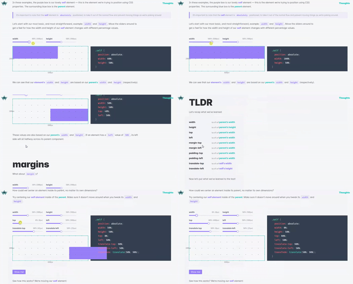
What does 100% mean in CSS?

Amelia Wattenberger: One of the CSS units I use most is the wonderful % — so handy for positioning elements on the page. Unfortunately, the rules aren’t exactly straightforward. One question I’m always asking myself is: “Percent of what?” Hopefully this guide can help clear things up. As per usual: It Depends™ Amelia being Amelia …

Simple Image Gallery with display: grid; and object-fit: cover;

On the Full Stack Belgium Slack channel, user @Brammm recently asked how to create a simple image gallery. Anyone have a favorite way of making an image grid with CSS? I’d like one of those “fancy” ones where no matter the aspect ratio of the image, they all have the same gap between them. While …

10 Modern Layouts in 1 Line of CSS

Already making rounds on Twitter last week, but now the video’s been released too: In this dynamic talk, Una goes over the power of modern CSS layout techniques by highlighting a few key terms and how much detail can be described in a single line of code. Learn a few layout tricks you can implement …

CSS-Only Resizable Elements

In Playing With (Fake) Container Queries Chris used the <resize-asaurus> web component to make the elements resizable. Curious to see how that worked I dug into its source. As I was expecting a truckload of JavaScript to make it work, I was very surprised to see that it basically revolved around using just one single …

Spacing grid/flexbox items in CSS with the gap property

The gap property for Flexbox about to land in Chromium 85. It allows you to define the size of the gutters between Grid/Flexbox children. CSS Grid brought a delightful spacing feature called grid-gap, which quickly became a popular way to put space into layouts. It was easy to fall in love with because it took …

Use Tailwind classes within any CSS-in-JS library with Twin

To use Tailwind – or any prebuilt CSS library/framework for that matter – in a React app you can simply import its generated CSS file and use the classes it exposes: import ‘../tailwind.generated.css’; // … const Alert = ({ title = '', message }) => ( <div class="bg-red-100 border border-red-400 text-red-700 px-4 py-3 rounded relative" …

Rebuilding our tech stack for the new Facebook.com

The Facebook Engineering Team on how they’ve built the new Facebook.com – a version which I’ve been able to try for nearly two months by now. Throughout the process, we anchored our work around two technical mantras: As little as possible, as early as possible. We should deliver only the resources we need, and we …

Alternative text for CSS generated content

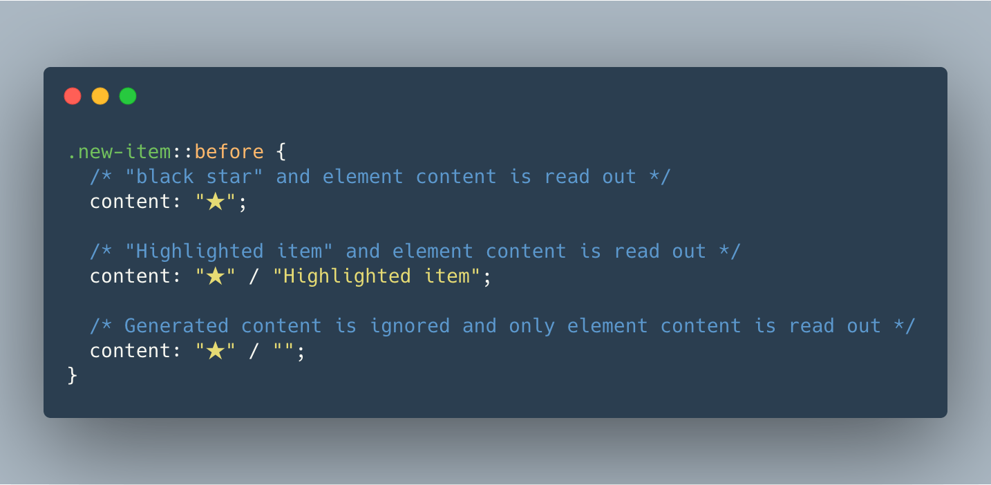
Great find by Stefan Judis: Today I learned that the content property supports a way to define alternative text for generated content. You can specify the alternative content after a /: .new::before { content: url(./img/star.png) / "New!"; } Here’s how that works with screen readers: .new-item::before { /* "black star" and element content is read …