The gap property for Flexbox about to land in Chromium 85. It allows you to define the size of the gutters between Grid/Flexbox children.
CSS Grid brought a delightful spacing feature called
grid-gap, which quickly became a popular way to put space into layouts. It was easy to fall in love with because it took upon itself so much responsibility with such elegance. Starting in Chromium 85grid-gapis now justgap, and you can use it with Flexbox. 💪
So no more grid-gap, but simply gap:
.layout {
-  grid-gap: 1em;
+  gap: 1em;
}
~
Why use gap (and not margin)?
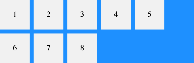
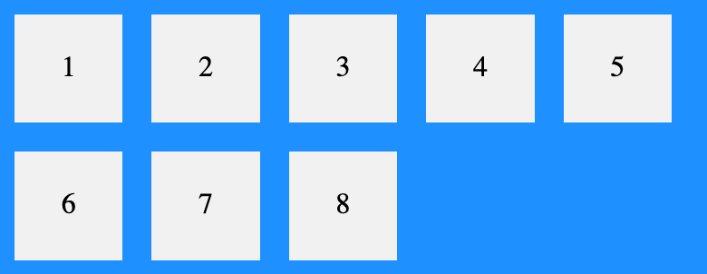
Margins in flexbox don’t collapse, so when working with margin you’ll have to adjust the value you’re using. Because of this you’ll also get edges on the inside of your container, as the margin applied on the children is pushing the children inwards. Compare the screenshot below (using margin) with the one at the top of this post (using gap).
A margin of 1em is applied. Note the broader width between items and the extra blue edge on the container, all due to margins not collapsing.
~
Demo
See the Pen
Flexbox Gap by Bramus (@bramus)
on CodePen.
Sidenote: @supports vs. Flexbox Gap
In the demo above I wanted to show a warning in browsers that don’t support flexbox gap. For that I tried using @supports, which has proven to be successful before.
.warning {
    display: block;
}

/* Hide warning in case browser supports flexbox gap */
@supports (display: flex) and (gap: 1em) { /* DOES NOT WORK AS INTENDED! */
    .warning {
        display: none;
    }
}
But that’s not really working as intended. In Chromium < 85 – which does not support flexbox gap – the warning is hidden, this because both conditions are evaluated separately:
- Does Chromium < 85 support
display: flex? Yes - Does Chromium < 85 support
gap: 1em? Yes (from CSS Grid)
This makes me wonder whether re-using property names remains a good idea or not
Perhaps an extension to css-conditional should be made so that it supports a combination of properties — e.g. @supports (display: flex; gap: 1em)?
I’ve filed an issue for the latter.
~
Shorthand
gap is a shorthand for row-gap and column-gap:
.layout {
   display: flex;
   gap: 1em 2em;
}
The first value targets row-gap, the second value column-gap.
~
Browser Support
Firefox has supported it ever since version 63. Chromium is the first engine to follow its lead.

💡 Shown above is a dynamic CanIUse.com image, showing an always up-to-date support table. By the time you are reading this browser support might have become better.
Leave a comment