“On the origin of cascades“, a talk by @hdv on how CSS came to be

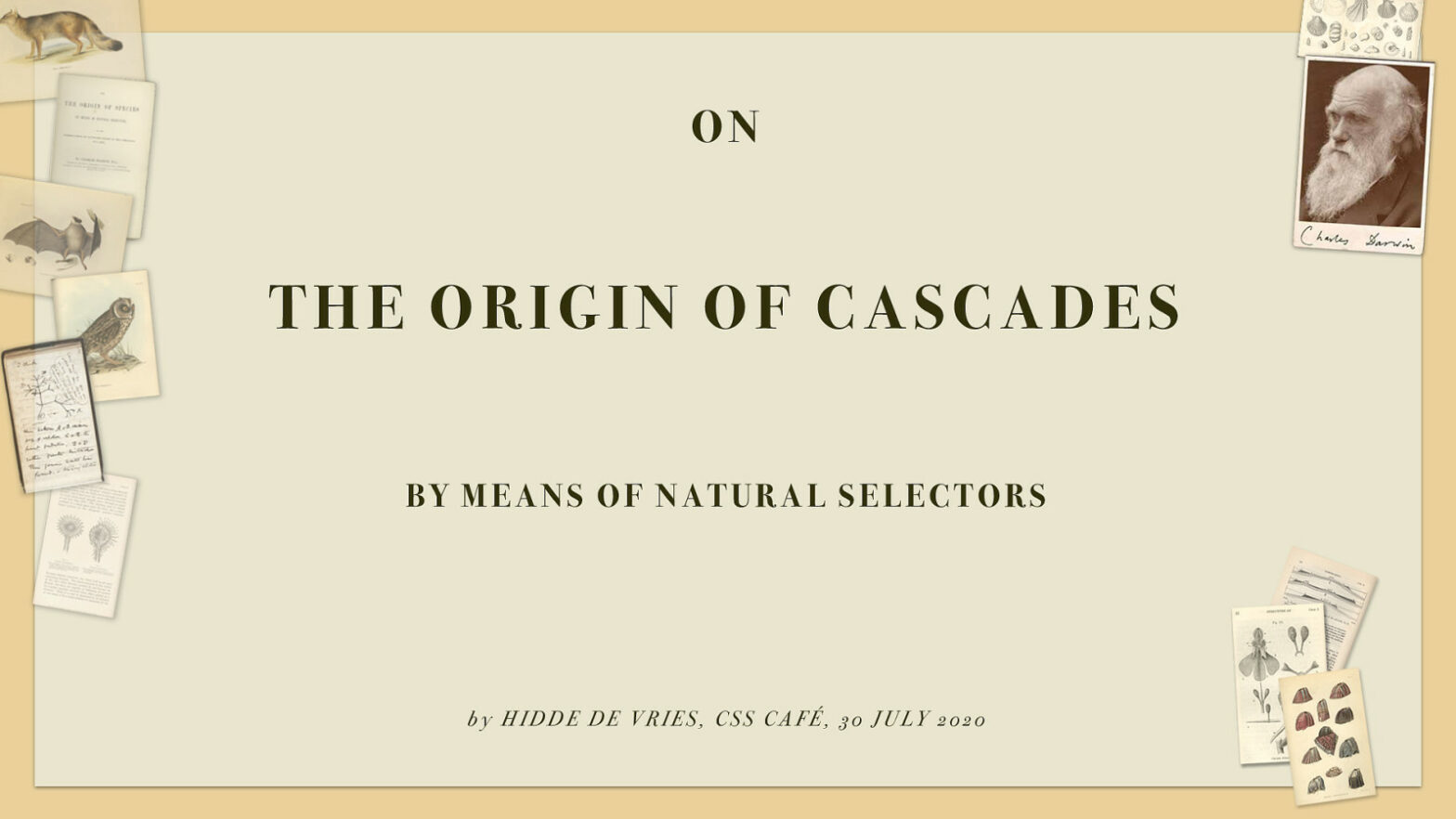
Hidde recently gave a talk at CSS Café on the origins of CSS: It’s been 25 years since the first people proposed a language to style the web. Since the late nineties, CSS lived through years of platform evolution. The cascade, specificity and the enormous choice in values and units set the language up for …

A Lightweight Masonry Solution

With Masonry being specced in Grid Layout Module Level 2 – and already being implemented in Firefox – Ana Tudor looked into whipping up a lightweight fallback for browsers that don’t support it. 🤔 Masonry Layout? Masonry is a grid layout based on columns, as popularized by Pinterest. Unlike other grid layouts, it doesn’t have …

The Just in Case Mindset in CSS

Some nice examples of defensive programming in CSS by Ahmad Shadeed. The just in case mindset aims to educate designers and developers to think ahead of time of some possible failure scenarios for a component. I called it just in case because that’s literally what it means. Just in case the title got longer, do …

Enhancing User Experience With CSS Animations

Great talk by Stéphanie Walter (starting at 39:00): With practical examples, I show why certain animations work better than others and how to find the best timing and duration to build UI animations that “feel right”. I explain how our brain works, why and how animations contribute to improving user experience. And what you need …

content-visibility: the new CSS property that boosts your rendering performance

Coming to Chromium 85 is content-visibility (part of Display Locking): content-visibility enables the user agent to skip an element’s rendering work, including layout and painting, until it is needed. Because rendering is skipped, if a large portion of your content is off-screen, leveraging the content-visibility property makes the initial user load much faster. It also …

Modern CSS grid solutions to common layout problems

Kevin Pennekamp (Vycke): With the addition of grids, we can overcome media-query fatigue. Not only make our CSS more maintainable, but they also improve the user experience. We can let CSS handle the available space. In this article, I will describe three layout implementations that can improve your (personal) website. The addition of Grid Layout …

What does 100% mean in CSS?

Amelia Wattenberger: One of the CSS units I use most is the wonderful % — so handy for positioning elements on the page. Unfortunately, the rules aren’t exactly straightforward. One question I’m always asking myself is: “Percent of what?” Hopefully this guide can help clear things up. As per usual: It Depends™ Amelia being Amelia …

Simple Image Gallery with display: grid; and object-fit: cover;

On the Full Stack Belgium Slack channel, user @Brammm recently asked how to create a simple image gallery. Anyone have a favorite way of making an image grid with CSS? I’d like one of those “fancy” ones where no matter the aspect ratio of the image, they all have the same gap between them. While …

10 Modern Layouts in 1 Line of CSS

Already making rounds on Twitter last week, but now the video’s been released too: In this dynamic talk, Una goes over the power of modern CSS layout techniques by highlighting a few key terms and how much detail can be described in a single line of code. Learn a few layout tricks you can implement …

CSS-Only Resizable Elements

In Playing With (Fake) Container Queries Chris used the <resize-asaurus> web component to make the elements resizable. Curious to see how that worked I dug into its source. As I was expecting a truckload of JavaScript to make it work, I was very surprised to see that it basically revolved around using just one single …