Update 2021.07.08: There are new viewport units on the way that will finally solve this issue. 100dvh is the one you’re looking for.
When working with Viewport Units there’s this longstanding and extremely annoying bug in Safari on iOS where it does not play nice with the vh unit. Setting a container to 100vh for example will actually result in an element that’s a wee bit too tall: MobileSafari ignores parts of its UI when calculating 100vh.

Image by Max Schmitt
🤔 New to Viewport Units? Ahmad Shadeed has got you covered.
~
Apple/WebKit’s stance is that it works as intended, although it’s not what I (and many other developers) expect. As a result we have to rely on workarounds.
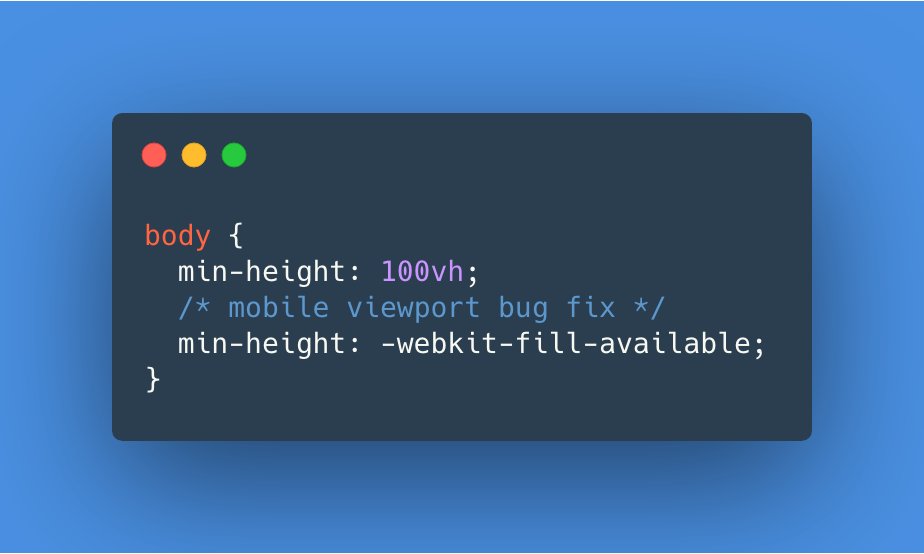
In the past I’ve used Viewport Units Buggyfill or Louis Hoebregts’ CSS Custom Properties Hack to fix this behavior. I was glad to see that Matt Smith recently found a way to have MobileSafari render an element at 100vh using CSS:
🔥 TIL a #CSS trick to handle that annoying mobile viewport bug with `100vh` in WebKit (iOS Safari)! #WebDev #ProTip
— Matt Smith (@AllThingsSmitty) April 25, 2020
~
As I replied on Twitter: Nice, but I’d rather have MobileSafari fix the vh unit, as using -webkit-fill-available for this will only work to achieving 100vh.
If you want to achieve a perfect 50vh for example, using -webkit-fill-available won’t work as you can’t use -webkit-fill-available in calc(). Above that it won’t work when the targeted element is nested somewhere deep in your DOM tree with one its parents already having a height set.
Come ‘on Safari, stop being the new IE6 …
~
UPDATE 2020.05.16 Apparently this -webkit-fill-available workaround can negatively impact the Chrome browser:
Ugh, while this works on iOS Safari and in-app browsers like the one in Google Hangouts, it breaks in Chrome, since Chrome honors `-webkit-fill-available` (and consequently doesn't ignore it). Demo: https://t.co/Rx0VSoxe0e. pic.twitter.com/z3MKEcgUAz
— Thomas Steiner (@tomayac) April 29, 2020
Given this it’s recommended to selectively ship -webkit-fill-available to only Safari using a @supports rule that tests for -webkit-touch-callout support:
body {
  height: 100vh;
}

@supports (-webkit-touch-callout: none) {
  body {
    height: -webkit-fill-available;
  }
}
Alternatively you can still use Louis Hoebregts’ CSS Custom Properties Hack, which uses JavaScript:
.my-element {
  height: 100vh;
  height: calc(var(--vh, 1vh) * 100);
}
const setVh = () => {
const vh = window.innerHeight * 0.01;
document.documentElement.style.setProperty('--vh', `${vh}px`);
};
window.addEventListener('load', setVh);
window.addEventListener('resize', setVh);
Leave a comment