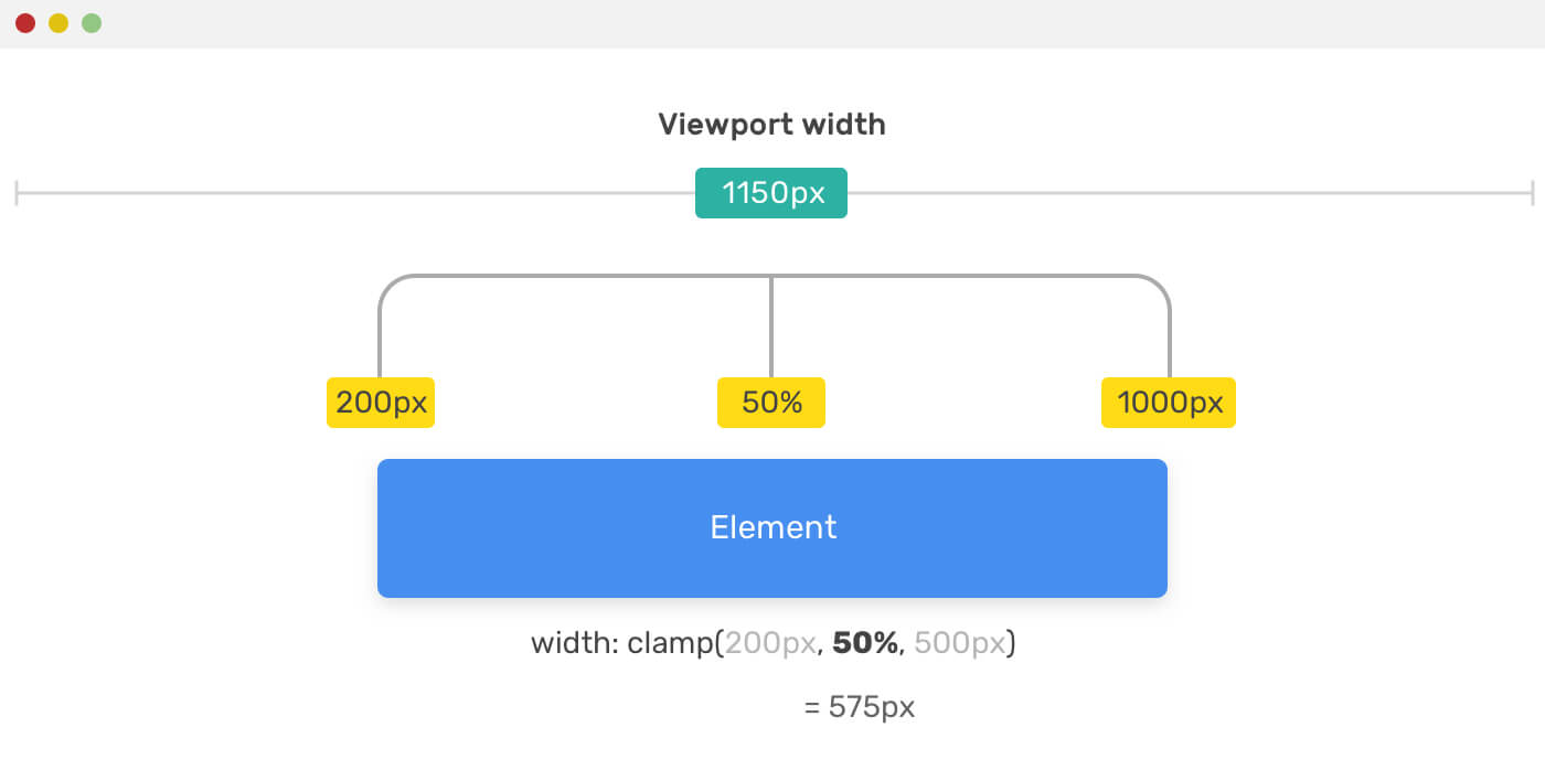
Ahmad takes a look into the CSS min(), max(), and clamp() functions. As with all his articles, he also provides some practical use cases and examples.
Regarding the clamping of the font-size of a page, you don’t really need clamp():
This is how to accessibly set a viewport relative scaling `font-size` with a min AND max now.
:root {
font-size: min(calc(1em + 1vw), 4em);
}`clamp()` isn't necessary, since the calc() part already makes `1em` the min, and in a way that respects browser body font size prefs.
— Heydon (@heydonworks) April 29, 2020
Above that clamp() in Safari 13.1 doesn’t seem to like font-size, so it wouldn’t work there anyway.
Everything I Learned About min(), max(), clamp() in CSS →
💁♂️ You might also like this post by Dannie Vinther which covers the same subject: Flexible layouts without media queries
💡 Want to know more about CSS Functions? You can read The Complete Guide to CSS Functions on CSS-Tricks.
UPDATE 2020.05.07: An interesting discussion sparked on Twitter regarding the clamping of the font-size.
As Šime Vidas noted, using font-size: clamp(16px, 5vw, 50px); has an accessibility issue as it breaks page zoom.
The problem isn’t the clamping itself, but using a “pure vw” font size.
It does work fine on a big screen, but not when you make your window smaller.
The problem relies in the situation where 10vw is being applied as font-size.
When then zooming in, the width of the viewport stays the same. Therefore the font-size also stays the same. pic.twitter.com/w0OnlZ5rsU
— Bramus! (@bramus) May 7, 2020
To fix page-zoom, add a unit that does respond to page zoom in the mix.
.title {
    font-size: clamp(16px, 5vw + 16px, 50px);
}
This way it will respond to both viewport width change and page zoom.