Flexbox Dynamic Line Separator

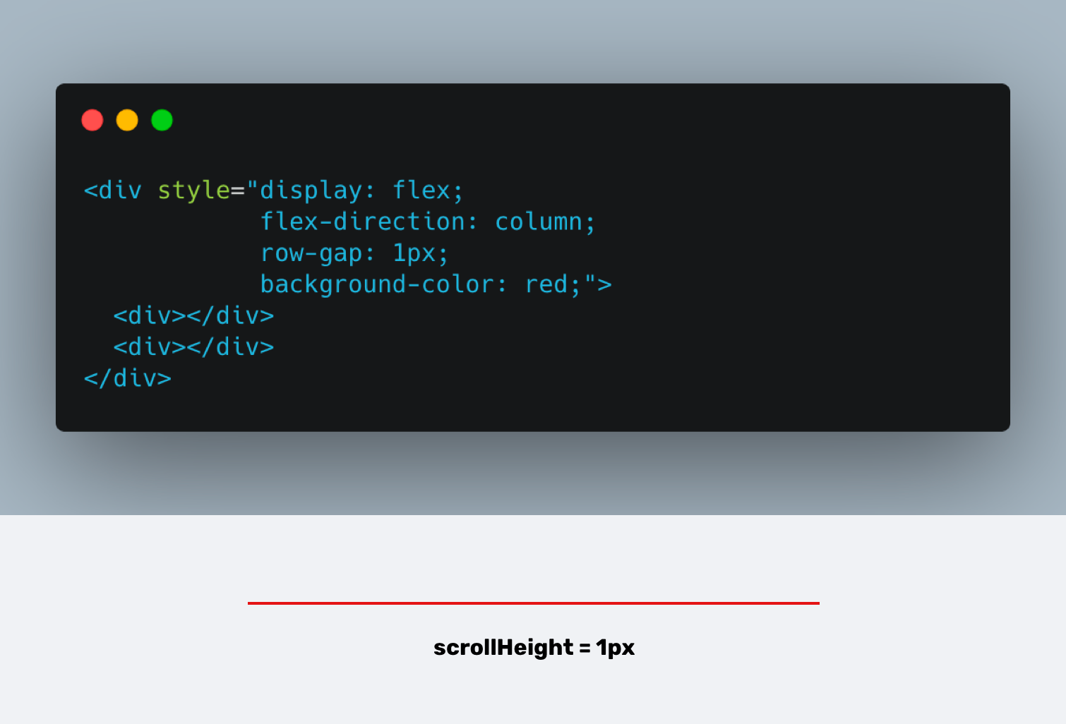
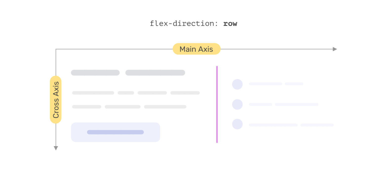
Nice one by Ahmad Shadeed: a line-separator between two flex items that plays nice with either flex-directions. The line itself is dynamically injected using generated content. As it becomes part of the flexbox layout it’s contained in — something I didn’t know — you can control its flex properties. The trick is to: Stretch the …

The Fundamentals of CSS Layout

At Chrome Dev Summit 2021, Rachel Andrew hosted a workshop “The Fundamentals of CSS Layout”. If you’re looking to get started with CSS Grid and Flexbox, this is the video you’re looking for. In this 90-minute workshop you’ll learn about the key CSS layout methods of flexbox and grid. You’ll learn how these layout methods …

Feature Detecting CSS Flexbox Gap Support

In my post on Flexbox Gap I wanted to feature detect support for it using @supports. That however failed. As I then noted: In the demo above I wanted to show a warning in browsers that don’t support flexbox gap. For that I tried using @supports, which has proven to be successful before. .warning { …

Spacing grid/flexbox items in CSS with the gap property

The gap property for Flexbox about to land in Chromium 85. It allows you to define the size of the gutters between Grid/Flexbox children. CSS Grid brought a delightful spacing feature called grid-gap, which quickly became a popular way to put space into layouts. It was easy to fall in love with because it took …

“Designing Intrinsic Layouts” by Jen Simmons

Twenty-five years after the web began, we finally have a real toolkit for creating layouts. Combining CSS Grid, Flexbox, Multicolumn, Flow layout and Writing Modes gives us the technical ability to build layouts today without the horrible hacks and compromises of the past. In this hour-long talk captured live at An Event Apart DC 2019, …

Relearn CSS layout with “Every Layout”

As just announced (on stage) at CSS Day by Heydon himself: If you find yourself wrestling with CSS layout, it’s likely you’re making decisions for browsers they should be making themselves. Through a series of simple, composable layouts, Every Layout will teach you how to better harness the built-in algorithms that power browsers and CSS. …

CSS masonry with flexbox, :nth-child(), and order

Tobias Ahlin: On the surface it seems fairly easy to create a masonry layout with flexbox; all you need to do is set flex-flow to column wrap and voilà, you have a masonry layout. Sort of. The problem with this approach is that it produces a grid with a seemingly shuffled and obscure order. Flexbox …

The Flexbox Holy Albatross

Great work by Heydon Pickering, in which he lets a flexbox layout respond to the size of its container, and not the viewport Sometimes you want your items to wrap in a very particular way. For instance, when you have three items, you’ll be happy with the three-abreast layout and accepting of the single-column configuration. …

Counting With CSS Counters and CSS Grid

Thanks to Counting With CSS Counters and CSS Grid my attention was directed to this fact comes to using CSS Counters: The effectiveness of counter() wanes when we realize that an element displaying the total count can only appear after all the elements to be counted in the source code. This is because the browser …

Vertical margins/paddings and Flexbox, a quirky combination

In CSS, percentage-based paddings are – as per spec – calculated with respect to the width of an element. However, for flex items (e.g. items whose parent have display: flex; applied) that’s not always the case. Depending on which browser you are using the percentage-based padding of a flex item will be resolved against its …