Star Wars Scene Transition Effects in CSS

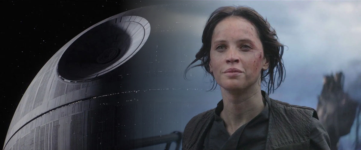
You know those wipe transitions between scenes in Star Wars movies? Have you ever thought it would be awesome to recreate them with CSS? Probably not, but, well, here we are. Let’s do it. Uses gradients set as a mask-image which transition on hover. For the iris and clock wipte effects, @property is used. Star …

Multi Colored Text with CSS

Nice text-effect demo by Shireen Taj: Using DevTools you can see that there’s a gradient background set onto the element. By also applying -webkit-background-clip: text; the gradient is only shown on the text itself. The demo’s also fun to fork and remix: Add some Houdini to animate it See the Pen Multi Colored Text with …

CSS Text Morphing

Similar to this 2019 demo by CodePen user Valgo (which uses SVG to create the effect), Amit Sheen created this wonderful CSS-only Word Morphing demo: The key parts to this demo are the filter on the wrapping .morphing element combined with the animated blurring on the .word elements themselves. You need both to get the …

Animated Greyscale to Color Image Reveal Effect

Ana Tudor recently shared a trick on how to make an image partially greyscale: #tinyCSStip Would you like to apply `filter: grayscale(1)`, but only partly, not everywhere? You can emulate that with blend modes. background: url(cat) 50%/ cover, linear-gradient(-45deg, transparent 50%, grey 0);background-blend-mode: luminosity Many variations possible. — Ana Tudor 🐯 (@anatudor) January 20, 2021 …

Creating a Pencil Effect in SVG

Using the feTurbulence and feDisplacementMap filters, Scott Turner make his SVG line-drawings look like they’re pencil-on-paper-like drawings: See the Pen SVG Pencil Filter #1 by Scott Turner (@srt19170) on CodePen. Creating a Pencil Effect in SVG → 💡 If you constantly randomize the turbulence you can create squiggles using SVG or even recreate a heat …

Multi-line Highlights in CSS

These lines aren’t injected using ::after or the like, but are done via backgrounds. The key CSS property you’re looking for is display: inline; though, as set on the p elements; without it, it won’t work. That last swipe effect also uses box-decoration-break clone; so that each line animates in parallel.

Crafting a Cutout Collage Layout with CSS Grid and clip-path

On Codrops there’s a tutorial on how to create a Cutout Collage Layout using CSS Grid and Clip Path. The result looks quite nice I must say: What I’m not too excited about in this implementation is the fact that it requires you to manually cut up the image into parts beforehand, even though clip-path …