SmolCSS – Minimal snippets for modern CSS layouts and components

Collection of CSS snippets by Stephanie Eckles to create some common layouts. It’s good to see how Flexbox and Grid have changed our approach to layouting, as these examples used to require a truckload of markup and/or some nasty CSS hacks before 😅 SmolCSS →
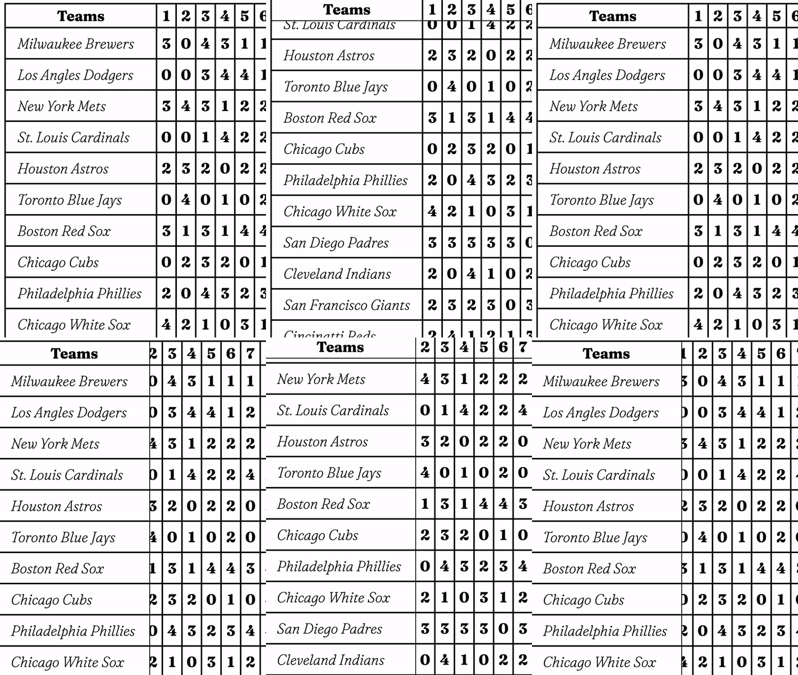
HTML Table with Sticky Header Row and Sticky First Column

Nice work by Chris Coyier: See the Pen Table with Sticky Header and Sticky First Column by Chris Coyier (@chriscoyier) on CodePen. I tried this on a table before and would swear it didn’t work back then. Perhaps I did something wrong, because it’s quite tricky as Chris details: The “trick” at play here is …

Style the target text from text-fragment links using the ::target-text pseudo-element

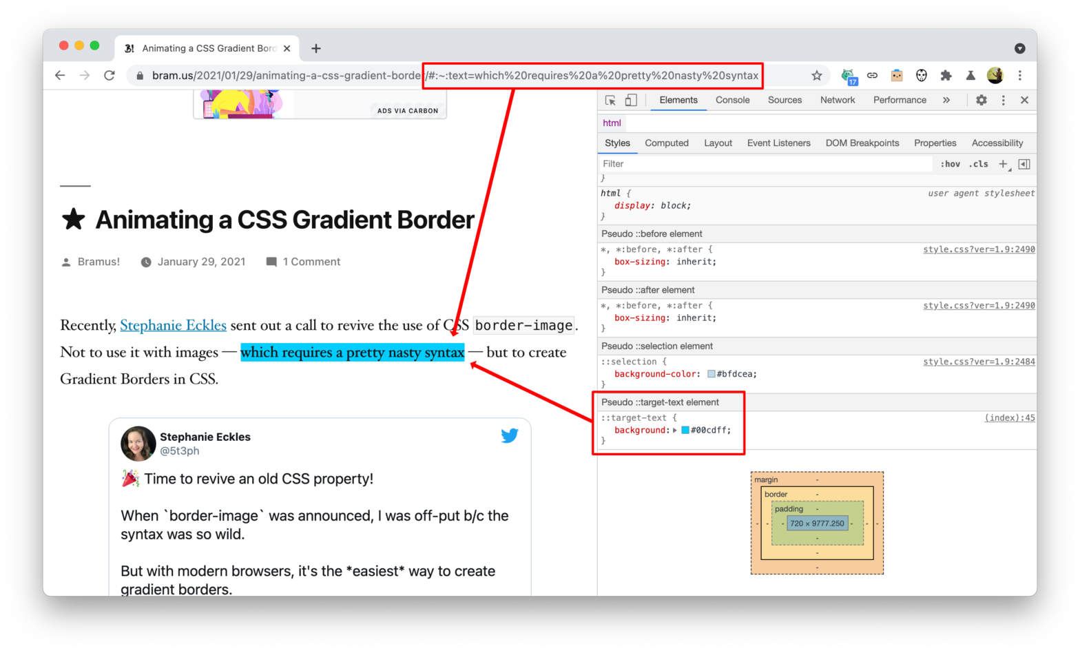
One of my favorite features that shipped with Chrome 80 — apart from Optional Chaining — is the ability to link to text-fragments. By default Chrome will highlight those in yellow: 💡 To easily create text-fragment links there’s this Chromium Plugin you can use. ~ As tweeted before, coming to Chromium 89 is the ability …

About Us Pop-Out Effect

Cool demo that uses clip-path: path(…);, a feature that recently shipped with Chromium, making it supported in all three major rendering engines. See the Pen About Us Pop-Out Effect by Mikael Ainalem (@ainalem) on CodePen. Peeking under the hood – using the SVG Path Visualizer — you can see that it’s the .container-inner that is …

The Surprising Things That CSS Can Animate

Back in June, Will Boyd wondered what things CSS can animate, which turns out to be quite a lot. This articles explores some of the unexpected things that CSS can animate and some nifty things you can do by animating them. I like this demo where you choose between two options (in which a z-index …

Make the page count of a 3D book visible using CSS Custom Properties

Michael Scharnagl: I am currently building a book section for this site and thought it would be cool to show the books in 3D and also to make it visible how many pages a book has. In this article I would like to show you how to use CSS custom properties to adapt the thickness …

Animated Greyscale to Color Image Reveal Effect

Ana Tudor recently shared a trick on how to make an image partially greyscale: #tinyCSStip Would you like to apply `filter: grayscale(1)`, but only partly, not everywhere? You can emulate that with blend modes. background: url(cat) 50%/ cover, linear-gradient(-45deg, transparent 50%, grey 0);background-blend-mode: luminosity Many variations possible. — Ana Tudor 🐯 (@anatudor) January 20, 2021 …

Animating a CSS Gradient Border

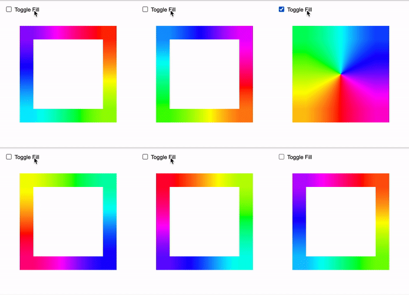
Recently, Stephanie Eckles sent out a call to revive the use of CSS border-image. Not to use it with images — which requires a pretty nasty syntax — but to create Gradient Borders in CSS. 🎉 Time to revive an old CSS property! When `border-image` was announced, I was off-put b/c the syntax was so …

:focus-visible Is Here

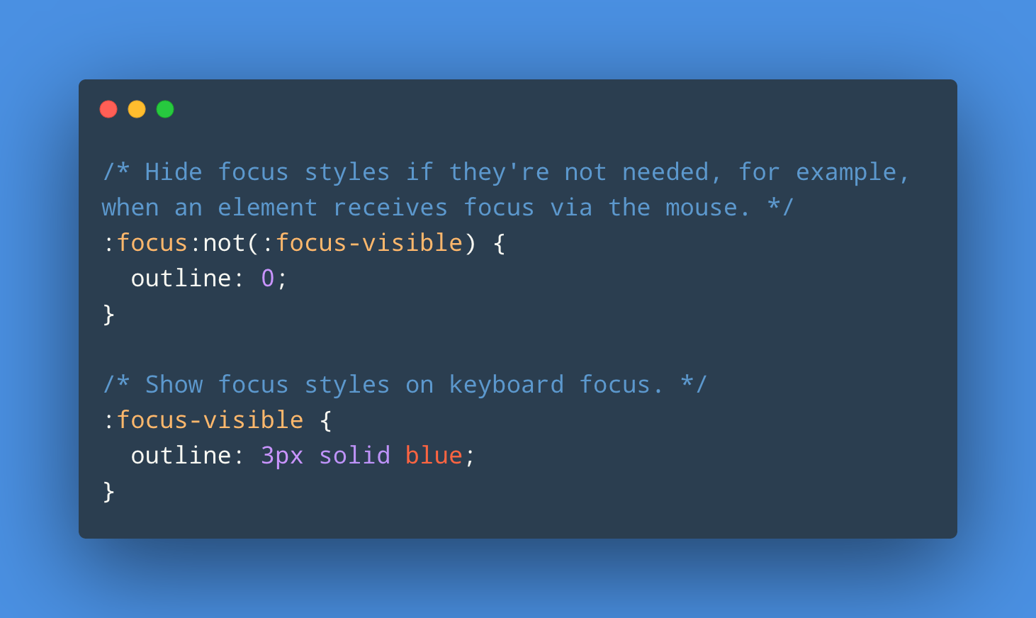
With Chromium 86 and now recently Firefox 85 supporting :focus-visible, it’s a good time to refer to this post by Matthias Ott: The :focus-visible pseudo-class lets you show focus styles only when they are needed, using the same heuristic that the browser uses to decide whether to show the default focus indicator. You use :focus-visible …

The Minimum Content Size In CSS Grid

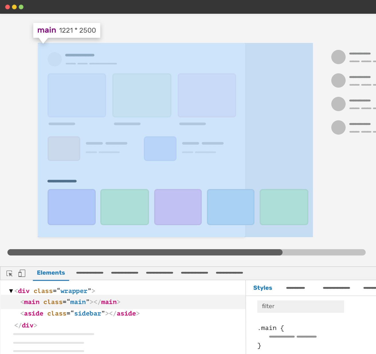
Ahmad recently encountered an issue where a CSS Grid column grew too large: .wrapper { display: grid; grid-template-columns: [main] 1fr [aside] 16em; grid-gap: 2em; } The main column has a 1fr value. That means it will take the available space minus the sidebar and the gap. However, the minimum content size of a grid item …