
An answer to a headscratcher Tyler Gaw (and Chris Coyier) ran into …
A rather geeky/technical weblog, est. 2001, by Bramus
cos(25deg) in CSS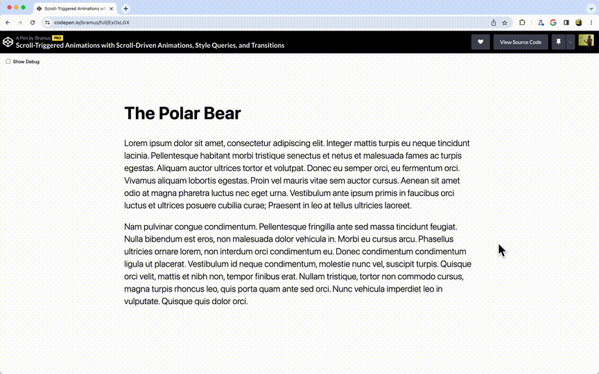
When you combine Scroll-Driven Animations with Custom Properties, Style Queries, and Transitions you hack your way into creating Scroll-Triggered Animations.
Brilliant work by Roman Komarov. Using the cyclic dependency invalidation and space toggles to select one value from an entire list. Cyclic Dependency Space Toggles →
@property
Custom properties – even when registered through @property – don’t animate on the compositor.
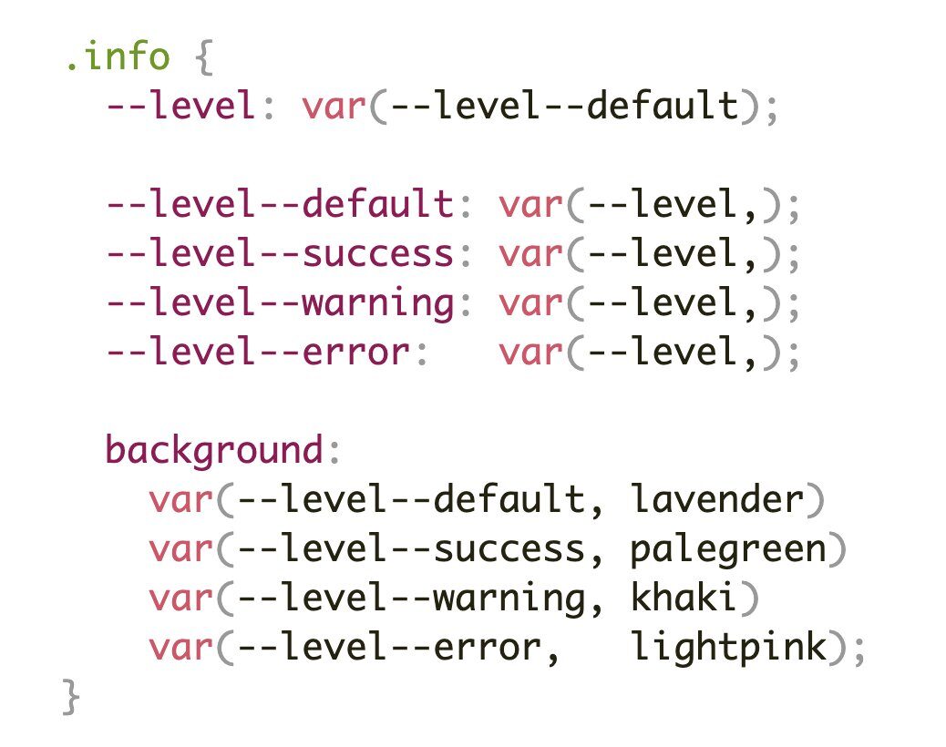
sm|md|etc) into Useful Values (aka Style Queries without Style Queries thanks to @property)
My favorite use case for Style Queries is the ability to change a bunch of styles based on the value of a so called “higher-order variable”. You use that variable as a switch to change a bunch of properties. @container style(–theme: dark) { .card { background: royalblue; border-color: navy; color: white; } .card button { …
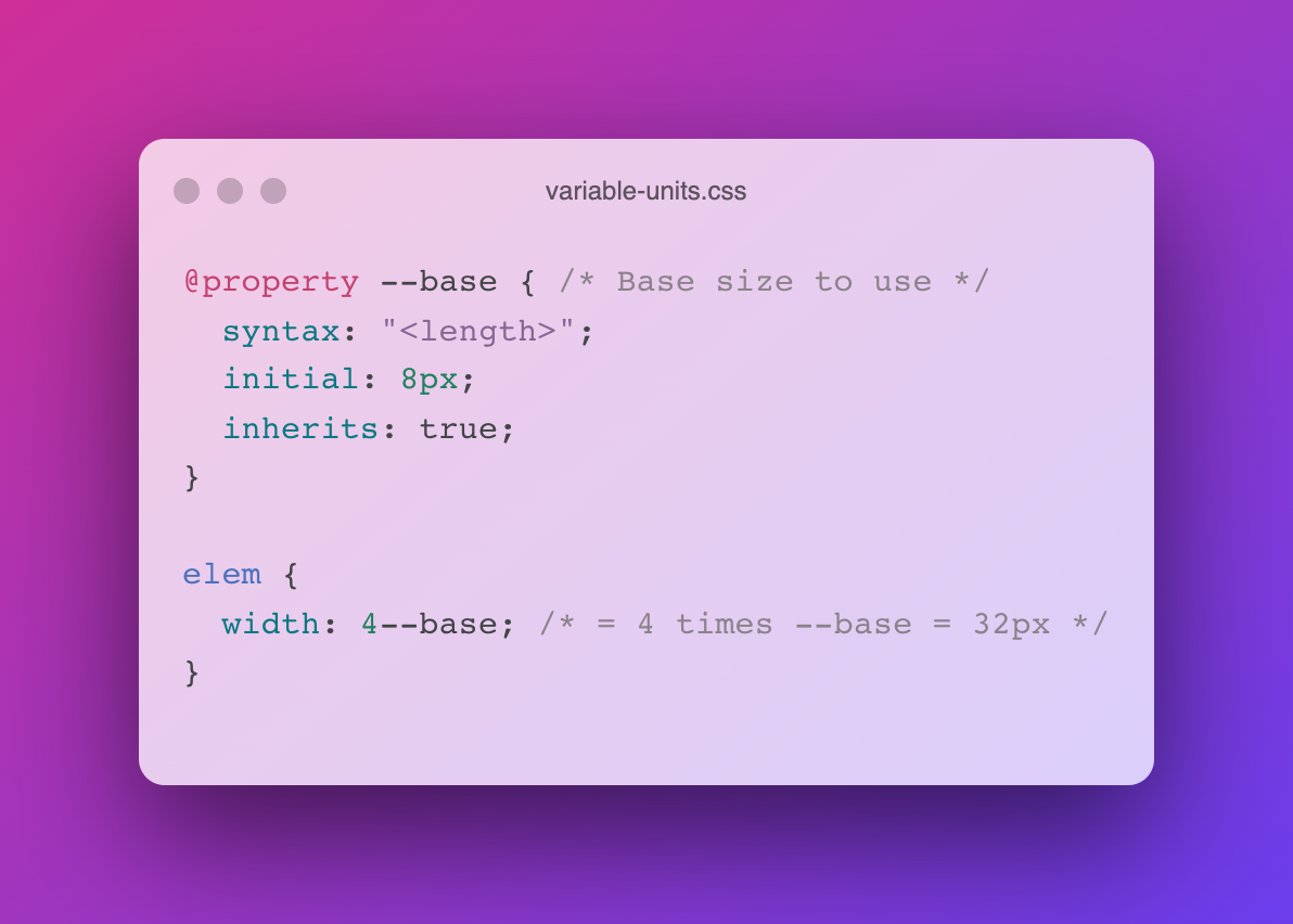
Thanks to Variable Units, authors can define Custom Properties and use them as units in their CSS
!important What happens when you set !important on a Custom Property? It’s not exactly what you think …
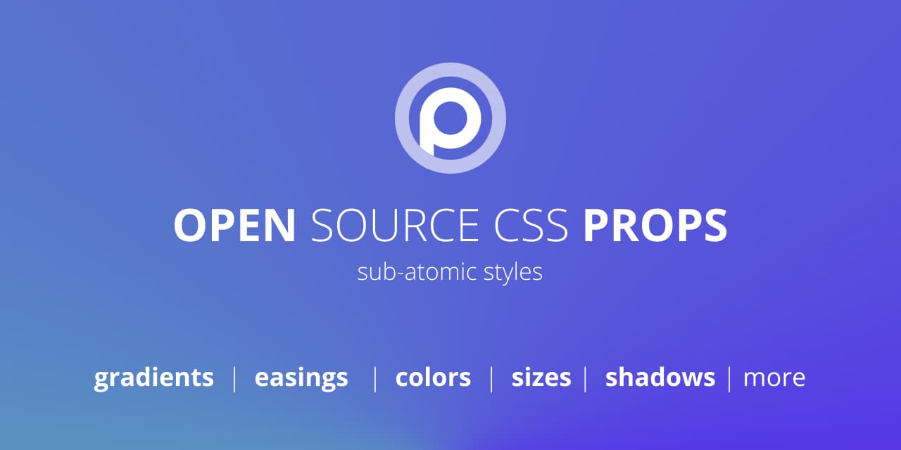
Adam Argyle released a new project named Open Props. Similar to the aforementioned Pollen, it’s a library that offers nothing but CSS Custom Properties. Open source CSS custom properties to help accelerate adaptive and consistent design. Available from a CDN or NPM, as CSS or Javascript. Once included, you can use the Custom Properties the …
On Twitter, John Allsopp recently shared that Flexbox is the greatest thing that happed to CSS. I quickly chimed in with my personal favourite. To me the single greatest addition to CSS over the past 20 years is Custom Properties. They’ve opened up a ton of possibilities, and make us CSS Authors way more productive. …