Recently, Stephanie Eckles sent out a call to revive the use of CSS border-image. Not to use it with images — which requires a pretty nasty syntax — but to create Gradient Borders in CSS.
🎉 Time to revive an old CSS property!
When `border-image` was announced, I was off-put b/c the syntax was so wild.
But with modern browsers, it's the *easiest* way to create gradient borders.
Learn more about CSS borders in the new ModernCSS tutorial:https://t.co/W7YVS7f0Jp pic.twitter.com/nj6WSmBplC
— Stephanie Eckles (@5t3ph) December 11, 2020
Curious to see what we can do with them, I whipped up a few demos using CodePen.
~
The most simple usage is to set some type of CSS gradient as the border-image:
div {
    border: 3em solid;
    border-image: linear-gradient(to right, green, yellow) 1;
}
See the Pen CSS Gradient Border by Bramus (@bramus) on CodePen.
Then I wondered if I could animate the border, so that it would rotate along the edge.
~
To animate the border gradient you’ll need to add an angle in there — using a Custom Property — which you animate using some @keyframes.
div {
  --angle: 0deg;
  /* … */
  border-image: linear-gradient(var(--angle), green, yellow) 1;
  animation: 10s rotate linear infinite;
}

@keyframes rotate {
  to {
    --angle: 360deg;
  }
}
By using a Custom Property we can have the browser properly automatically interpolate this value from 0deg to 360deg instead of needing to add individual keyframes for every 1 degree increase. For this to work we have to register the Custom Property using the amazing @property at-rule
@property --angle {
  syntax: '<angle>';
  initial-value: 0deg;
  inherits: false;
}
⚠️ As @property is only supported in Chromium at the time of writing, the demos from here on down will only work in browsers based upon it (e.g. Google Chrome, Microsoft Edge, …).
For browsers that don’t support it you could add individual keyframes for each step, as shown in this demo. However, for demonstration purposes I’m not including the extra code in any of the demos below.
See the Pen CSS Gradient Border (Animated) by Bramus (@bramus) on CodePen.
~
While the effect here looks quite nice it won’t play nice with more than two colors. Take this rainbow animated gradient border for example:
See the Pen CSS Rainbow Gradient Border (Animated, Attempt 1) by Bramus (@bramus) on CodePen.
🕵️♂️ You can see best what’s going on by toggling the fill option there … ugh, that’s not what we want!
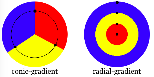
To fix that I first thought of using a radial gradient but what I need is a conic gradient:

This way each color of the gradient will extend nicely into the border, resulting in a correct animation.
div {
    /* … */
    border-image: conic-gradient(from var(--angle), red, yellow, lime, aqua, blue, magenta, red) 1;
}💁♂️ To make the end of the gradient blend nicely into its begin color, we have to repeat the said color — e.g. red — as the last entry.
See the Pen CSS Rainbow Gradient Border (Animated) by Bramus (@bramus) on CodePen.
When toggling the fill you can see that border-image here stretches out the color perpendicular to its edge, instead of letting the gradient “pass”. This might not be 100% what you want, but for me it was exactly what I aimed for 🙂
🎩 For non-Houdini browsers you can check out this fork, which uses individual keyframes to animate the gradient.
~
Thank me with a coffee.
I don\'t do this for profit but a small one-time donation would surely put a smile on my face. Thanks!
To stay in the loop you can follow @bramus or follow @bramusblog on Twitter.
Animation looks great in the Chromiums. Not seeing it in Firefox, Safari. 🎨
very awesome code.
Thanks!
Pretty rad! Presumably will degrade gracefully too
How do I apply radius to this edge?
Unfortunately you can’t:
border-imageis not affected byborder-radius🙁Any idea on how to make this work smoothly on a rectangular shape?