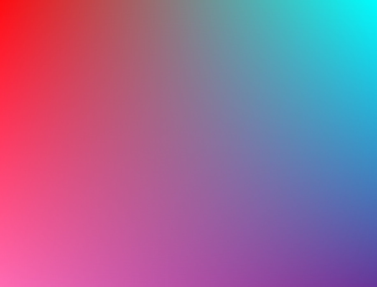
Visualizing How Gradient Angles in CSS Work Nils Binder noticed that Gradient Angles in Sketch, Figma, and CSS don’t behave exactly the same. To dig deeper into the subject he built this wonderful Pen that visualizes how gradient angles in CSS behave: The pen visualizes linear-gradient(var(--angle), #f09, #3023AE, #0ff). Very nice!
Creating a 4 Corner Gradient in CSS Nice demo by Adam Argyle to create a 4 Corner Gradient in CSS: Even though working with gradients has gotten some improvements, you’ll still need a trick to achieve this one: stack 2 simple linear gradients and use a linear mask to blend them together: mask-image: linear-gradient(to bottom, transparent, black);
Multi-line gradient links Zell Liew deconstructed and recreated the gradient links as seen on CSS-Tricks When I saw the CSS Tricks redesign, I was hooked. I loved the links with gradients. I told myself Iām going to use gradient links for my next project. The result looks like this: Uses the aforementioned box-decoration-break to span styles across multiple lines along with text-decoration-color to tweak the color of the line below the link. .gradient-text { background: linear-gradient(120deg, #ab4e19, #c99a2e); -webkit-background-clip: text; -webkit-text-fill-color: transparent; -webkit-box-decoration-break: clone; text-decoration-color: #ab4e19; } Multi-line gradient links →
Grade.js This JavaScript library produces complementary gradients generated from the top 2 dominant colours in supplied images. Apply the Grade function to elements wrapping the source images: <script src="path/to/grade.js"></script> <script type="text/javascript"> window.addEventListener('load', function(){ Grade(document.querySelectorAll('.gradient-wrap')) }) </script> ⦠<div class="gradient-wrap"> <img src="./samples/finding-dory.jpg" alt="" /> </div> Installation possible with npm: npm install grade-js Grade.js →Grade Source (GitHub) →