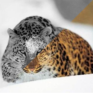
Ana Tudor recently shared a trick on how to make an image partially greyscale:
#tinyCSStip Would you like to apply `filter: grayscale(1)`, but only partly, not everywhere? You can emulate that with blend modes.
background: url(cat) 50%/ cover,
linear-gradient(-45deg, transparent 50%, grey 0);
background-blend-mode: luminosityMany variations possible.
— Ana Tudor 🐯 (@anatudor) January 20, 2021
Here’s her code in a CodePen demo for you to play with:
See the Pen CSS Partial Greyscale by Bramus (@bramus) on CodePen.
☝️ Tip: Tweak the angle and the percentage of transparent to see how it behaves.
~
Inspired by a CodePen demo by Jhey — in which he built image reveal on hover using filter and clip-path — Ana rebuilt his demo using her technique:
See the Pen No image duplication reveal effect with Houdini magic 🎩🐇✨ (Chromium only) by Ana Tudor (@thebabydino) on CodePen.
One advantage of Ana’s technique is that it doesn’t require duplicated images in the markup. A disadvantage though is that it only works with background images. Chrome only too, as it relies on @property.
I like this form of code golfing 🙂
UPDATE 2021-02-02: Ana also made a non-Houdini version that uses box-shadow on a wrapping element. Because of that you can simply leave your img tags intact, so all cons of her first iteration have been nullified. Cool!