Utopia – Elegantly scale type and space without breakpoints

In addition to my talk “Embrace the Platform” at UX Ghent, James Gilyead and Trys Mudford from Clearleft also joined the meetup with a talk on Utopia. With Utopia you get to define the small- and large-screen layouts. All font sizes in between will be calculated by Utopia. Utopia →Meet Utopia: Designing And Building With …

Responsive Layouts, Fewer Media Queries

Over at CSS-Tricks you can read a min-bending article by Temani Afif Since the introduction of media queries (literally decades ago), CSS has evolved to the points that there are a lot of tricks that can help us drastically reduce the usage of media queries we use. In some cases, I will show you how …

Media Queries in Times of Container Queries

Max Böck: With container queries now on the horizon – will we need media queries at all? Is there a future where we build responsive interfaces completely without them? As Max details we will still need both, but will see a shift from some Media Queries to Container Queries. Good read; I found myself nodding …

Viewport Unit Based Typography vs. Safari

A common thing to do regarding font-sizing is to use Viewport Unit Based Typography, nowadays often combined with CSS min() or clamp(): :root { font-size: min(calc(1em + 1vw), 4em); } However, as Sara Soueidan details, Safari doesn’t co-operate here: In Safari on macOS, the fluid text wasn’t really fluid—resizing the viewport did nothing to the …

The new responsive: Web design in a component-driven world

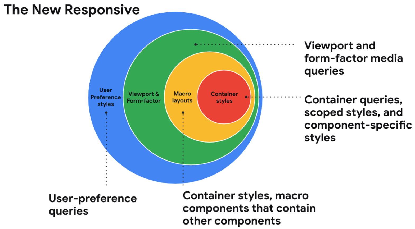
In this session from Google I/O 2021, Una Kravets talks about “the new responsive”, short for being responsive to the user, container, and form-factor (text-version available via link below): The web community is entering into a new era of responsive design and shifting our perspectives on what it means. With user preference queries, container queries, …

Responsive Images the Simple Way

The logic behind displaying an image responsively is complicated. It involves determining how large the image will be displayed, as well as understanding whether the user is on a high-resolution display, among other things. Thankfully, the browser is better equipped than we are to handle this logic. All we need to do is give it …

Responsive UIs in React Native

On the web it is – by now – obvious that you make your website responsive (*). Using a listener listening to the change event of the Dimensions API, it’s also possible to implement this kind of behaviour in React Native. import {Component} from "react"; import {Dimensions} from "react-native"; export default class LogDimensionChanges extends Component …

Responsive Components: a Solution to the Container Queries Problem

Extensive writeup by Philip Walton on how he tackles the Container Queries problem. Instead of narrowly focusing on the specific CSS feature proposal we call “container queries”, I want to focus on the broader concept of building components that respond to their environment. And if you accept this larger framing, there are actually new web …

Responsive Typography

Mike Riethmuller: It is possible to have precise control over responsive typography. Using calc() and viewport units you can create fluid type that scales perfectly between specific pixel values, within a specific viewport range. The formula used is this one: @media (min-width: #{$min_width}px) and (max-width: #{$max_width}px) { font-size: calc(#{$min_font}px + (#{$max_font} – #{$min_font}) * ( …