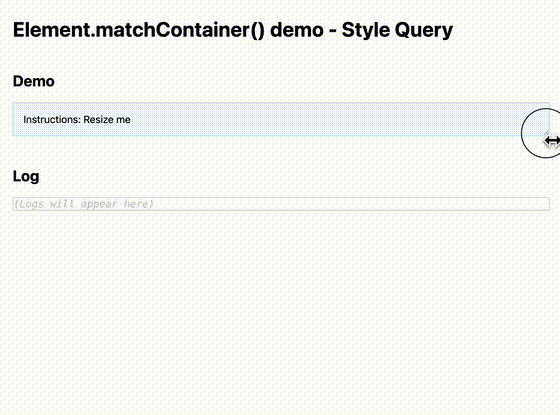
Martin Winkler published a package that polyfills Element.matchContainer to get notified in script when a Container Query matches/unmatches. Under the hood, it uses a StyleObserver.
A rather geeky/technical weblog, est. 2001, by Bramus
StyleObserver: Element.matchContainer() Martin Winkler published a package that polyfills Element.matchContainer to get notified in script when a Container Query matches/unmatches. Under the hood, it uses a StyleObserver.
In CSS, Style Queries which allow querying computed values of a container. Let’s take a look at what that means …

At JSWORLD Conference, Maarten van Hoof presented “Container queries, the next step towards a truly modular CSS” Modular, componentized frameworks and libraries are more popular than ever, but currently screen size is the only dimensional constraint to which a web design can adapt to. In this talk, Maarten will explain what Container Queries are and …
Continue reading “Container queries, the next step towards a truly modular CSS”
container-query-polyfill, a polyfill for CSS Container Queries
Surma has been working on container-query-polyfill, a lightweight polyfill for CSS Container Queries. Let’s take a look at how it works and how it differs from cqfill … What Unlike cqfill —which was covered here before— this Polyfill for Container Queries: Does not require you to declare a separate Custom Property –css-contain that duplicates the …
Continue reading “A first look at container-query-polyfill, a polyfill for CSS Container Queries”
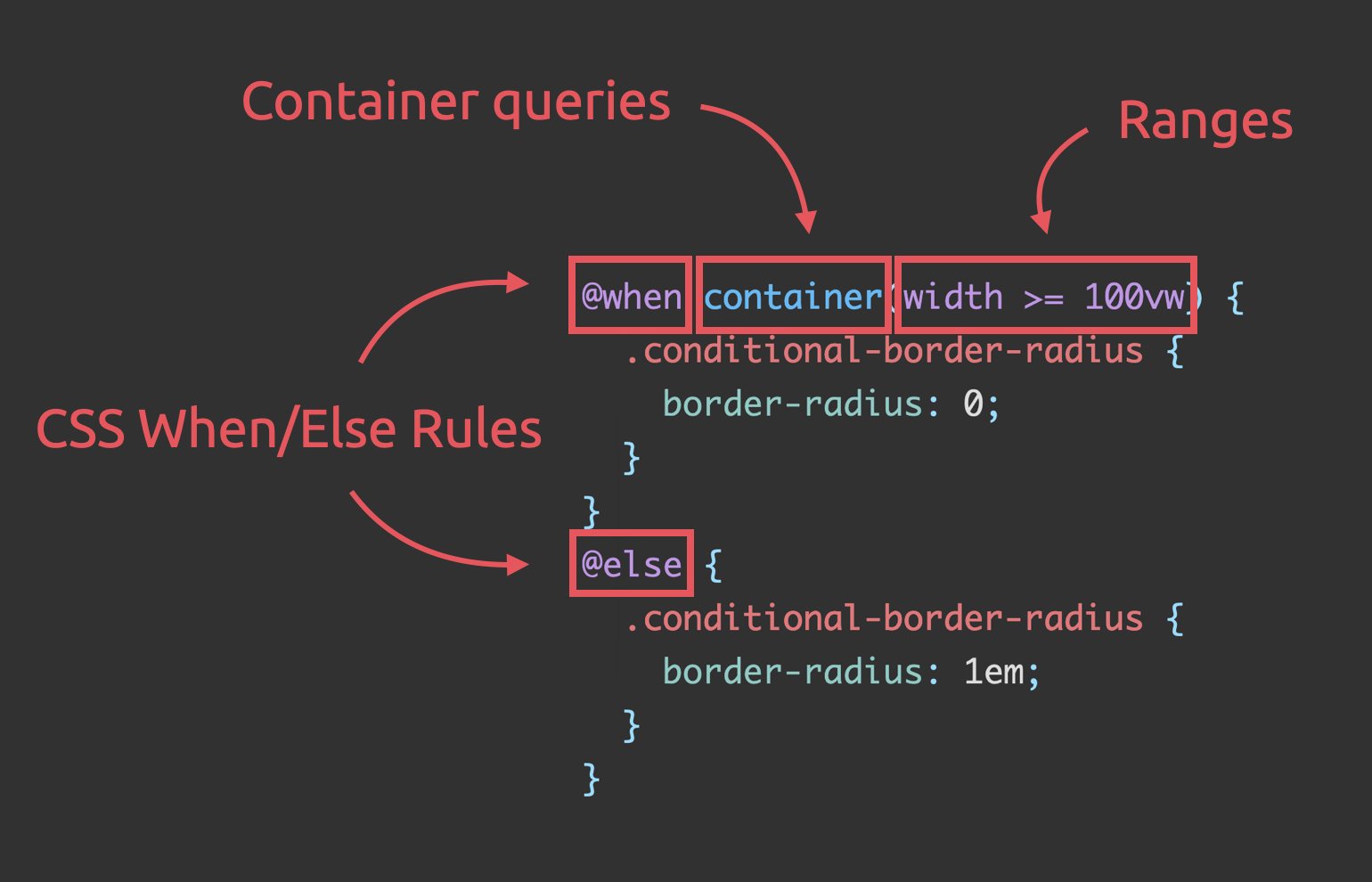
Stefan Judis has reworked Ahmad Shadeed‘s Conditional border-radius, using these three (future) CSS additions: Media query ranges Container Queries CSS @when + @else Unlike the original code, the result definitely is a very nice and readable piece of code that doesn’t feel hacky at all — I like where CSS is headed 😊 Conditional border-radius …
Continue reading “Conditional border-radius and three future CSS features”

At (the ongoing) TPAC 2021 — the W3C Annual Conference — the CSS Working Group provided two video updates that summarize some of the ongoing work they’ve been doing. Perfect way to get up to speed in less than 10 minutes Improving CSS Architecture with Cascade Layers, Container Queries, Scope In this video Miriam Suzanne …
Coming with Container Queries are “Query Length Units”, a way to dynamically target the width/height of containers (cfr. viewport units). Let’s take a look …

Support for Container Queries has landed in Chrome DevTools (Chrome 93). Let’s take a look at what this feature brings us today …
Max Böck: With container queries now on the horizon – will we need media queries at all? Is there a future where we build responsive interfaces completely without them? As Max details we will still need both, but will see a shift from some Media Queries to Container Queries. Good read; I found myself nodding …
Continue reading “Media Queries in Times of Container Queries”
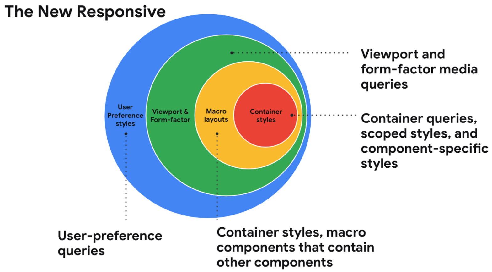
In this session from Google I/O 2021, Una Kravets talks about “the new responsive”, short for being responsive to the user, container, and form-factor (text-version available via link below): The web community is entering into a new era of responsive design and shifting our perspectives on what it means. With user preference queries, container queries, …
Continue reading “The new responsive: Web design in a component-driven world”