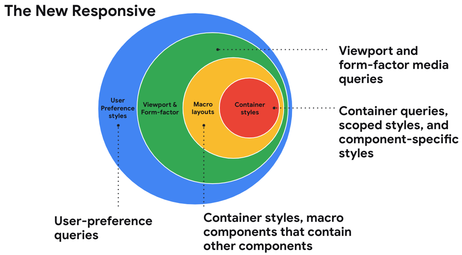
In this session from Google I/O 2021, Una Kravets talks about “the new responsive”, short for being responsive to the user, container, and form-factor (text-version available via link below):
The web community is entering into a new era of responsive design and shifting our perspectives on what it means. With user preference queries, container queries, and other form-factor queries on the horizon, we’ll soon have the tools to create responsive designs far beyond what querying the global viewport allows.
To me, this post is the perfect successor to A List Apart’s A Dao of Web Design and Responsive Web Design. The timing is only off by one year …
Not to put any pressure on the author of @alistapart’s upcoming Spring 2020 feature, but I know a trend when I see one:
– April 2000: A Dao of Web Design
– May 2010: Responsive Web Design
– June 2020: …🤪
— Bramus! (@bramus) October 27, 2019
The new responsive: Web design in a component-driven world →