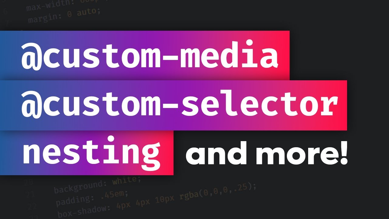
In this video, Kevin J Powell, shows how to use new and upcoming CSS features today, thanks to PostCSS and its postcss-preset-env plugin. The video covers Custom Media Queries, Media Query Ranges, CSS Nesting, and Custom Selectors.
A rather geeky/technical weblog, est. 2001, by Bramus
In this video, Kevin J Powell, shows how to use new and upcoming CSS features today, thanks to PostCSS and its postcss-preset-env plugin. The video covers Custom Media Queries, Media Query Ranges, CSS Nesting, and Custom Selectors.
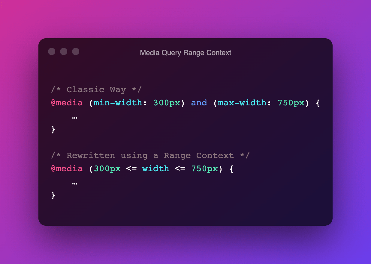
A media feature like width can take its value from a range. When used, we prefix these with min- or max- to express “minimum condition” or “maximum condition” constraints. @media (min-width: 300px) and (max-width: 750px) { … } In CSS Media Queries Level 4 these type of Media Features can now be written as a …
Continue reading “Media Queries Level 4: Media Query Range Contexts (Media Query Ranges)“
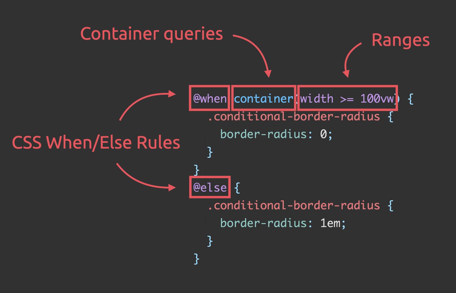
Stefan Judis has reworked Ahmad Shadeed‘s Conditional border-radius, using these three (future) CSS additions: Media query ranges Container Queries CSS @when + @else Unlike the original code, the result definitely is a very nice and readable piece of code that doesn’t feel hacky at all — I like where CSS is headed 😊 Conditional border-radius …
Continue reading “Conditional border-radius and three future CSS features”
Kilian Valkhof recently needed to check if prefers-reduced-data was supported by the browser or not For this, I couldn’t use just @media (prefers-reduced-data: no-preference) because that would be false if either there was no support (since the browser wouldn’t understand the media query) or if it was supported but the user wanted to preserve data. …
Continue reading “Detecting media query support in CSS and JavaScript”
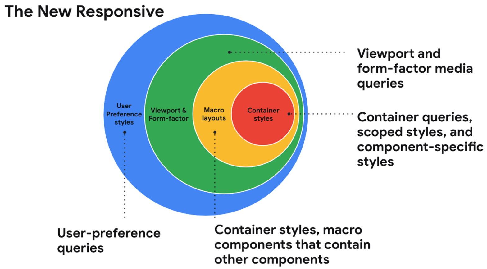
In this session from Google I/O 2021, Una Kravets talks about “the new responsive”, short for being responsive to the user, container, and form-factor (text-version available via link below): The web community is entering into a new era of responsive design and shifting our perspectives on what it means. With user preference queries, container queries, …
Continue reading “The new responsive: Web design in a component-driven world”

Last summer Kilian Valkhof did a wonderful write-up on the Polypane blog covering CSS Media Queries. Media queries are what make modern responsive design possible. With them you can set different styling based on things like a users screen size, device capabilities or user preferences. But how do they work, which ones are there and …
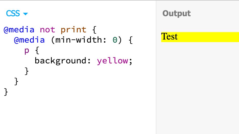
I can’t seem to find any mention of this in the Media Queries Module specification, but apparently it’s allowed to nest media queries, as shared by Šime Vidas: Apparently, nested media queries are a thing https://t.co/2L2pEWy2JW — Šime Vidas (@simevidas) January 10, 2021 That’s … awesome! 🤯 Fiddling with it a bit more, turns out this …
prefers-reduced-data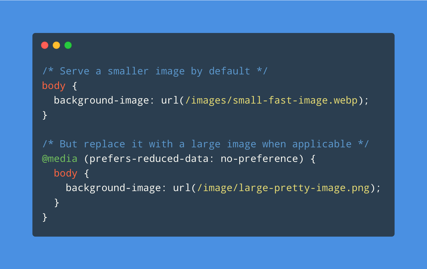
Part of CSS Media Queries Level 5 is the User Preference Media Feature prefers-reduced-data: The prefers-reduced-data CSS media feature is used to detect if the user has requested the web content that consumes less internet traffic. There currently is no browser support at all, but that doesn’t stop Kilian Valkhof from taking a peek under …
Continue reading “Creating websites with prefers-reduced-data“
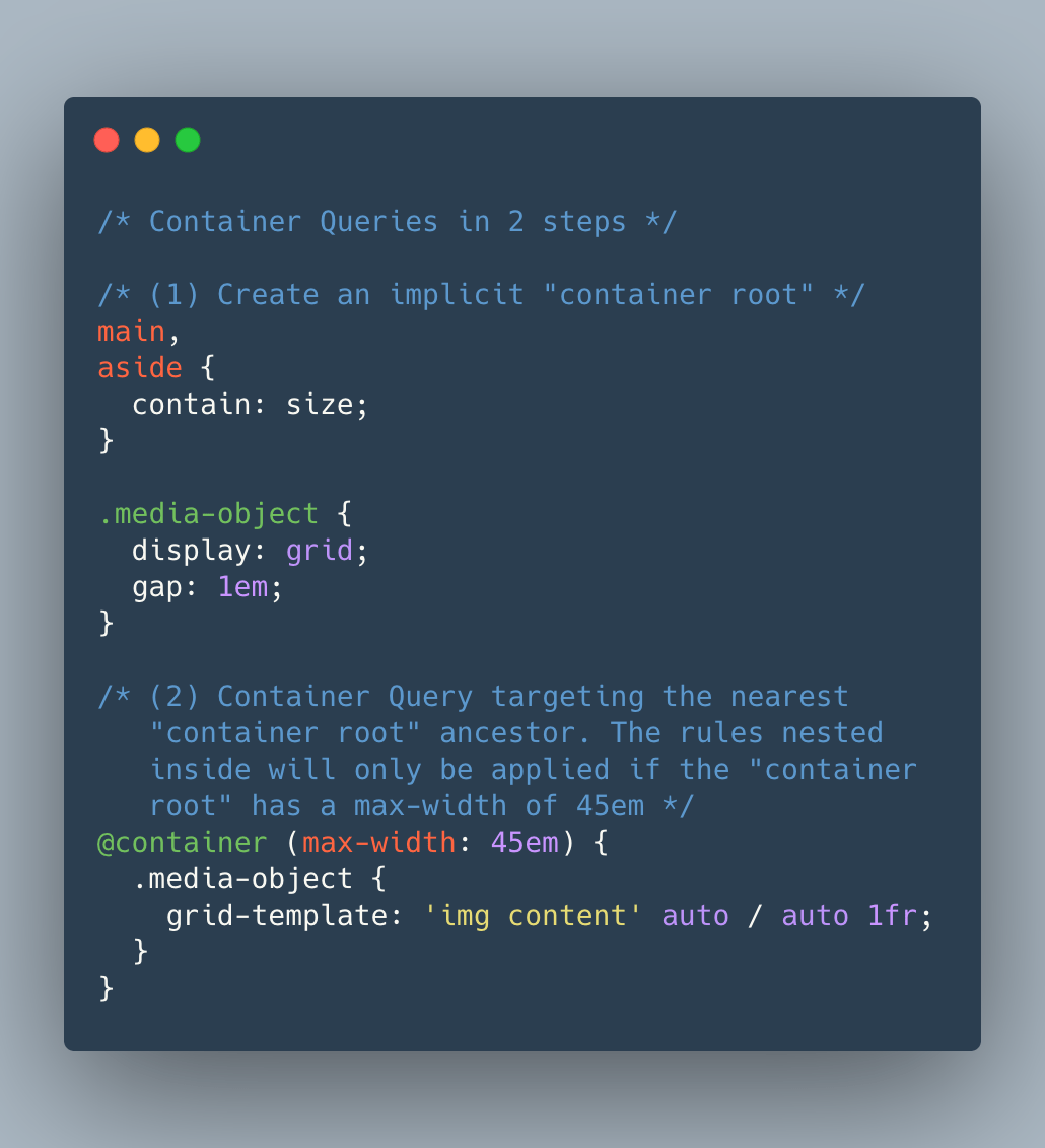
Just announced on the Chromium mailing list is an “Intent to Prototype” Container Queries. Let’s take a look at the proposed syntax …