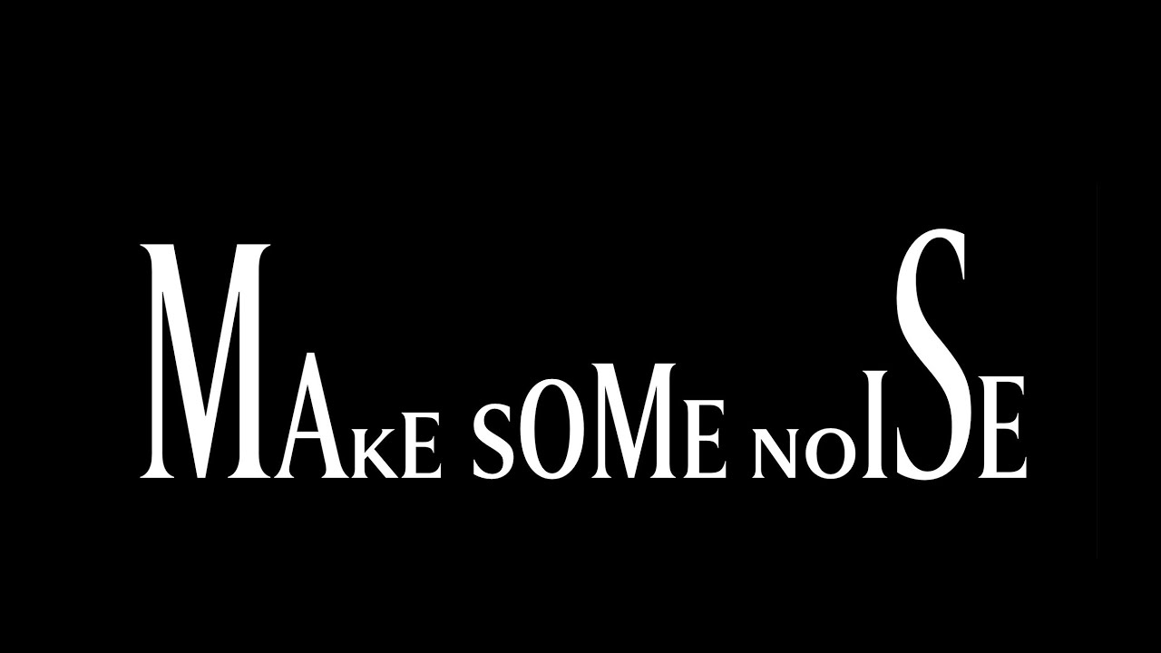
Olympe is a monospace font revived from an Olympia typewriter. The first weight, regular, is based on the original weights of the font that was on this machine, and the light weight, close to hairline actually, has been designed from scratch, with a heavy punctuation, because who doesn’t like a bit of contrast? When I …
Tag Archives: typography
Utopia – Elegantly scale type and space without breakpoints
In addition to my talk “Embrace the Platform” at UX Ghent, James Gilyead and Trys Mudford from Clearleft also joined the meetup with a talk on Utopia. With Utopia you get to define the small- and large-screen layouts. All font sizes in between will be calculated by Utopia. Utopia →Meet Utopia: Designing And Building With …
Continue reading “Utopia – Elegantly scale type and space without breakpoints”
Modern fluid typography editor
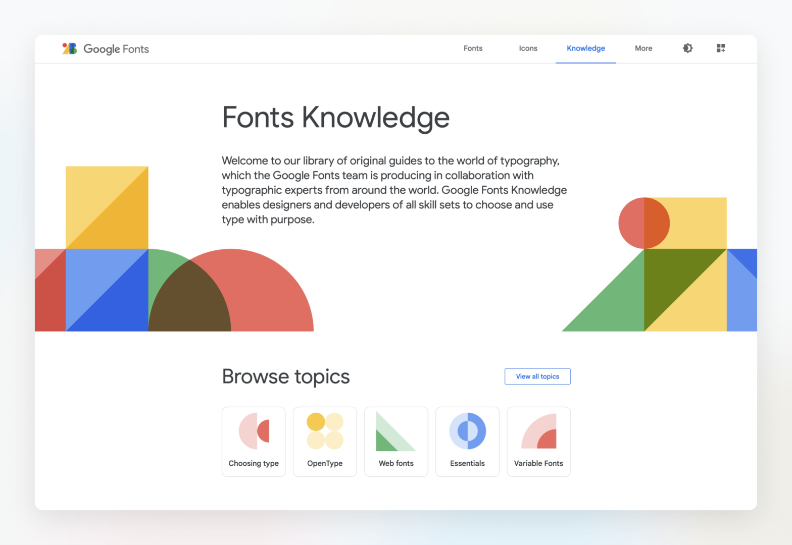
Google Fonts Knowledge
Welcome to our library of original guides to the world of typography, which the Google Fonts team is producing in collaboration with typographic experts from around the world. Google Fonts Knowledge enables designers and developers of all skill sets to choose and use type with purpose. Knowing that Eliott Jay Stocks helped work on this, …
Viewport Unit Based Typography vs. Safari
A common thing to do regarding font-sizing is to use Viewport Unit Based Typography, nowadays often combined with CSS min() or clamp(): :root { font-size: min(calc(1em + 1vw), 4em); } However, as Sara Soueidan details, Safari doesn’t co-operate here: In Safari on macOS, the fluid text wasn’t really fluid—resizing the viewport did nothing to the …
Continue reading “Viewport Unit Based Typography vs. Safari”
SYMPHOSIZER – Playing with SF Symphony’s new Visual Identity
At first sight the new visual identity for the San Francisco Symphony (pictured below, on the right) looks a bit off … Those letters sure look a bit oddly sized, no? Turns out there’s a dynamic drive behind them: Leveraging new creative technology including variable font design, our new visual language (of which the logo …
Continue reading “SYMPHOSIZER – Playing with SF Symphony’s new Visual Identity”
A Five-Minute Guide to Better Typography
CSS leading-trim
– The Future of Digital Typesetting
Ethan Wang, who works at Microsoft: In a standard text box, there’s almost always extra space above and below the actual text. Because of this, when you use a text box to measure and implement spacing, it ends up larger than you intended. The bigger the line height, the bigger the problem. You can see …
Continue reading “CSS leading-trim
– The Future of Digital Typesetting”
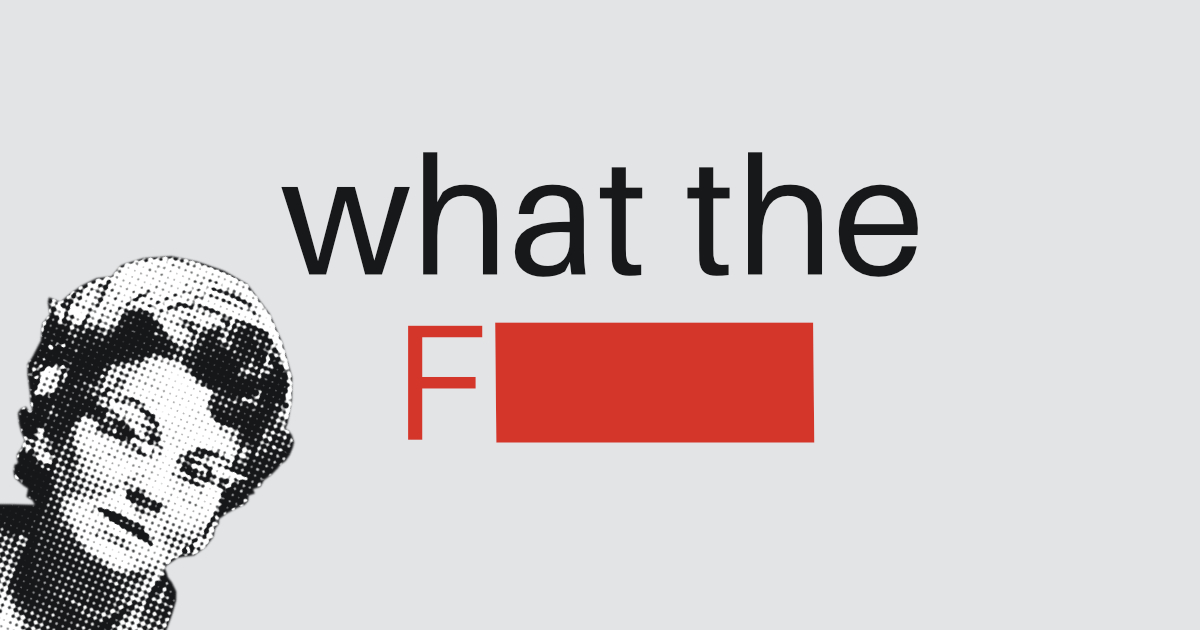
Scunthorpe Sans 🗯🚫 profanity-blocking font
text-decoration-*
CSS Properties Coming to Firefox
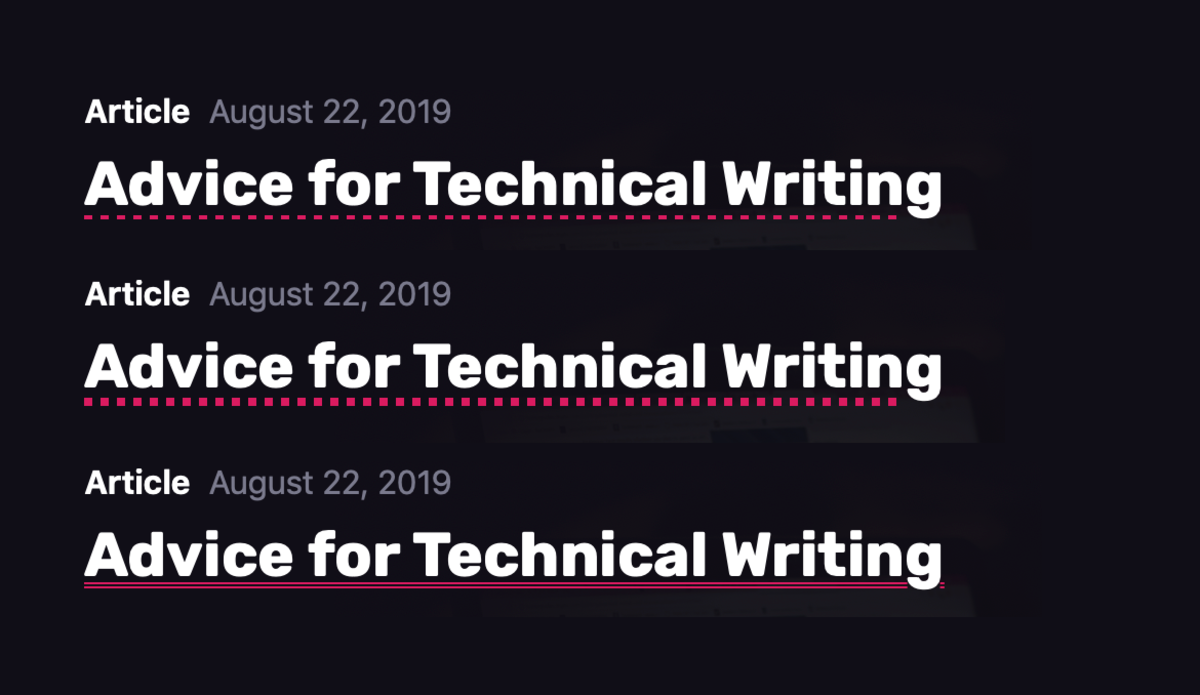
Glad to see this announcement by Mozillian Daniel Holbert: As of today (Sept 12 2019), I’ve turned on support for the CSS properties text-decoration-skip-ink, text-decoration-thickness, and text-underline-offset, on all platforms. As posted before, text-decoration-skip-ink gives you nicer underlines. The other two properties allow one to tweak the position and color of the underline. CSS Tricks …
Continue reading “text-decoration-*
CSS Properties Coming to Firefox”