The logic behind displaying an image responsively is complicated. It involves determining how large the image will be displayed, as well as understanding whether the user is on a high-resolution display, among other things. Thankfully, the browser is better equipped than we are to handle this logic. All we need to do is give it …
<picture> <!–[if IE 9]><video style="display: none;"><![endif]–> <source type="image/svg+xml" srcset="path/to/header–full.svg"> <source type="image/svg+xml" srcset="path/to/header–medium.svg" media="(max-width: 1024px)"> <source type="image/svg+xml" srcset="path/to/header–small.svg" media="(max-width: 640px)"> <!–[if IE 9]></video><![endif]–> <img src="path/to/header-1x.png" srcset="path/to/header-2x.png 2x, path/to/header-3x.png 3x" alt="Header description"> </picture> Besides using an SVG as a background image in CSS, you can serve SVG foreground images in HTML using one of several embedding techniques, …
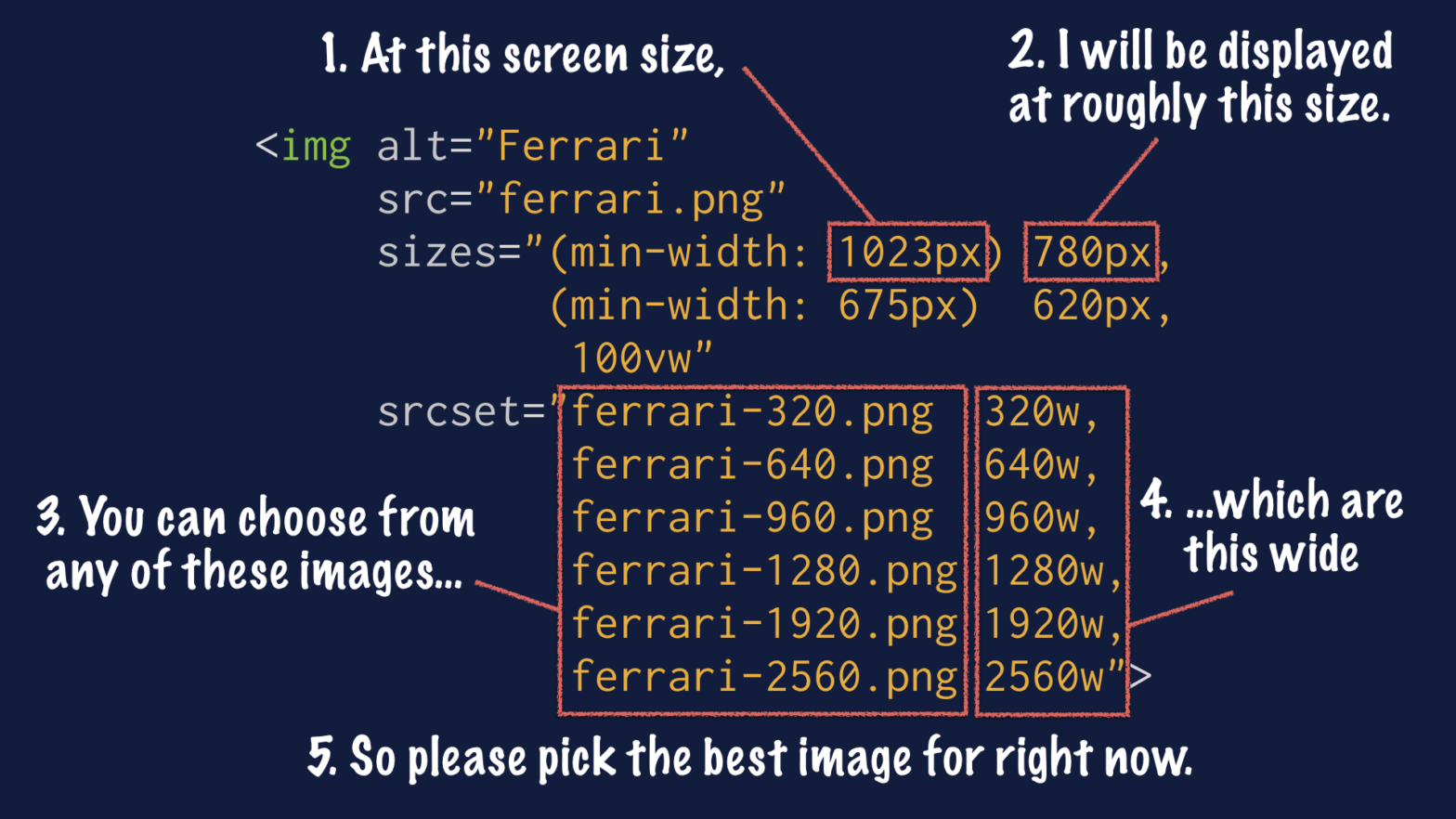
<img srcset="quilt_3/large.jpg 1240w, quilt_3/medium.jpg 620w, quilt_3/small.jpg 310w" sizes="(min-width: 41.25em) 38.75em, calc(100vw – 2.5em)" src="quilt_3/medium.jpg" alt="A crazy quilt whose irregular fabric scraps are fit into a lattice of diamonds." /> Let’s take an existing web page and make its images responsive. We’ll do so in three passes, applying each piece of the new markup in turn: …
<picture> <source srcset=”examples/images/extralarge.jpg” media=”(min-width: 1000px)”> <source srcset=”examples/images/large.jpg” media=”(min-width: 800px)”> <source srcset=”examples/images/medium.jpg”> <img srcset=”examples/images/medium.jpg” alt=”A giant stone face at The Bayon temple in Angkor Thom, Cambodia”> </picture> The picture element and associated features are W3C standard HTML features that allow web developers to deliver an appropriate image to every user depending on a variety of conditions …
When working with images on small screen devices it is recommended to focus on the subject: don’t just show a scaled down version of the photo, it’s better to remove some of the background scenery and show the person on the photo (see the Obama example at the top of this post on responsive images). …
Now that phones, tablets and laptops use high-resolution, “can’t tell it’s pixels” displays it’s time to take the plunge and make your sites and apps ready for retina. With my ebook you’ll be up to speed in no time, with easy to follow step-by-step instructions on creating stunningly beautiful high-resolution websites, that load fast and …
Responsive images is a surprisingly complicated topic, and one that’s been steadily gaining attention over the last year as more developers discover they need them and then discover there’s no good solution yet. This article aims to give an overview of the problem itself, and show the different proposals in the works to address it. …
Pngy is a bit of jQuery that allows you to load images of different file sizes based on a page’s load speed. So, if the load speed is slow, Pngy can load your small image. If it’s fast, it can load a hi-res image. It’s kinda like a ping test in Javascript. Resonates with my …
Anystretch is a jQuery plugin that allows you to add a dynamically-resized background image to any page or block level element. The image will stretch to fit the page/element, and will automatically resize as the window size changes. Handy when having a fluid layout/responsive design. Anystretch Demo → Anystretch (GitHub) → UPDATE: Reader Oemebamo pointed …
The past few weeks a lot has been going on around one of the challenges of responsive web design, namely responsive images. The gist of it is pretty straightforward: it’s not a good idea to let a device download a big image if that device is a small-screen device. It’s better to serve that device …