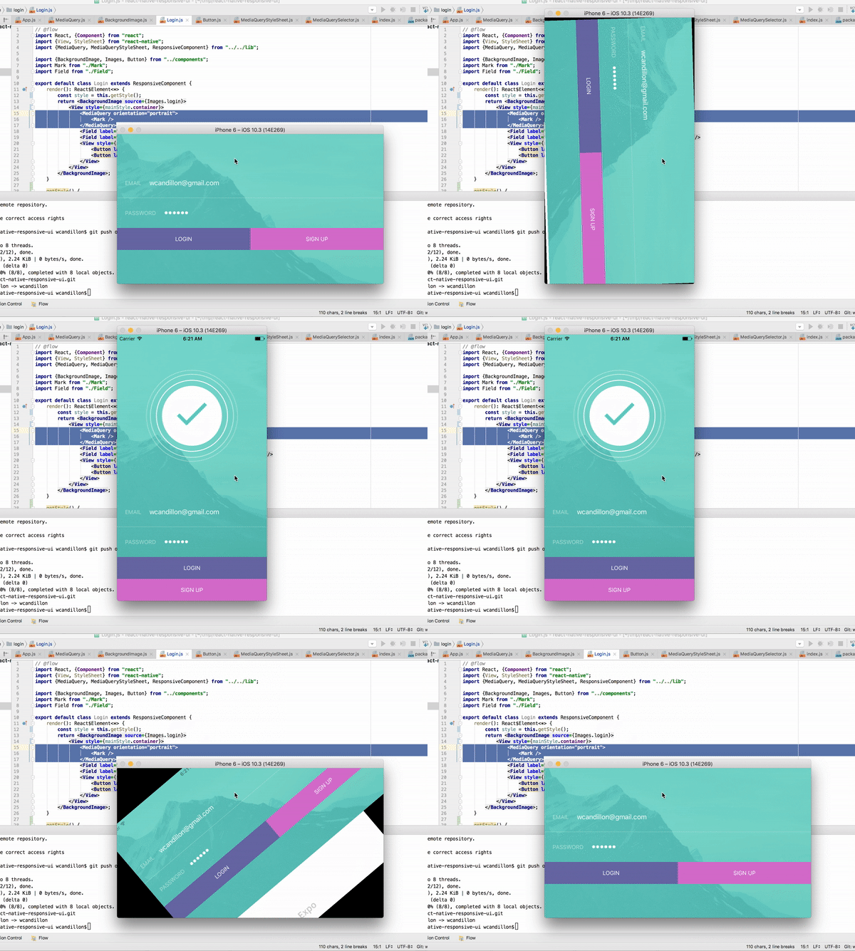
On the web it is – by now – obvious that you make your website responsive (*). Using a listener listening to the change event of the Dimensions API, it’s also possible to implement this kind of behaviour in React Native.
import {Component} from "react";
import {Dimensions} from "react-native";

export default class LogDimensionChanges extends Component {
    state = Dimensions.get("window");
    handler = dims => this.setState(dims);

    componentWillMount() {
        Dimensions.addEventListener("change", this.handler);
    }

    componentWillUnmount() {
      // Important to stop updating state after unmount
      Dimensions.removeEventListener("change", this.handler);
    }

    render() {
        const {width, height} = this.state.window;
        const mode = height > width ? "portrait" : "landscape";
        console.log(`New dimensions ${width}x${height} (${mode})`);
        return null;
    }
}
This logic is applied into the react-native-responsive-ui package, which provides you with a <MediaQuery /> component, ResponsiveStyleSheet class, etc.:
import React, {Component} from "react";
import {View} from "react-native";
import {MediaQuery} from "react-native-responsive-ui";

export default class Login extends Component {
    render(): React$Element<*> {
        return <View>
            <MediaQuery minHeight={450} orientation="portrait">
                <Logo />
            </MediaQuery>
        </View>;
    }
}
Responsive UIs in React Native →react-native-responsive-ui →
(*) I know, this site still uses a non-responsive WordPress theme … shame on me