Extensive writeup by Philip Walton on how he tackles the Container Queries problem.
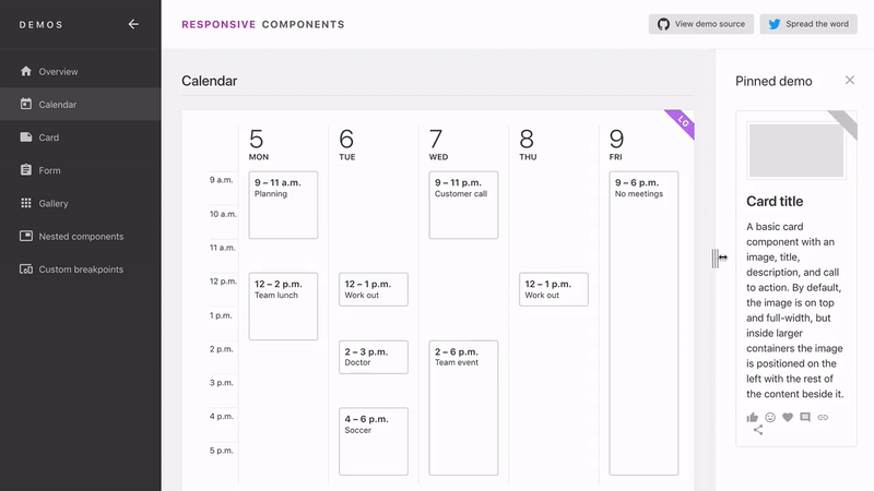
Instead of narrowly focusing on the specific CSS feature proposal we call “container queries”, I want to focus on the broader concept of building components that respond to their environment. And if you accept this larger framing, there are actually new web APIs that already let you achieve this.
That’s right, we don’t need to wait for container queries to start building responsive components. We can start building them now!
His result takes about the same approach as Elementary takes, but then using the more modern ResizeObserver.
Must say I’m leaning more towards Elementary though, as:
- Elementary targets the responsive elements themselves, and not their parent element.
- Elementary defines the breakpoints in the CSS itself and not the HTML (something Philip points out too).
- Philip’s solutions relies on
ResizeObserverwhich is only available in Chrome right now.
Responsive Components: a Solution to the Container Queries Problem →