Arun Venkatesan takes a deep dive into the design and engineering behind the new Mac Pro: Apple held its annual developer conference, WWDC, this week in San Jose. In the keynote, aside from a slew of developer-focused software announcements, one new hardware announcement has attracted the most attention, the 2019 Mac Pro and Pro Display …
Tag Archives: design
Can’t Unsee – A game where your attention to details earns you a lot of coins.
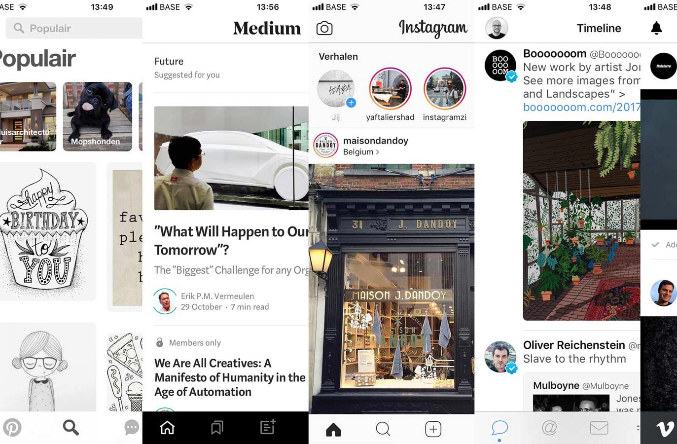
Beyond the interface – The Sameness of Apps and Websites

Friend Thomas Byttebier – Digital Director at Base Design – has written a very insightful post on the sameness of apps, websites, subway maps, and coffee shops. Why do all apps look the same nowadays? Why do all websites look the same? What can brands do to create more memorable digital experiences? And also: how …
Continue reading “Beyond the interface – The Sameness of Apps and Websites”
Geometric cover replication with CSS Grid, clip-path, and writing-mode
Building Flexible Design Systems
InVision Studio
Color in UI Design: A (Practical) Framework
Erik D. Kennedy goes into detail on how to pick color variations for your designs: Element states for example are variations on a single color, let’s take “blue”. The result isn’t best described as “a palette of 3 blues”. It’s one blue with variations. But this begs the question: how do you actually modify a …
Continue reading “Color in UI Design: A (Practical) Framework”
How to design clarity in 3 steps
This article is a quick summary of a basic design course. It addresses a simple question: How do you design interactive systems that are easy to understand? Well, it all comes down to two things: structure and process. Next to the content itself, I especially love the (animated) visuals created for this article. Now I …
Using science to make truly tappable user interfaces
Since the average human finger pad is 10 to 14mm — and the average fingertip is 8mm to 10mm we can pretty easily define a range for what constitutes a “truly tappable UI:” A truly tappable UI is built with elements that are at minimum around 10mm, with the optimum touch element size around 13mm. …
Continue reading “Using science to make truly tappable user interfaces”