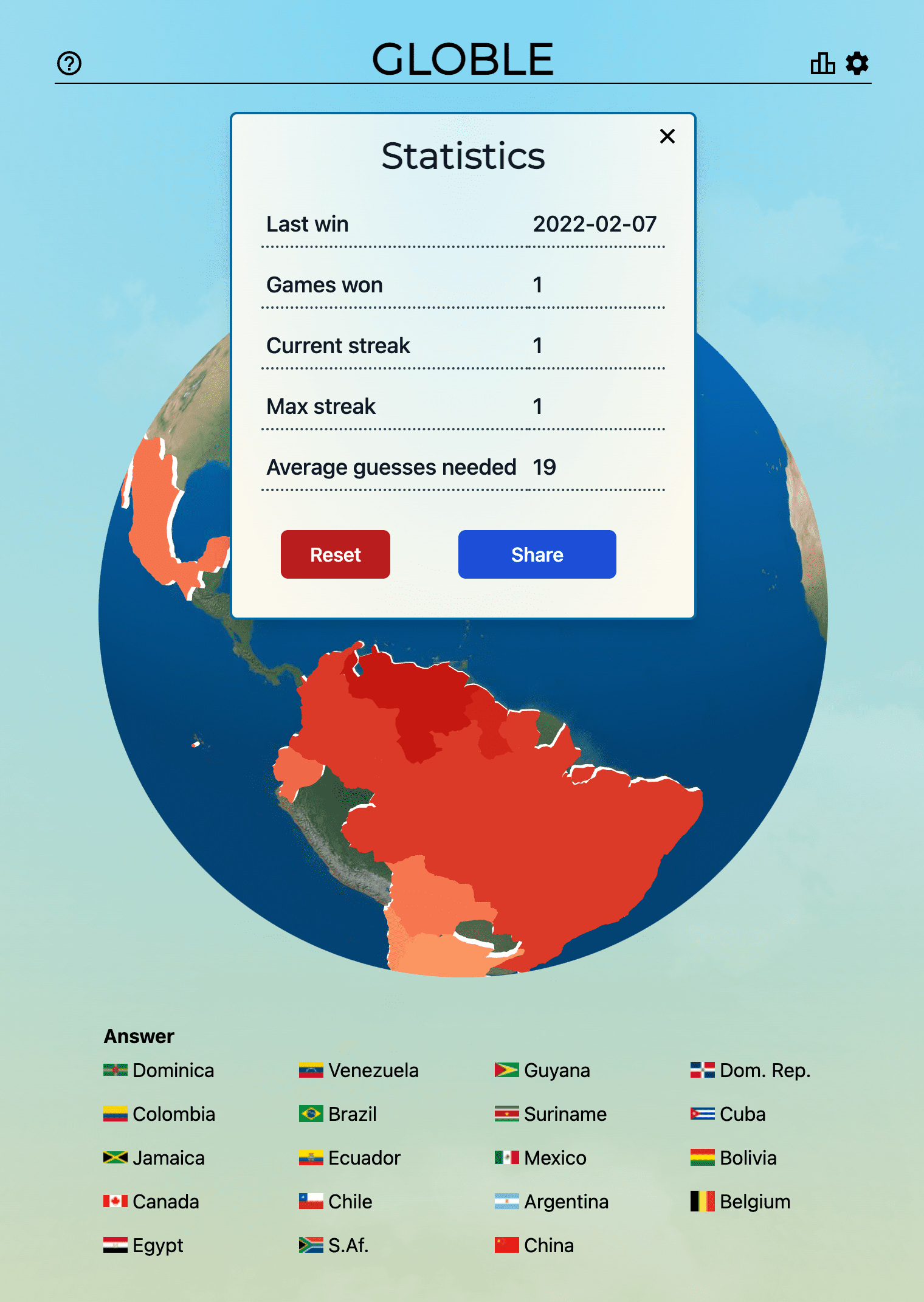
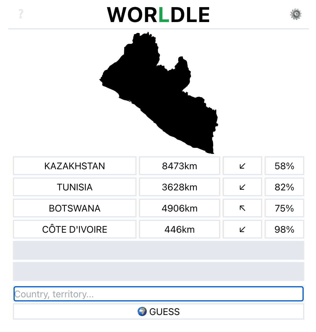
For the past year and a half, it’s been our privilege to work on one of our largest and most ambitious undertakings ever: collaborating closely with a team of Facebook engineers, designers, and data experts to roll out a global, multi-scale base map for all of Facebook’s billions of users. In late 2020, this map went live, and we’re extremely proud of the results.
Always in for a good map, so definitely for this behind the scenes look!
99 second hand smartphones are transported in a handcart to generate virtual traffic jam in Google Maps. Through this activity, it is possible to turn a green street red which has an impact in the physical world by navigating cars on another route to avoid being stuck in traffic.
Coming to the next version of ArcGIS is the “Spilhaus projection”:
In September and October of 2018, three maps went viral on social media and the web. All of them had the same perspective, featured oceans as the main focus, and presented the oceans as one body of water. The maps were based on the so-called “Spilhaus projection” and centered on Antarctica. Though it has recently gained some popularity online, this projection is not new. Many articles recognize Athelstan F. Spilhaus, a South African-American geophysicist and oceanographer, as the author of this projection back in 1942.
Over at the ArcGIS blog they outline the history and how they’ve implemented it in their next version (ArcGIS Pro 2.5 / ArcGIS 10.8).
The folks at IAmsterdam have released a map that measures distances not in miles / kms but in time. Select a spot + a means of transportation + a desired travel time and it’ll show you how far away (in time) you can get.
From what I can tell European countries such as Belgium, France, Germany, etc. are also supported but New York (USA) and London (UK) for example aren’t.
In the 16th century, Gerardus Mercator, a Flemish cartographer devised a new way of depicting the world on a flat plane. We set off to explore his map in order to illustrate his biggest blunders, unearth curious facts and explain the advantages that make this representation of the globe still relevant today.
I especially like the fact that the several parts of the map get highlighted as you scroll, thanks to the use of ScrollMagic
📜 If you’d want to venture into your own “animate as you scroll” adventure, I’d recommend a more modern library such as the aforementioned Scrollama(which uses IntersectionObserver)
🗺 In case you want to see for yourself how much Mercator distorts our view of the world, go play The Mercator Puzzle. In case you’re really into projections you might want to check out the contents of my talk Geoshizzle(from a long long time ago)
🌍 If you’re new to mapping & projections, or don’t want to read the lengthy article, this video from Vox sums it up quite nicely what’s wrong with the Mercator projection:
In Kalaallit Nunaat (Greenland), the Inuit people are known for carving portable maps out of driftwood to be used while navigating coastal waters. These pieces, which are small enough to be carried in a mitten, represent coastlines in a continuous line, up one side of the wood and down the other. The maps are compact, buoyant, and can be read in the dark.