CSS Full-Height Slideshow with Centered Slides thanks to grid-auto-rows

Recently I saw this tweet float by: CSS experts, I need your help! 👇 I need a container that vertically centers its children and that can be scrollable if necessary. It should be a single container. Not 2. <div class="container"> <item>Vertically centered</item> <item>Vertically centered</item></div> — Álvaro Trigo 🐦🔥 (@IMAC2) September 24, 2021 Now that sounds …

Practical CSS Subgrid Video Tutorials

With CSS Subgrid already being supported in Firefox (ever since version 71), and Chromium recently having started work on it, it might be the perfect time to start learning about CSS Subgrid. That’s exactly what Kevin J Powell thought too, with his “October Subgrid Awareness Month”, so he created a bunch of videos on the …

No-JS Fingerprinting

No-JS Fingerprinting is a POC that you can do fingerprinting — a way of uniquely identifying browsers — without the need for JavaScript. Fingerprinting is a way of identifying browsers without the use of cookies or data storage. Created using properties like language and installed fonts, your fingerprint stays the same even if your browser …

Divtober Speedrun

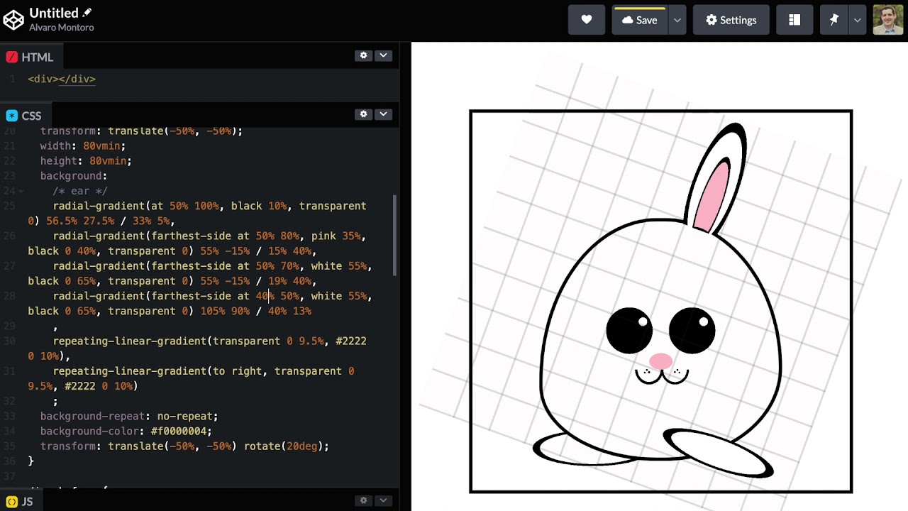
October is the month of “Divtober”, where artists are challenged to draw different things using CSS and a single HTML element. Each day they get a theme to work with. You can find some nice works on CodePen, all tagged #divtober. Here’s a small selection: See the Pen Single div CSS chili garlic sauce by …

100 Bytes of CSS to look great everywhere

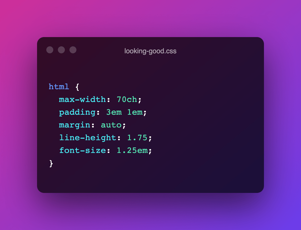
Interesting little CSS snippet by Shawn Wang. This should be simple drop-in css to look good on most displays It’s an enhancement that builds on top of the User-Agent provided styles to make your content more easily consumable by limiting line-length, centring the content column, adding some whitespace, bumping up the font-size, etc. html { …

Media Queries Level 4: Media Query Range Contexts (Media Query Ranges)

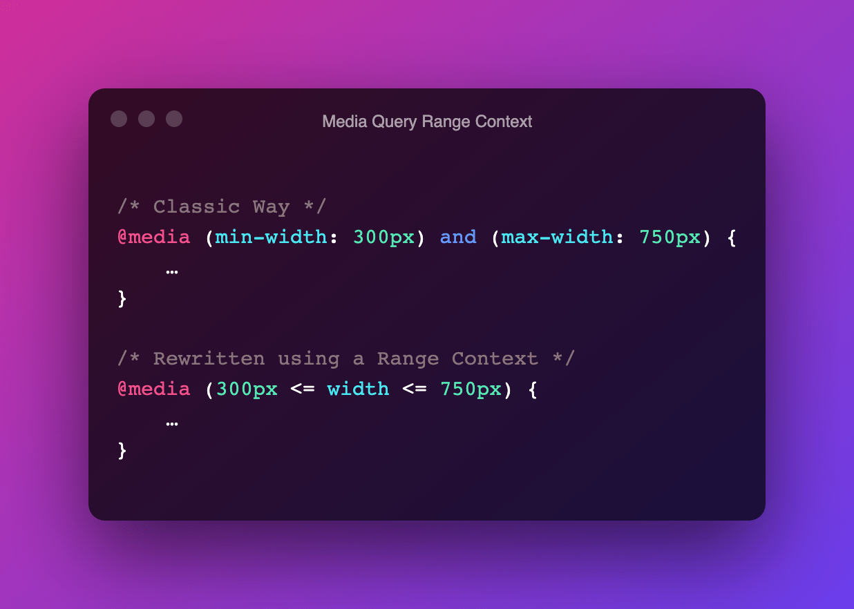
A media feature like width can take its value from a range. When used, we prefix these with min- or max- to express “minimum condition” or “maximum condition” constraints. @media (min-width: 300px) and (max-width: 750px) { … } In CSS Media Queries Level 4 these type of Media Features can now be written as a …

CSS Custom Properties are the single greatest addition to CSS over the past 20 years

On Twitter, John Allsopp recently shared that Flexbox is the greatest thing that happed to CSS. I quickly chimed in with my personal favourite. To me the single greatest addition to CSS over the past 20 years is Custom Properties. They’ve opened up a ton of possibilities, and make us CSS Authors way more productive. …

How I Structure My CSS

Matthias Ott: In this post, I will share my current take on CSS structure. It does not religiously follow any particular methodology, although people familiar with Harry Roberts’ ITCSS (“Inverted Triangle CSS”) will definitely recognize parts of his methodology. The folder structure indeed looks very familiar: /scss/ ├── 1-settings ├── 2-design-tokens ├── 3-tools ├── 4-generic …

Conditional border-radius and three future CSS features

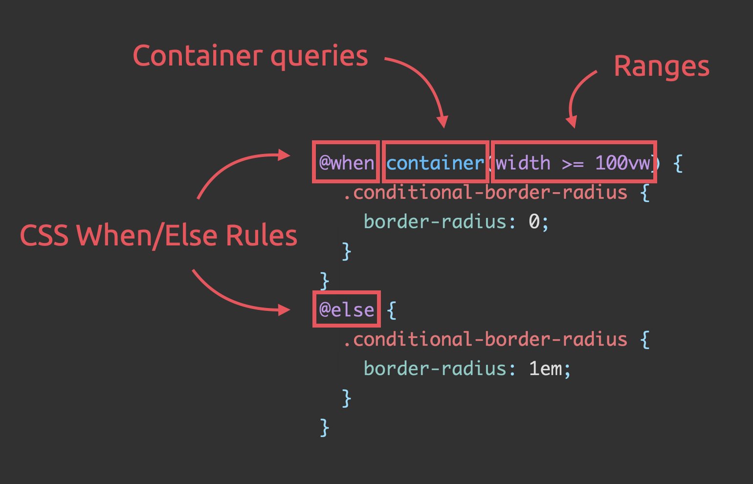
Stefan Judis has reworked Ahmad Shadeed‘s Conditional border-radius, using these three (future) CSS additions: Media query ranges Container Queries CSS @when + @else Unlike the original code, the result definitely is a very nice and readable piece of code that doesn’t feel hacky at all — I like where CSS is headed 😊 Conditional border-radius …

ESNext: Import Assertions (JSON Modules, CSS Modules, …)

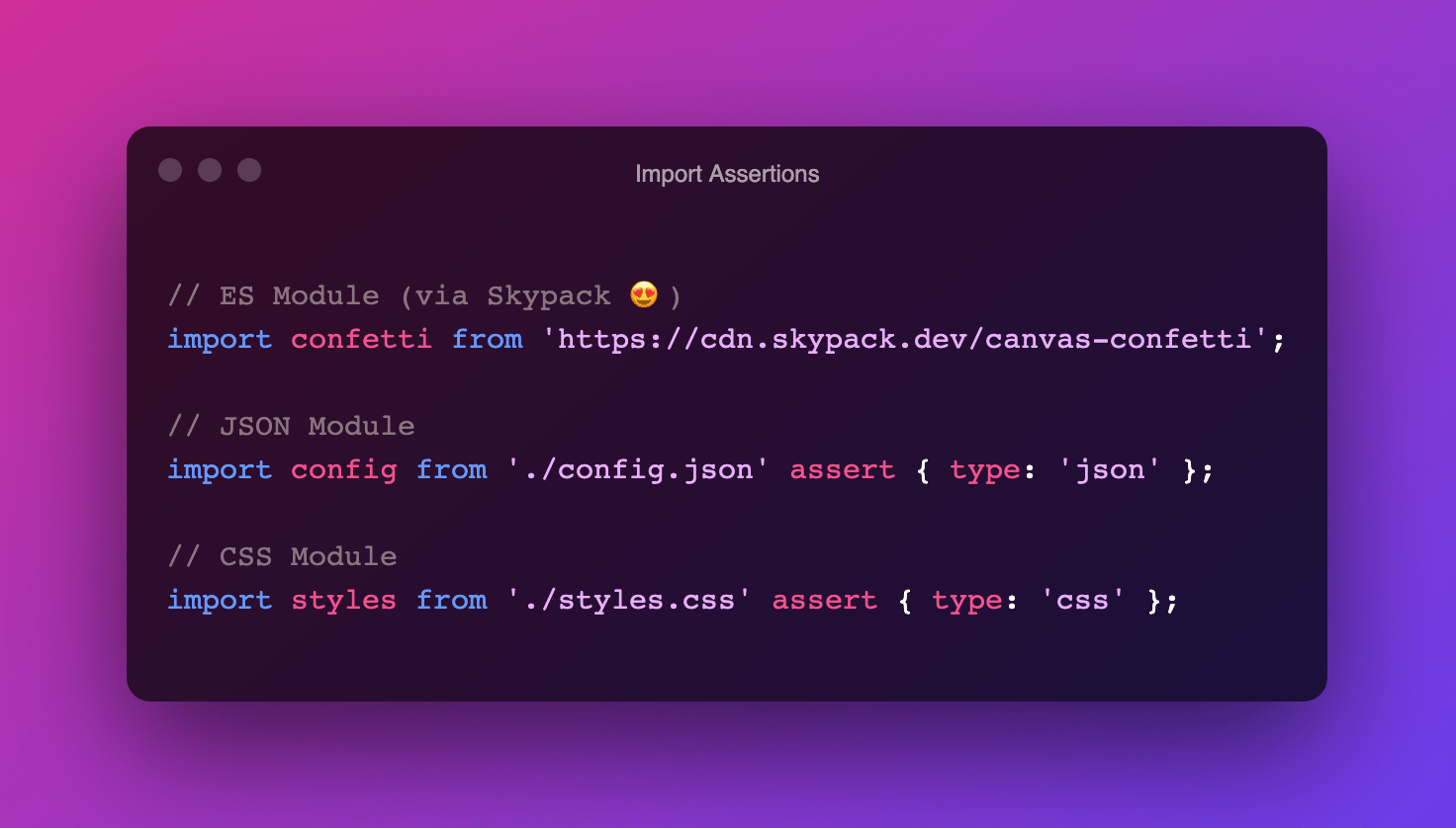
Did you know you can import JSON and CSS files just like you import JavaScript Modules? Thanks to Import Assertions, it’s as easy as this: Building upon "Import Assertions" we recently saw JSON Modules land in V8/Chromium 91: “`import json from './foo.json' assert { type: 'json' };“` In Chromium 93 the same thing for CSS …