Interesting little CSS snippet by Shawn Wang.
This should be simple drop-in css to look good on most displays
It’s an enhancement that builds on top of the User-Agent provided styles to make your content more easily consumable by limiting line-length, centring the content column, adding some whitespace, bumping up the font-size, etc.
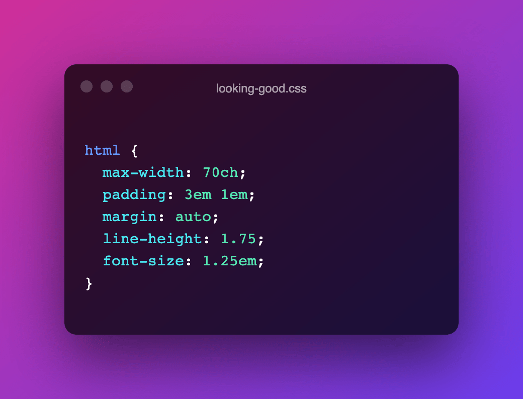
html {
  max-width: 70ch;
  padding: 3em 1em;
  margin: auto;
  line-height: 1.75;
  font-size: 1.25em;
}
I have used (a slightly tweaked version of) this snippet in the test included in the post on Media Query Range Contexts and it works wonderfully well I must say, especially when the page is fullscreen. On larger screens I even tend to go for a a font-size of 1.5em.