
CSS in 2022
A rather geeky/technical weblog, est. 2001, by Bramus
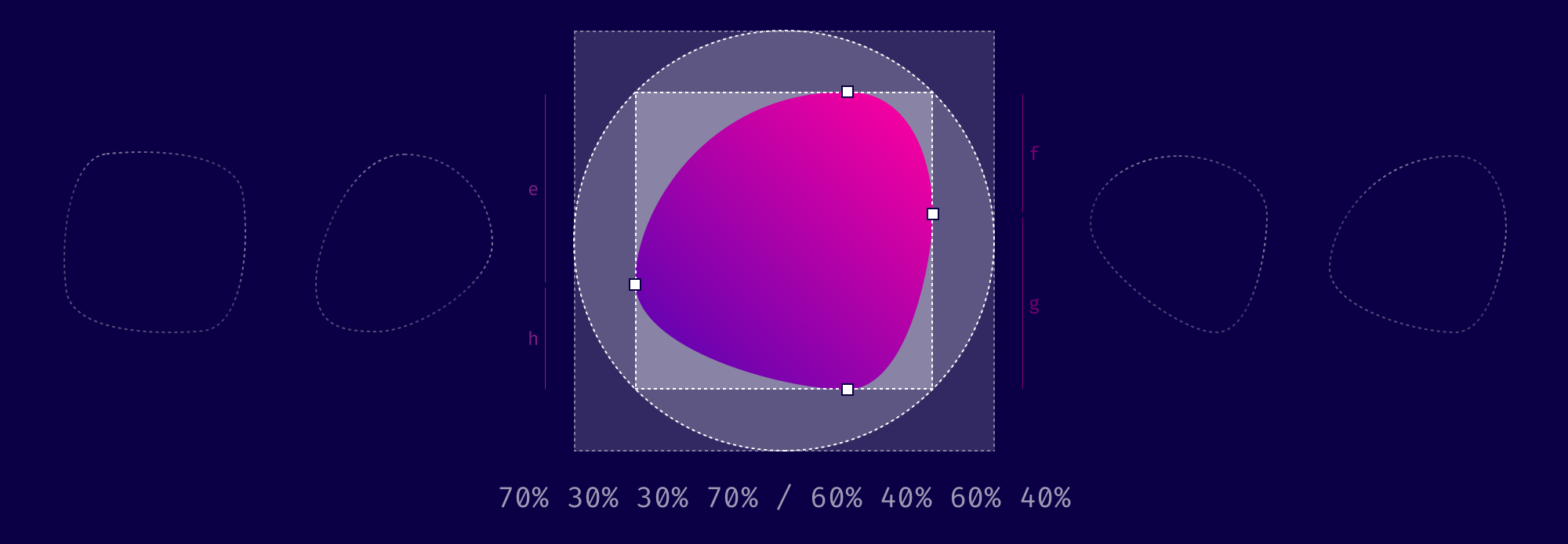
Nils and Mirko from 9elements create a handy tool to create blobs using border-radius. When you use eight values specifying border-radius in CSS, you can create organic looking shapes. Like so: border-radius: 40% 60% 60% 40% / 70% 30% 70% 30%; And as that’s CSS, you can also animate that easily: See the Pen Untitled …
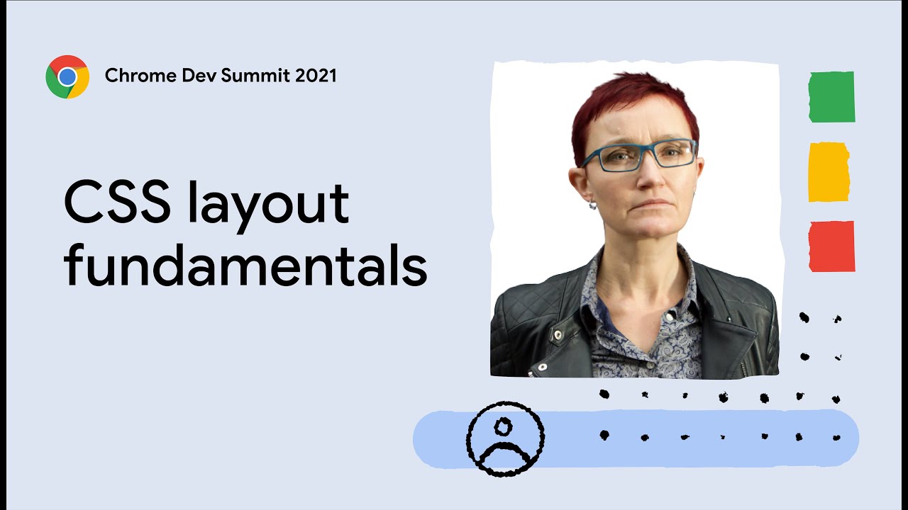
At Chrome Dev Summit 2021, Rachel Andrew hosted a workshop “The Fundamentals of CSS Layout”. If you’re looking to get started with CSS Grid and Flexbox, this is the video you’re looking for. In this 90-minute workshop you’ll learn about the key CSS layout methods of flexbox and grid. You’ll learn how these layout methods …
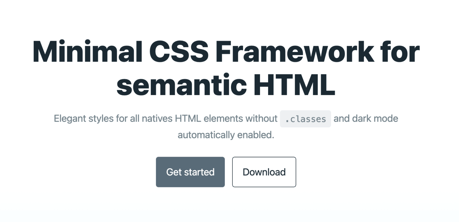
Elegant styles for all natives HTML elements without .classes and dark mode automatically enabled. It’s no coincidence the site looks similar to the one from The Framework That Must Not Be Named 😅 Pico.css →

Nice work by Chris: when you crossfade an image — using the proprietary -webkit-cross-fade() — with a transparent gif, you can create semi-transparent background images. .el { background-image: -webkit-cross-fade( url(image.jpg), url(data:image/gif;base64,R0lGODlhAQABAIAAAAAAAP///yH5BAEAAAAALAAAAAABAAEAAAIBRAA7), /* transparent GIF, base64 encoded */ 50% ); Clever! WebKit/Chromium based browsers only though (i.e. no Firefox) Maybe there kinda is background-opacity? →
:has() selector is way more than a “Parent Selector”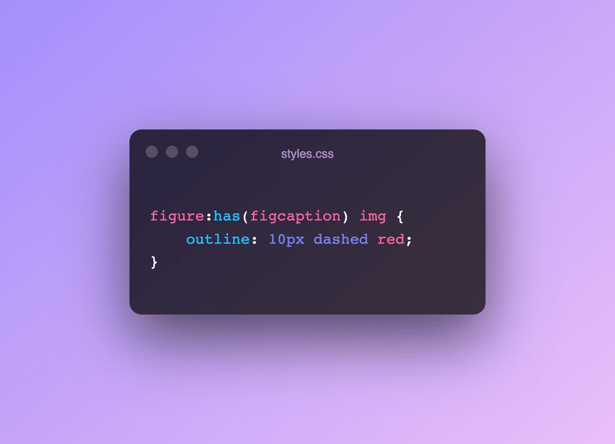
Safari TP 137 just dropped with unflagged support for :has(). Often dubbed “the parent selector”, :has() is way more than that …

An issue with linear gradients in CSS is that they often have hard edges where they start and/or end or transition from one color to the other. In 2017, Andreas Larsen wrote about them on CSS-Tricks, eventually leading him to create a nice editor to generate them. Sparked by that post, a CSSWG Issue to …
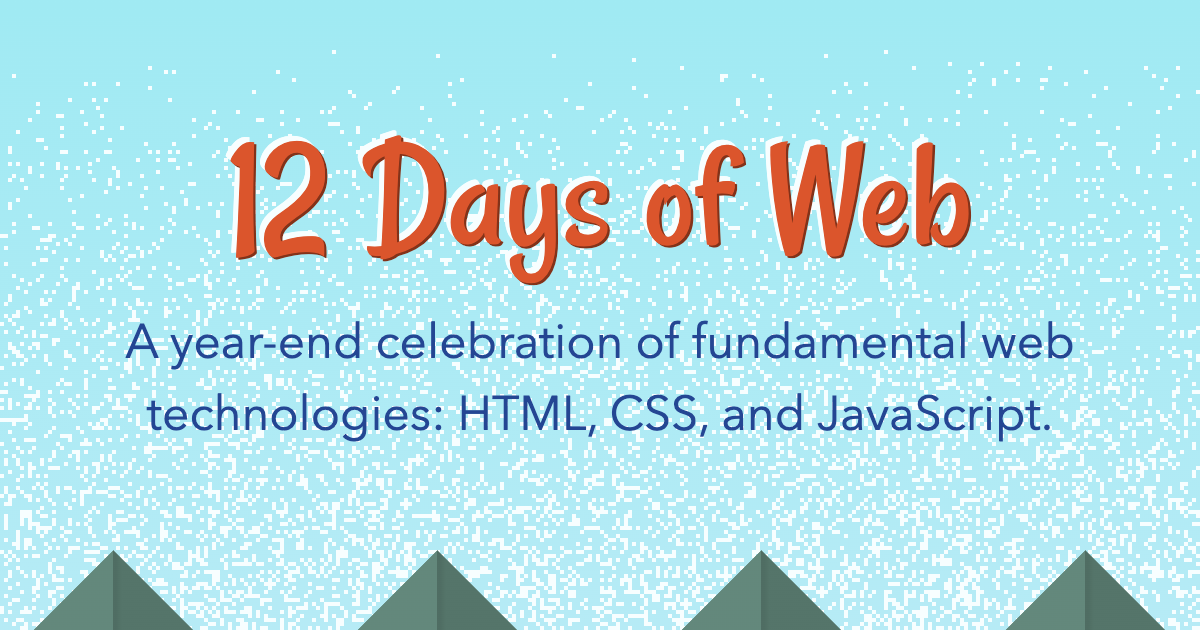
12 Days of Web is Stephanie Eckles‘s “advent” calendar. A year-end celebration of fundamental web technologies: HTML, CSS, and JavaScript. Three days in, and she has already covered Intersection Observer, <details> + <summary>, and CSS Custom Properties. Good stuff. 12 Days of Web → Related: Find more web advent calendars here.
Just like last year and the year before, Sacha Greif (with help from a team of contributers and consultants) ran “The State of CSS Survey”. This survey was created to identify upcoming trends in the web development ecosystem in order to help developers make technological choices. As such, these surveys are focused on anticipating what’s …