Organic Blobs in CSS with border-radius

Nils and Mirko from 9elements create a handy tool to create blobs using border-radius.

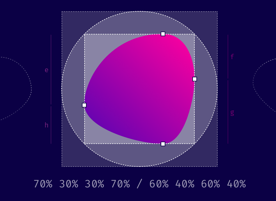
When you use eight values specifying border-radius in CSS, you can create organic looking shapes.

Like so:

border-radius: 40% 60% 60% 40% / 70% 30% 70% 30%;

And as that’s CSS, you can also animate that easily:

See the Pen Untitled by Bramus (@bramus)on CodePen.

Hit the post for a detailed explanation on how these eight values work.

Fancy Border Radius Generator →
CSS Border-Radius Can Do That? →

Published by Bramus!

Bramus is a frontend web developer from Belgium, working as a Chrome Developer Relations Engineer at Google. From the moment he discovered view-source at the age of 14 (way back in 1997), he fell in love with the web and has been tinkering with it ever since (more …)

Leave a comment

Your email address will not be published. Required fields are marked *

This site uses Akismet to reduce spam. Learn how your comment data is processed.