A while ago I joined Dan Neciu – whom I met at Frontmania in 2023 – on his “Señors @ Scale” podcast. We talked about all things CSS.
A rather geeky/technical weblog, est. 2001, by Bramus
A while ago I joined Dan Neciu – whom I met at Frontmania in 2023 – on his “Señors @ Scale” podcast. We talked about all things CSS.
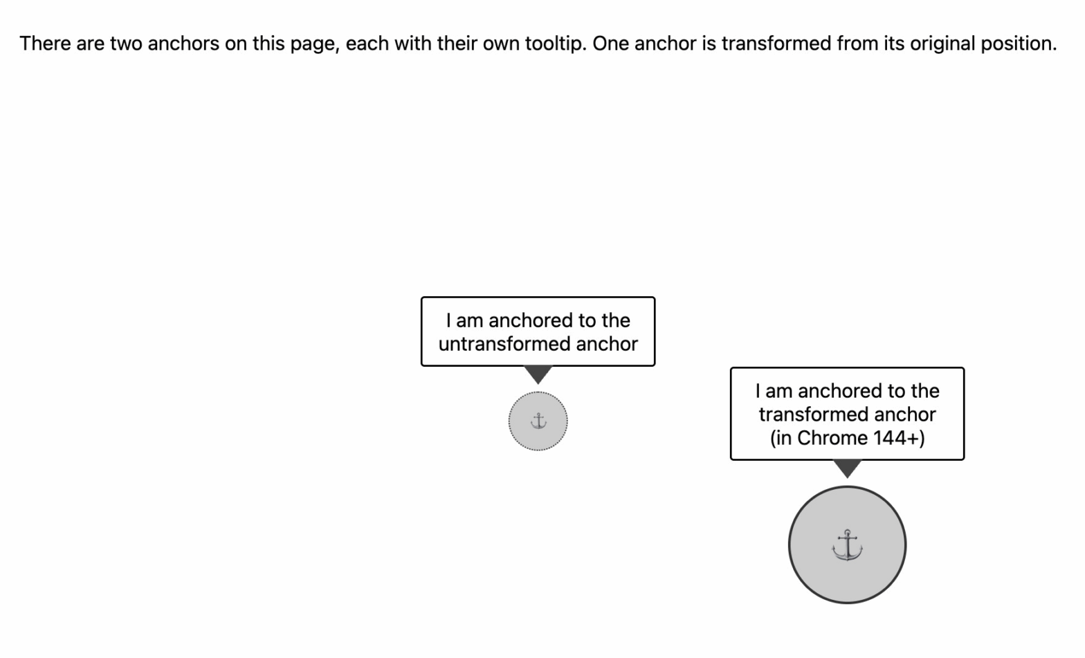
Starting with Chrome 144, Anchor Positioning is going to be transform-aware. From then on, anchoring will resolve against the bounding box of the transformed ancho
precommitHandler
By using two sequential View Transitions when intercepting links with the Navigation API – one in the precommitHandler and one in the regular handler – you can fake a Two-Phase View Transition today!
width or height no longer forces a Main Thread animation (in Chrome, under the right conditions)
When their values don’t change throughout the animation, CSS width / height animations can run on the Compositor, instead of being forced to run on the Main Thread.
@starting-style
How the cascade, the animation-fill-mode, and implicit keyframes make things a bit more complicated then you’d initially think …

I built something that I needed into DevTools: debugging support for CSS @starting-style rules.

The CSS Podcast is back! Together with Una I’m co-hosting season 5 of the show, and we have some good episodes coming your way …

Check out the post I wrote for developer.chrome.com to learn what changed for View Transitions in 2025.
