Learn all about “Invalid At Computed Value Time” or IACVT for short.
A rather geeky/technical weblog, est. 2001, by Bramus
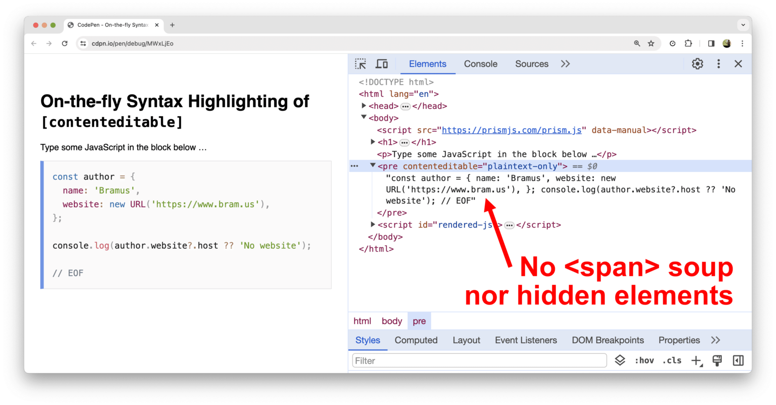
Can you Syntax Highlight a code snippet on the web without overloading the DOM with a ton of <span> elements wrapped around the tokens? Thanks to the Custom Highlight API, you can!
overflow: clip, not overflow: hidden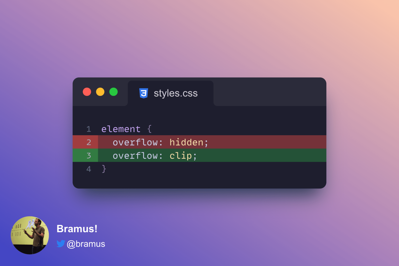
If you create a scroll-driven animation and find that scroll(nearest) is not working, check for overflow: hidden elements up the DOM tree and change them to overflow: clip.

So, you’ve found a custom easing function defined in JavaScript. Great! But how do you use that with the Web Animations API (WAAPI)? Turns out that’s more difficult than you’d first expect it to be.
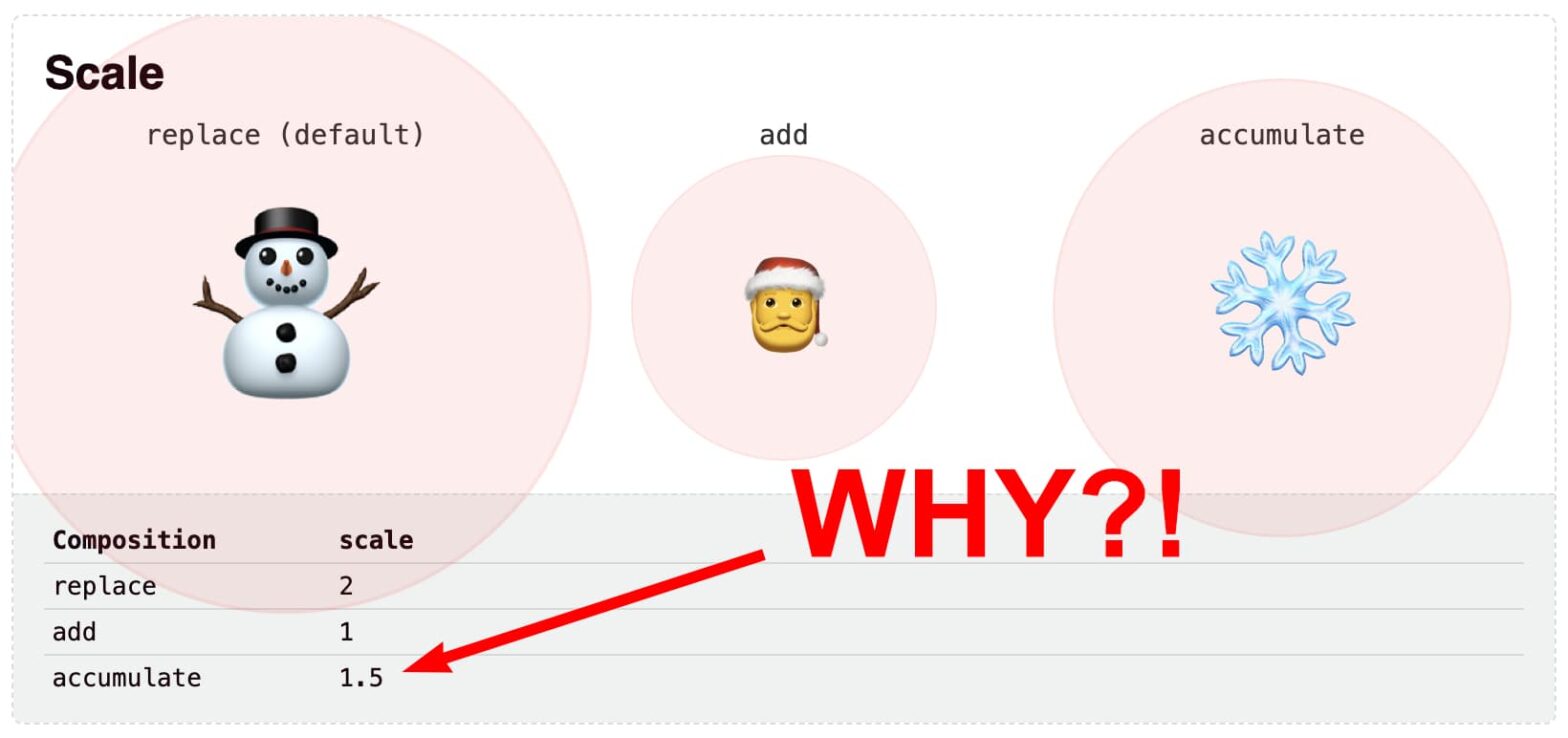
animation-composition: accumulate on a scale transform
At the end of 2021, CSS-Tricks (RIP) asked a bunch of authors “What is the one thing people can do to make their websites better?”. This here, is my submission for that end-of-year series.
@scope (2023.10.19 @ Full Stack Europe)
Combine Scroll-Driven Animations with @property, transition-delay, calc(), sign() and abs() … and you can do Scroll Detection using only CSS!