Because Scroll-Driven Animations are only active when there is scrollable overflow, it is possible to use them as a mechanism to detect if an element can scroll or not. Mix in a Space Toggle or a Style Query, and you’ve got all you need to selectively style an element based on it being scrollable or not.
~
The Code
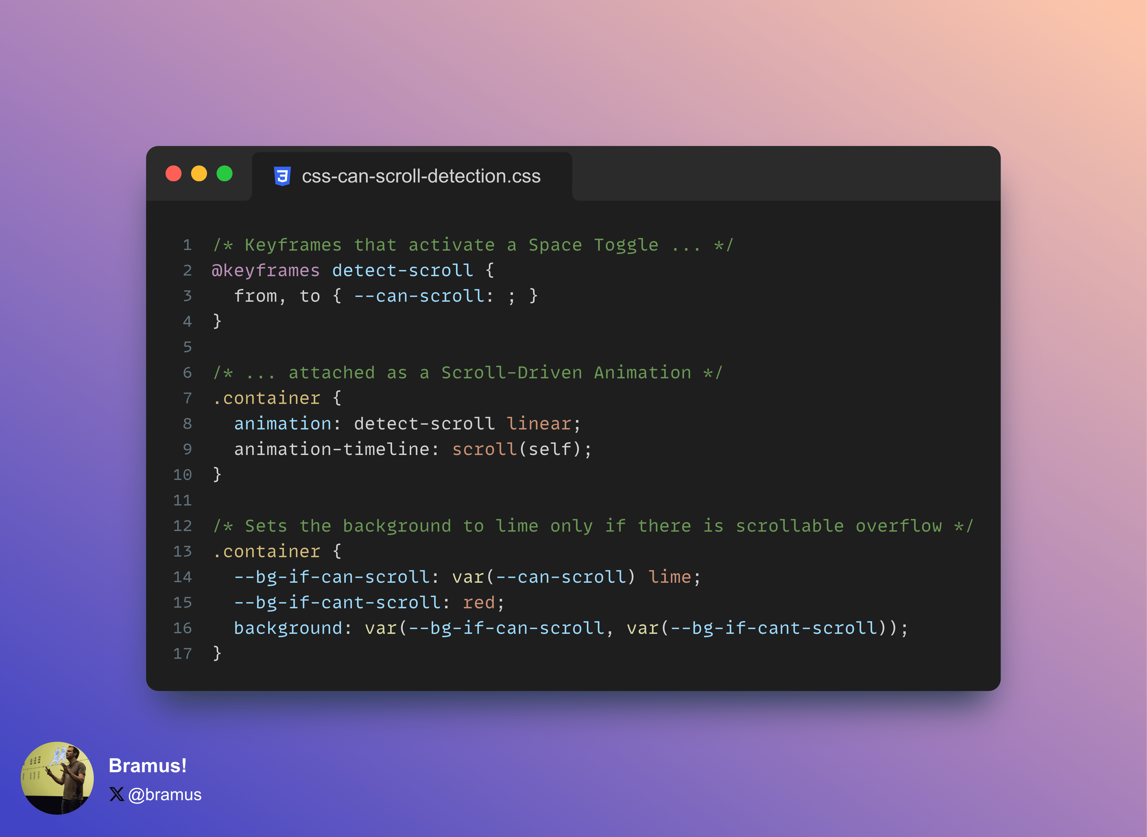
If you’re here for just the code, here it is:
@keyframes detect-scroll {
  from, to { --can-scroll: ; }
}

.container {
  animation: detect-scroll linear;
  animation-timeline: scroll(self);

  --bg-if-can-scroll: var(--can-scroll) lime;
  --bg-if-cant-scroll: red;
  background: var(--bg-if-can-scroll, var(--bg-if-cant-scroll));
}
If you want to know how to use it and why this works, keep on reading 😉
~
Active vs Inactive Scroll-Driven Animations
A Scroll-Driven Animation is an animation that is driven by scroll. But what if there is no scroll distance to animate on, what happens then? Well, the spec has this covered, and states that the animation is inactive in that case:
If the source of a ScrollTimeline is an element whose principal box does not exist or is not a scroll container, or if there is no scrollable overflow, then the ScrollTimeline is inactive.
Take this animation anim for example, which animates the color from hotpink to lime.
.container {
  height: 250px;
  width: 250px;
  overflow-y: auto;

  animation: anim linear;
  animation-timeline: scroll(self);
}

@keyframes anim {
  from { color: hotpink; }
  to { color: lime; }
}
In a scroll container that has no scrollable overflow, the animation won’t be active, and thus the text will have the color that was declared on it.
See the Pen
Scroll Detection with CSS Scroll-Driven Animations: Intro by Bramus (@bramus)
on CodePen.
~
Adding Custom Properties to the mix to make a scroll detector
Just like regular CSS Properties, Custom Properties can also be animated.
@keyframes anim {
  from { --foo: 0; }
  to { --foo: 1; }
}
When attached as a Scroll-Driven Animation to a scroll container that has no scrollable overflow, the value of the custom property would be initial, because it is not set.
To turn this into a scroll detector, it’s a matter of making sure the value has one and the same value when inside the animation. This is done by setting the to and from to the same value.
@keyframes anim {
  from, to { --can-scroll: 1; }
}
Hooking that animation to a Scroll-Driven Animation and also making sure that --can-scroll has an initial value of 0, the full code becomes this:
.container {
  height: 250px;
  width: 250px;
  overflow-y: auto;

  --can-scroll: 0;
  animation: detect-scroll;
  animation-timeline: scroll(self);
}

@keyframes detect-scroll {
  from, to  {
    --can-scroll: 1;
  }
}
For elements that have scrollable overflow, the animation will be active, so the computed value of --can-scroll will be 1. For elements without scrollable overflow, the value will be 0
This value can be used in calculations, for example:
.container {
  outline: calc(10px * var(--can-scroll)) dotted lime;
}
This code will give the scrollable container a 10px side dotted lime outline, whereas a non-scrollable container will have a 0px wide outline.
See the Pen
Scroll Detection with CSS Scroll-Driven Animations by Bramus (@bramus)
on CodePen.
Note that you don’t need to register the property using @property here, as there’s no interpolation that needs to be done. The property is simply used as a telltale.
~
Making it more developer friendly
To make it easier to work with, there’s a few variations to make:
- Use a Space Toggle
- Use a Style Query
Space Toggle Variant
The Space Toggle Variant follows the basic mechanics of a Space Toggle by setting the --can-scroll to an initial value of initial and a space as the value inside the animation. This allows you to set more than just numbers.
.container {
  height: 250px;
  width: 250px;
  overflow-y: auto;

  --can-scroll: initial; /* initial = false */
  animation: detect-scroll;
  animation-timeline: scroll(self);

  --color-if-can-scroll: var(--can-scroll) lime;
  --color-if-cant-scroll: red;
  outline: 10px dotted var(--color-if-can-scroll, var(--color-if-cant-scroll));
}

@keyframes detect-scroll {
  from, to {
    --can-scroll: ; /* space = true */
  }
}
A downside of this approach is that is a bit harder to read if you’re not entirely familiar with how Space Toggles work.
See the Pen
Scroll Detection with CSS Scroll-Driven Animations by Bramus (@bramus)
on CodePen.
Style Query Variant
The Style Query Variant uses a Style Query to respond to this change in value. This makes it act as a polyfill for a State Query.
@container style(--can-scroll: 1) {
  p {
    color: lime;
  }
}

@container style(--can-scroll: 0) {
  p {
    color: red;
  }
}
A downside of this approach is that is that you can only style child elements of the container and that – at the time of writing – only Chrome supports Style Queries.
See the Pen
Scroll Detection with CSS Scroll-Driven Animations (Space Toggle) by Bramus (@bramus)
on CodePen.
~
Practical example
Recently I saw this nice demo by Shu Ding that shows/hides scroll indicators as you scroll up/down, powered by Scroll-Driven Animations.
See the Pen
Scroll Timeline by Shu Ding (@shuding)
on CodePen.
While nice, there is an issue with it though: when the content is too small for the scroller, the indicators both show!
See the Pen
Scroll Timeline by Bramus (@bramus)
on CodePen.
This is where the CSS scroll-detection detailed in this post can help: only show the indicators when there is scrollable overflow. I do this by conditionally setting the visibility to hidden so that there’s no layout shift when they are not visible.
@keyframes detect-scroll {
  from, to { --can-scroll: ;}
}

.container {
  animation: detect-scroll;
  animation-timeline: --scroll-timeline;
}

.up, .down {
  --visibility-if-can-scroll: var(--can-scroll) visible;
  --visibility-if-cant-scroll: hidden;
  visibility: var(--visibility-if-can-scroll, var(--visibility-if-cant-scroll));
}
The result, looks like this:
See the Pen
Conditional Revealing Scroll Indicators Scroll-Timeline by Bramus (@bramus)
on CodePen.
While at it, I also made the code more reusable. Instead of limiting the reveal keyframes from 0% to 2% – which makes them depend on the containing block’s size – they span the full 0%–100% range. Then, animation-range: 20px 40px; is used to limit when the animation should run. See this thread on X (née Twitter) for more info.
~
🔥 Like what you see? Want to stay in the loop? Here's how:
I can also be found on 𝕏 Twitter and 🐘 Mastodon but only post there sporadically.
There is a bug in the last example (codepen): if you scroll all the way down the select all the content and cut it (CTRL+X) then the arrows remain.
https://codepen.io/bramus/pen/MWZjGeG
Works fine on my machine. Which version of Chrome + OS are you using?
Oh wait … I see … you have to scroll to the **very** end of the scroller.
The bug is easily fixable by removing `animation-fill-mode` which is unneeded
The fill mode is needed to make sure the arrow is drawn / not drawn when outside of the set `animation-range`
I have filed https://issues.chromium.org/issues/375959955 on the engineering side to get this Chromium bug fixed.
As nice as this is, it does not work with Firefox.
hopefully it will soon!