Litepicker Date Range Picker

I like that the daterange needs to be entered in one single input, and that the rendered datepicker is used as a progressive enhancement on top. Installation per NPM: npm i litepicker At its core, usage is really simple: import Litepicker from ‘litepicker’; const picker = new Litepicker({ element: document.getElementById(‘litepicker’) }); Highly configurable too! Litepicker …

“Yes or No?” — One Checkbox vs Two Radio Buttons

Great research by Sara Soueidan: If you have a question with a binary Yes/No answer, is it better to use one checkbox or two radio buttons? As per usual: It Depends™. The consensus however seems to be that requiring an explicit “No” is the determining factor to avoid the simple checkbox. Over at CSS-Tricks Chris …

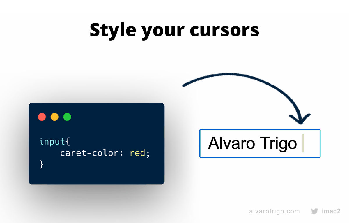
Customise the caret color with the CSS caret-color property

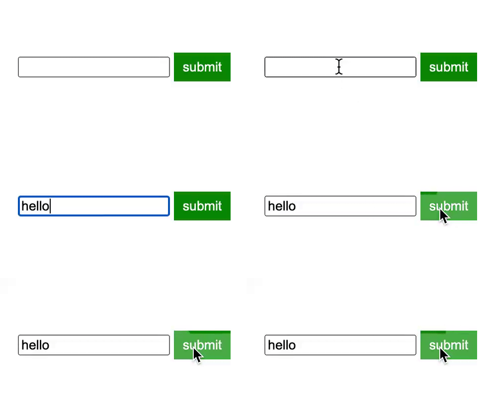
Thanks to this tweet by Álvaro Trigo I found out that you can change the color of the caret — that little blinking | in text inputs — using the caret-color CSS property: There are CSS properties I never heard of before! Hello `caret-color` 👋 pic.twitter.com/ndcDUjN13R — Álvaro Trigo 🐦🔥 (@IMAC2) November 24, 2020 Example: …

Make <input type="number"> respond to arrow keys with modifier keys

By default <input type="number"> elements will increment/decrement by its step attribute value when pressing the up/down arrows. Kilian Valkhof provides us with some JavaScript to have these elements also respond to up/down keypresses while holding modifier keys. When someone uses the arrow keys in the input field, we want the following to happen: If they …

Checkboxland – Render anything as HTML checkboxes

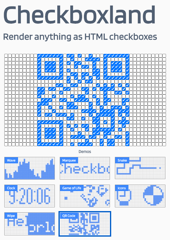
Checkboxland is a JavaScript library for rendering anything as HTML checkboxes. You can use it to display animations, text, and arbitrary data. It also supports plugins, so you can build more powerful APIs on top of it. Heh. Can’t quite think of a reason when exactly to use this, but it’s fun nonetheless 😅 Checkboxland …

Limit the colors to choose from in <input type=”color”> with <datalist>

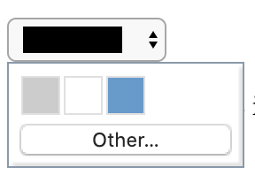
Christian Heilman: The input type colour supports the list attribute, which allows you to define a preset list of options. The colours need to be defined as hexadecimal colours. They can be defined as values or text inside the option tags, but the values take precedence. Pictured at the top of this post is how …

Guidelines for text fields design

Text fields are probably one of the most used interface components; contact forms, payment details, account creation, lead generation. Users definitely need to interact with text fields when using your product. The purpose of this post is to highlight some of the key guidelines which I follow when it comes to designing better text fields. …

Methods for assigning an accessible name to a form control

Adrian Roselli: Too often folks will grab ARIA first to provide an accessible name for a thing. Or they may sprinkle hidden content around a form. In most cases the impact of those decisions is unknown. The assumption that they do the same thing, give the same output to all users, is wrong. In short, …

React: You May Not Need Controlled Form Components

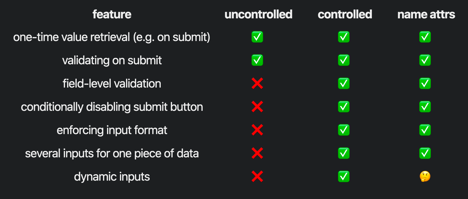
To work with forms in React two approaches are to either use Controlled Components or use Uncontrolled Components (as detailed here). Swyx shares a third way of working with forms: A lower friction way to handle form inputs is to use HTML name attributes. As a bonus, your code often turns out less React specific! …