
New in Chrome 134 on Android: the ability to place the Address Bar (aka “Omnibox”) at the bottom. To enable it, go to Chrome’s Settings, locate and tap “Address Bar”, and choose “Bottom”.
A rather geeky/technical weblog, est. 2001, by Bramus
New in Chrome 134 on Android: the ability to place the Address Bar (aka “Omnibox”) at the bottom. To enable it, go to Chrome’s Settings, locate and tap “Address Bar”, and choose “Bottom”.

Beware when manipulating the coordinates of the View Transition’s ::view-transition-group(*) pseudo. Depending on where you read those coordinates from, you might end up with layout jumps when writing them back. This post details the pitfalls and how to deal with them, unlocking more performant animations on the ::view-transition-group() pseudo along the way.
StyleObserver: Element.matchContainer()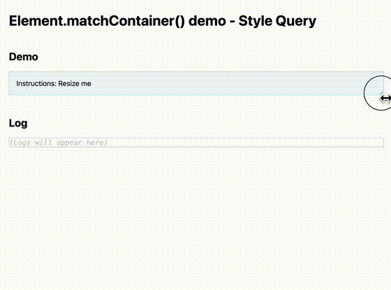
Martin Winkler published a package that polyfills Element.matchContainer to get notified in script when a Container Query matches/unmatches. Under the hood, it uses a StyleObserver.
@function + CSS if() = 🤯
Support for Nested Container Queries and the CSS if() function inside CSS Custom Functions make @function very powerful.
::view-transition-group(*) animations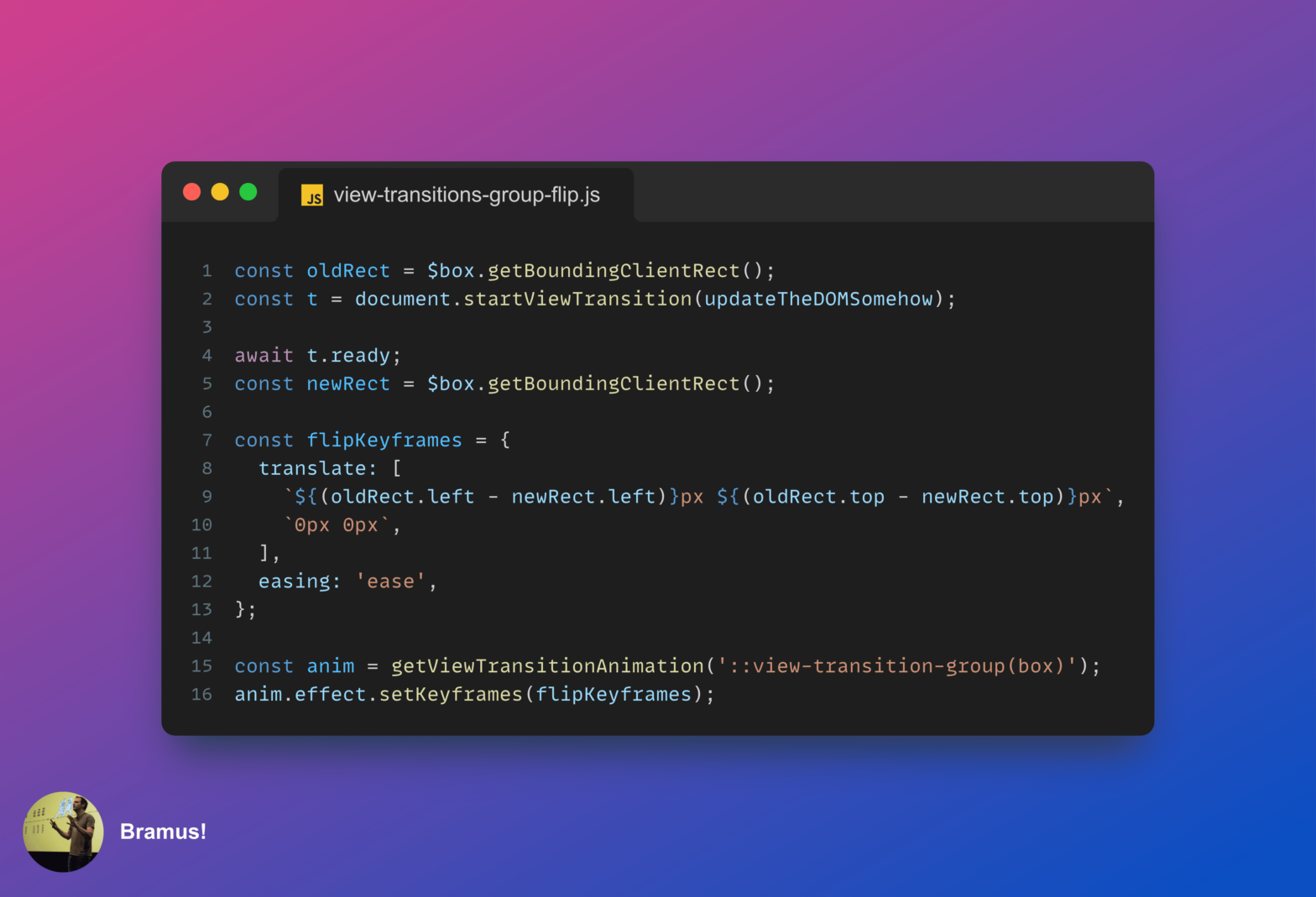
If the dimensions of the ::view-transition-group(*) don’t change between the old and new snapshot you can optimize its keyframes so that it animates on the compositor.
Back in December I joined Kevin J Powell on his channel to talk about Cross-Document View Transitions
attr() gets an upgrade
You can now use `attr()` with any CSS property — not just content – and it can parse values into data types other than <string>.
moveBefore
Unlike the classic way of moving a node by removing+reinserting it, the moveBefore method preserves the element’s state!
