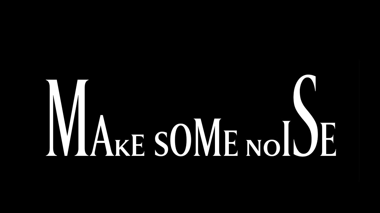
At first sight the new visual identity for the San Francisco Symphony (pictured below, on the right) looks a bit off … Those letters sure look a bit oddly sized, no? Turns out there’s a dynamic drive behind them: Leveraging new creative technology including variable font design, our new visual language (of which the logo …
Continue reading “SYMPHOSIZER – Playing with SF Symphony’s new Visual Identity”
