-
Update 2021-02-12: 🎉 Thanks to the hard work by Miriam Suzanne and others this proposal is now officially part of the CSS Specification Process (ref) and set to be part of css-contain-3 … it’s happening, people!
-
Update 2021-03-28: 👀 A first iteration of this implementation has landed in Chrome 91 … let’s take a closer look and build a demo!
-
Update 2021-05-02: ♻️ Creating a Containment Context / Container Root also requires
stylecontainment. The code examples have been updated to include this change. -
Update 2021.06.11: 🚨 To create a container you no longer need to set the contain property, but instead use the container property. This post does not include these changes, but the first look post does.
Just announced on the Chromium mailing list is an “Intent to Prototype” Container Queries, which is quite exciting news I must say!
🤔 Container Queries?
Container Queries allow authors to style elements according to the size of a container. This is similar to a @media query, except that it evaluates against a container instead of the viewport.
The experimental implementation will follow Miriam Suzanne’s proposal, which looks like this:
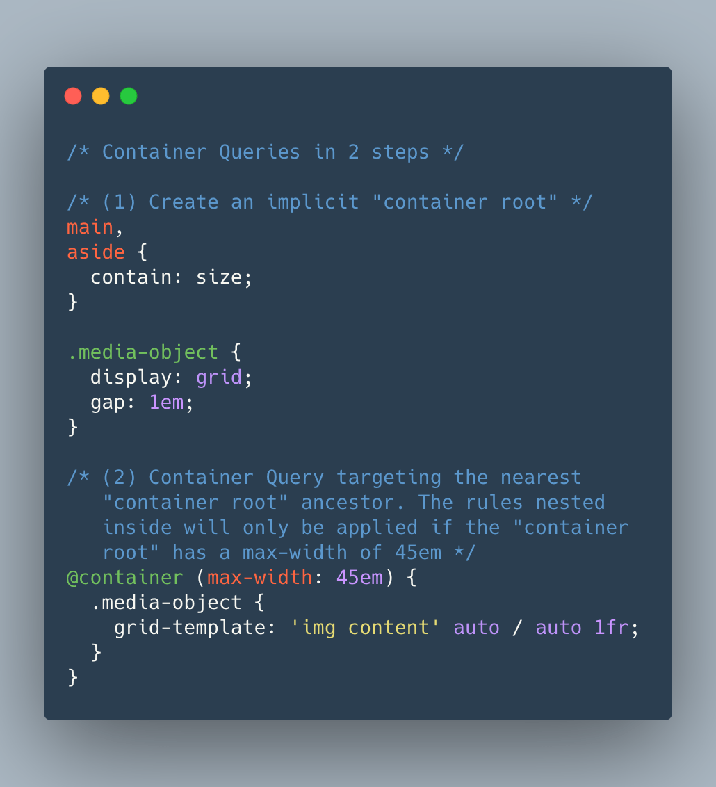
/* (1) Create an implicit "container root" */
main,
aside {
  contain: layout style inline-size;
}

.media-object {
  display: grid;
  gap: 1em;
}

/* (2) Container Query targeting the nearest
   "container root" ancestor. The rules nested
   inside will only be applied if the "container
   root" has a max-width of 45em */
@container (max-width: 45em) {
  .media-object {
    grid-template: 'img content' auto / auto 1fr;
  }
}
Applying contain: inline-size; (1) onto an element will make it an implicit “container root” or “containment context”. For this to work you also need to apply layout and style containment on the container, so the full code becomes contain: layout style inline-size;.
Elements contained inside a “container root” can then have container queries applied onto them, by use of a new at-rule @container (<container-media-query>) (2). The target selector and CSS rules to apply in that case are — similar to what we do with “regular” media queries — nested within the @container at-rule.
In the example above extra rules will be applied to .media-object whenever its nearest “container root” ancestor — such as <main> or <aside> — has a max-width of 45em.
🧑🔬 This proposal is experimental and has not been approved by the CSSWG yet. The expressed “intent to prototype” is meant as an experiment to see whether this idea would be worth pursuing or not. In the end, it could be that the final syntax can differ from the one listed here, if the proposal is workable in the first place.
~
A previous version of this proposal by L. David Baron required a context selector to be set, but that has been dropped here. The @container rule from Miriam’s version will work in any containment context (read: the nearest parent element that has contain: size set). The syntax might still change, but that’s irrelevant to the prototype which is to be implemented:
This is not at all finalized, but the underlying problems we need to solve in Blink are (mostly) the same regardless of how the feature is accessed, so we’ll for now use this proposal as the temporary syntax.
~
Intent to Prototype: Container Queries →
Chrome Tracking Bug →
🔥 Like what you see? Want to stay in the loop? Here's how:
I can also be found on 𝕏 Twitter and 🐘 Mastodon but only post there sporadically.
Leave a comment