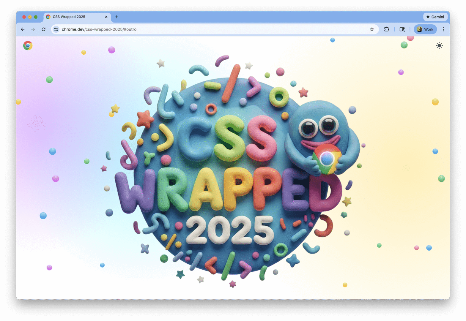
Once again, it has been an AMAZING year for CSS and UI. To celebrate this, we – the Chrome CSS/UI DevRel Team – created another edition of CSS Wrapped!
A rather geeky/technical weblog, est. 2001, by Bramus
Once again, it has been an AMAZING year for CSS and UI. To celebrate this, we – the Chrome CSS/UI DevRel Team – created another edition of CSS Wrapped!
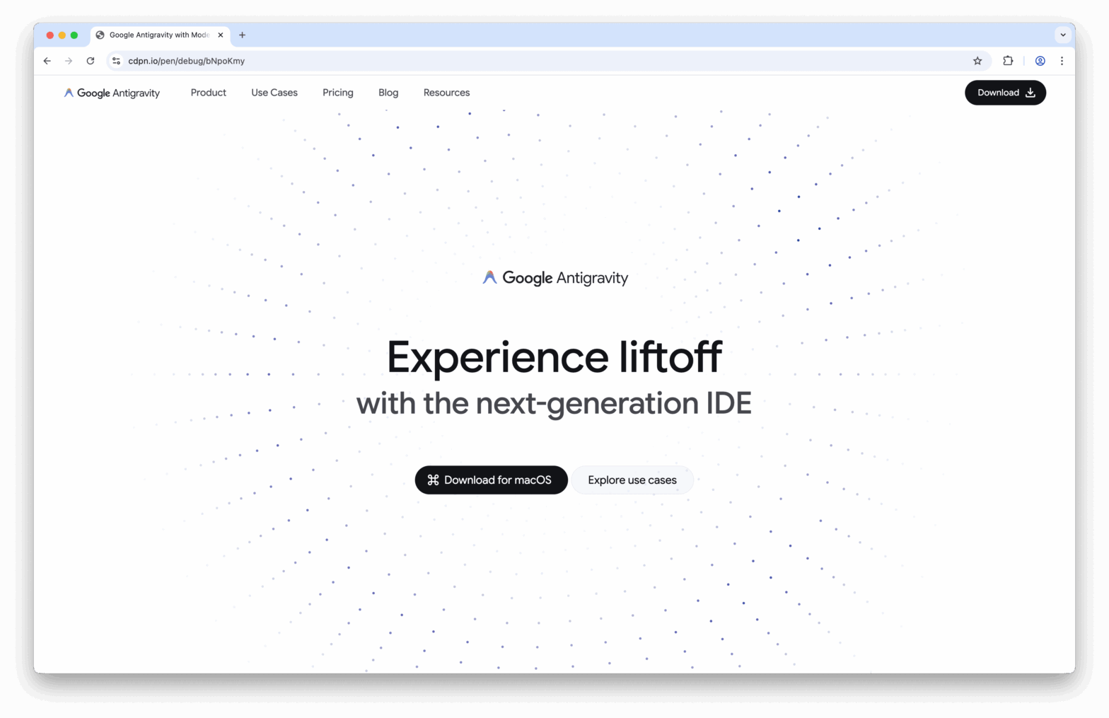
As an experiment to see if Modern CSS is up to the task, I recreated the Google Antigravity website with Modern CSS.

If you kinda understand Anchor Positioning, but it still surprises you from time to time, then most likely this is the missing piece of information: the Inset-Modified Containing Block (or IMCB for short).
overscroll-behavior: contain to prevent a page from scrolling while a <dialog> is open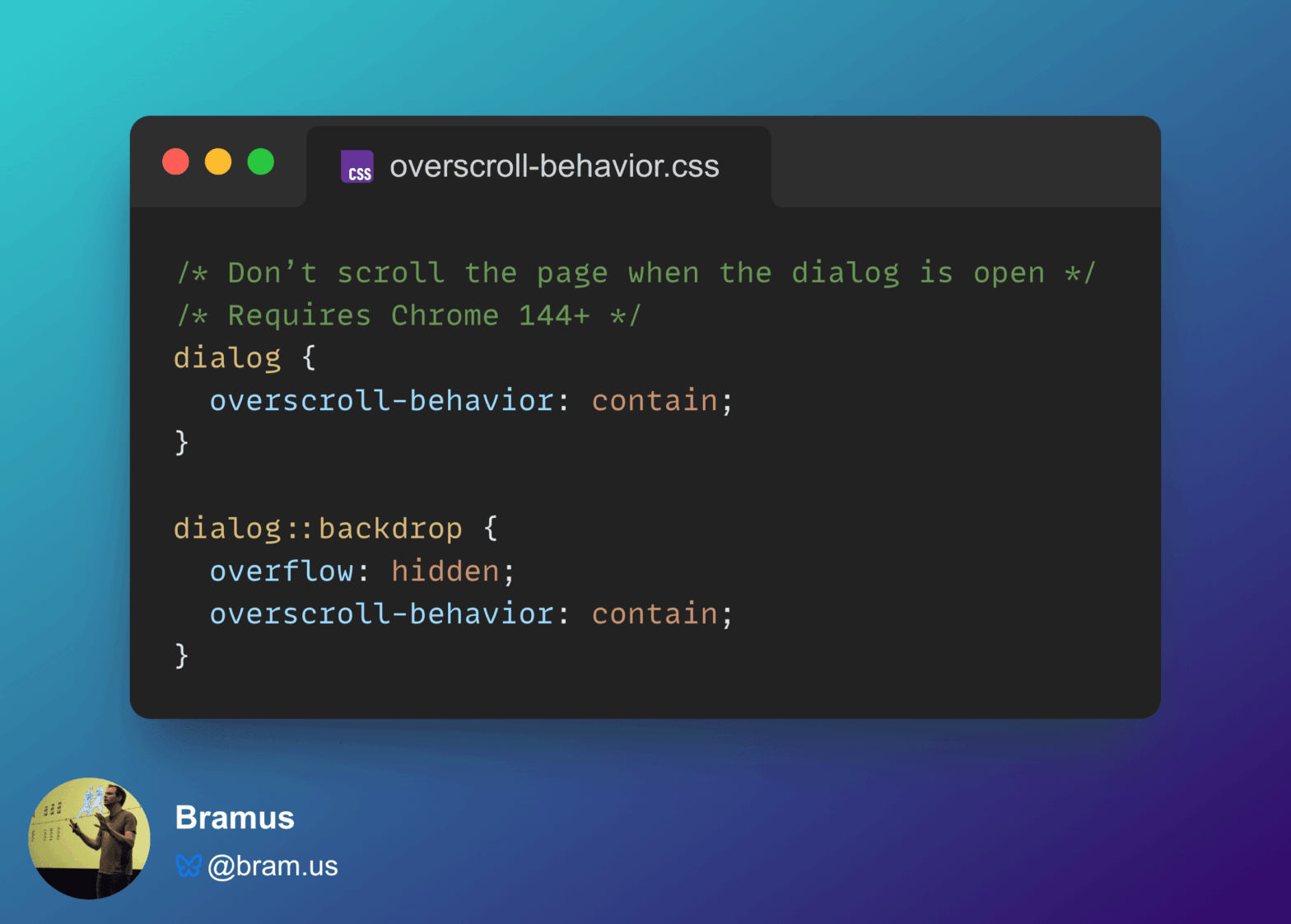
Chrome 144 features a small change to overscroll-behavior: it now also works on non-scrollable scroll containers. While this change might seem trivial, it fixes an issue developers have been dealing with for ages: prevent a page from scrolling while a (modal) <dialog> is open.

A while ago I joined Dan Neciu – whom I met at Frontmania in 2023 – on his “Señors @ Scale” podcast. We talked about all things CSS.
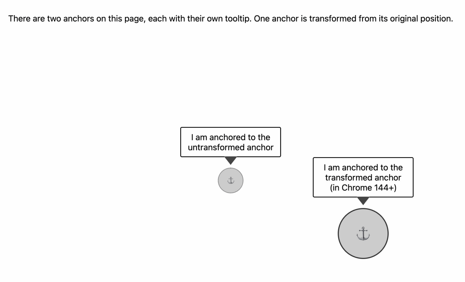
Starting with Chrome 144, Anchor Positioning is going to be transform-aware. From then on, anchoring will resolve against the bounding box of the transformed ancho
width or height no longer forces a Main Thread animation (in Chrome, under the right conditions)
When their values don’t change throughout the animation, CSS width / height animations can run on the Compositor, instead of being forced to run on the Main Thread.
@starting-style
How the cascade, the animation-fill-mode, and implicit keyframes make things a bit more complicated then you’d initially think …

I built something that I needed into DevTools: debugging support for CSS @starting-style rules.
