Over at 12 Days of Web, Tyler Gaw has a good piece on CSS animation-composition.
One thing that tripped Tyler up is the behavior of animation-composition: accumulate when used with a scale transform. Accumulating a scale(0.5) with scale(2) does not give scale(2.5) but scale(1.5) …
This post explains why that is the case.
~
animation-composition, a quick recap
I suggest you go read Tyler’s article, it’s wonderful (as are all other submissions on the site). If you’re just looking for the gist, here’s the wording I used earlier this year when I covered animation-composition over at web.dev:
With
animation-composition, you now have control over what should happen instead of the defaultreplace[when transforming to a new value]. Accepted values are:
replace: The effect value replaces the underlying value. (default)add: The effect value is added to the underlying value.accumulate: The effect value is combined with the underlying value.The difference between addition and accumulation is subtle. For example, take the two values
blur(2)andblur(3). When added together would this produceblur(2) blur(3), but when accumulated this would produceblur(5).You could compare this with a cup that is filled with tea. When pouring milk in it this would happen:
replace: The tea gets removed, and is replaced by the milk.add: The milk gets added to the cup, but it remains layered on top of the tea.accumulate: The milk is added to the tea and, because they are both fluids, they mix nicely.
Again, check out Tyler’s article … it’s great and it’s got a bunch of good demos that demonstrate this.
~
The weird thing with scale
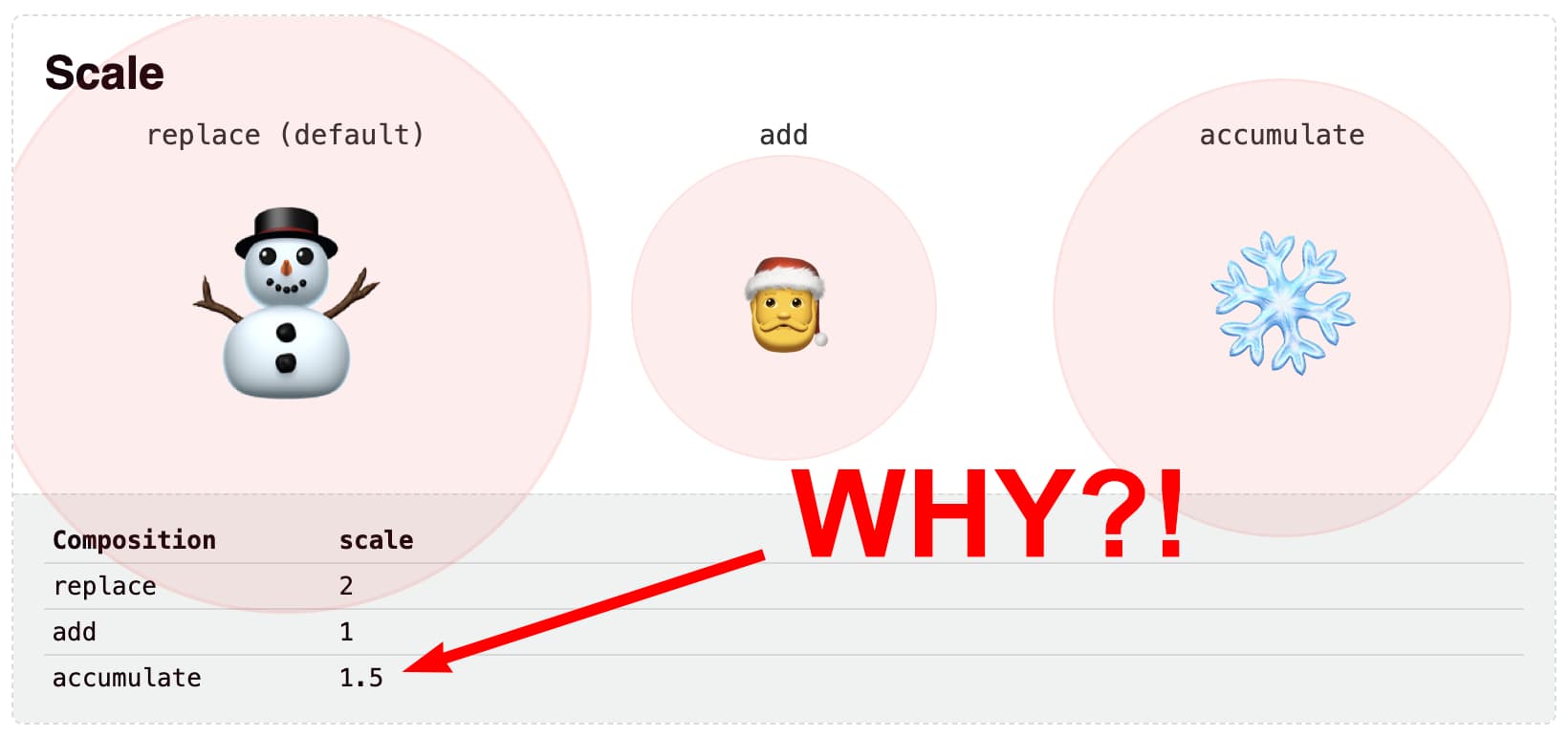
One of the examples Tyler uses, animates a scale transform. The transform starts off with a scale(0.5) and then changes to scale(2). That transform is ran several times, once for each different animation-composition value:
See the Pen
animation-composition scale demo by Tyler Gaw (@tylergaw)
on CodePen.
Here’s what happens for each animation-composition value:
replace- The end value is
scale(2), as the new value replaces the old value. add- The end value is
scale(1), which is the result of layering (or stacking) both values. When layered, the value intially becomesscale(0.5) scale(2). These two transform functions are applied from left to right: first the subject gets scaled down to half its size. That result then gets scaled to twice its size. So you end up with0.5 * 2 = 1 accumulate- The end value is
scale(1.5), which trips up a lot of people. One would assume the0.5and2simply get added up. However, the resulting scale factor is not2.5but1.5– Huh?
As Tyler put it:
0.5 + 2 should be 2.5, right? Why isn’t that happening, and what is the math behind this? Unfortunately, I couldn’t find an answer before the publish deadline for this post. This does work the same in all browsers, so it doesn’t seem like a bug. Some underlying logic for
scalemust make these the intended results. If you know the reason, please write about it!
~
Checking the source of truth: the specification
On Mastodon Schepp, T. Afif, and Kizu all chimed in trying to reverse engineer the math behind it all.
While there were some clever guesses, the person that got closest was Schepp, pointing to the css-values-4 spec:
Given two property values
VaandVb, returns the result,Vresult, of combining the two operands such thatVbis treated as a delta fromVa.
But if Vb is a delta from Va, we’d end up with Va + Vb = Vresult … yet we already noticed that wasn’t the case here?!
~
Checking the source of truth: the correct specification
As with many CSS specifications, one spec can build upon another. For example, scroll-driven animations has its own spec and defines new values for the animation-timeline property which is defined in css-animations-2. If you were to check only the css-animations-2 spec, you wouldn’t get the full picture.
Winging back to the curious case of scale, the answer needs to be sought in the css-transforms-2 spec. In there, we find § 15. Addition and accumulation of transform lists that holds the answer:
Accumulation of two transform lists Va and Vb follows the same steps as interpolation with regards to matching transform functions including padding lists with identity transform functions, converting
noneto an identity transform function, and converting both arguments to matrices as necessary (see CSS Transforms 1 § 9 Interpolation of Transforms). However, instead of interpolating the individual parameters, they are combined using arithmetic addition — except in the case of parameters whose value is one in the identity transform function (e.g.scaleparameters and matrix elementsm11,m22,m33, andm44), which combine using accumulation for one-based values as follows:Vresult = Va + Vb – 1
And there my friends lies the answer: scale is an exception and needs to be calculated using the formula Vresult = Va + Vb - 1.
Applied to scale(0.5) being accumulated with scale(2) we end up with:
- Va =
0.5 - Vb =
2 - Vresult = Va + Vb –
1=0.5+2–1=1.5
So Tyler, this should give you your answer 🙂
On Mastodon, T. Afif came up with a single formula that allows accumulating multiple values. Should you ever need it, here it is:
(Vresult - 1) = (V1 - 1) + (V2 - 1) + ... + (Vn - 1)
~
More examples
Embedded below is a pen with a bunch of example that change on hover. They all use animation-composition: accumulate. Using the lines on the page, you can see what scale they eventually end up at.
See the Pen
CSS animation-composition: accumulate by Bramus (@bramus)
on CodePen.
~
Spread the word
To help spread the contents of this post, feel free to retweet the announcements made on social media:
With CSS `animation-composition` you can define how animation effects should composite: replace, add, or accumulate.
Tyler Gaw stumbled upon a curious case: accumulating `scale(0.5)` with `scale(2)` is not `scale(2.5)` but `scale(1.5)`.
Here’s why: https://t.co/8gcDAyHGq5#CSS
— Bramus (@bramus) December 18, 2023
~
🔥 Like what you see? Want to stay in the loop? Here's how: