Flexbox Holy Albatross with CSS Grid

In succession to The Flebox Holy Albatross, Jonathan Snook wondered if he could recreate it using CSS Grid. ℹ️ To recap, with the Flexbox Holy Albatros a layout goes from either all items stacked next to each other (e.g. all horizontal) to all items stack on top of each other (e.g. all vertical): There’s no …
CSS Logical Properties and Values, the next Step of CSS Evolution

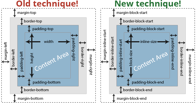
Still in draft, yet already thoroughly supported, is the CSS Logical Properties and Values Level 1 Specification, a CSS module which gets me excited. CSS Logical Properties and Values is a module of CSS introducing logical properties and values that provide the ability to control layout through logical, rather than physical, direction and dimension mappings. …

Relearn CSS layout with “Every Layout”

As just announced (on stage) at CSS Day by Heydon himself: If you find yourself wrestling with CSS layout, it’s likely you’re making decisions for browsers they should be making themselves. Through a series of simple, composable layouts, Every Layout will teach you how to better harness the built-in algorithms that power browsers and CSS. …

CSS Grid Level 2: Subgrid

Good news! Firefox 69 will support subgrid. As Rachel Andrew explains: In terms of new syntax, and new things to learn, this is a very small change for web developers who have learned grid layout. A grid defined as a subgrid is pretty much the same as a regular nested grid, albeit with its own …

CSS masonry with flexbox, :nth-child(), and order

Tobias Ahlin: On the surface it seems fairly easy to create a masonry layout with flexbox; all you need to do is set flex-flow to column wrap and voilà, you have a masonry layout. Sort of. The problem with this approach is that it produces a grid with a seemingly shuffled and obscure order. Flexbox …

The Flexbox Holy Albatross

Great work by Heydon Pickering, in which he lets a flexbox layout respond to the size of its container, and not the viewport Sometimes you want your items to wrap in a very particular way. For instance, when you have three items, you’ll be happy with the three-abreast layout and accepting of the single-column configuration. …

The Layouts of Tomorrow

With CSS Grid being available, Max Böck set out to find himself a layout challenge: I went over to dribbble in search of layout ideas that are pushing the envelope a bit. The kind of design that would make frontend developers like me frown at first sight. He settled on the “Digital Walls” shot (pictured …

How CSS’s display: contents; works

You might know that display: contents; does what it states it does: it only shows an element’s contents, just as if you were to remove the opening and closing tag. But what about the element’s attributes? What about the bound JavaScript events? What about … ? Ire Aderinokun digs deeper. How display: contents; works →

CSS Houdini Experiments

At the very end of the Say Hello to Houdini and the CSS Paint API article there’s only a small mention of this site. However it’s that great that it’s worth a link/post on its own. ⚠️ Be sure to use Chrome Canary – with “Experimental Web Platform features” enabled via chrome://flags – when visiting …