Eleventy plugin for static rendering of Lit components

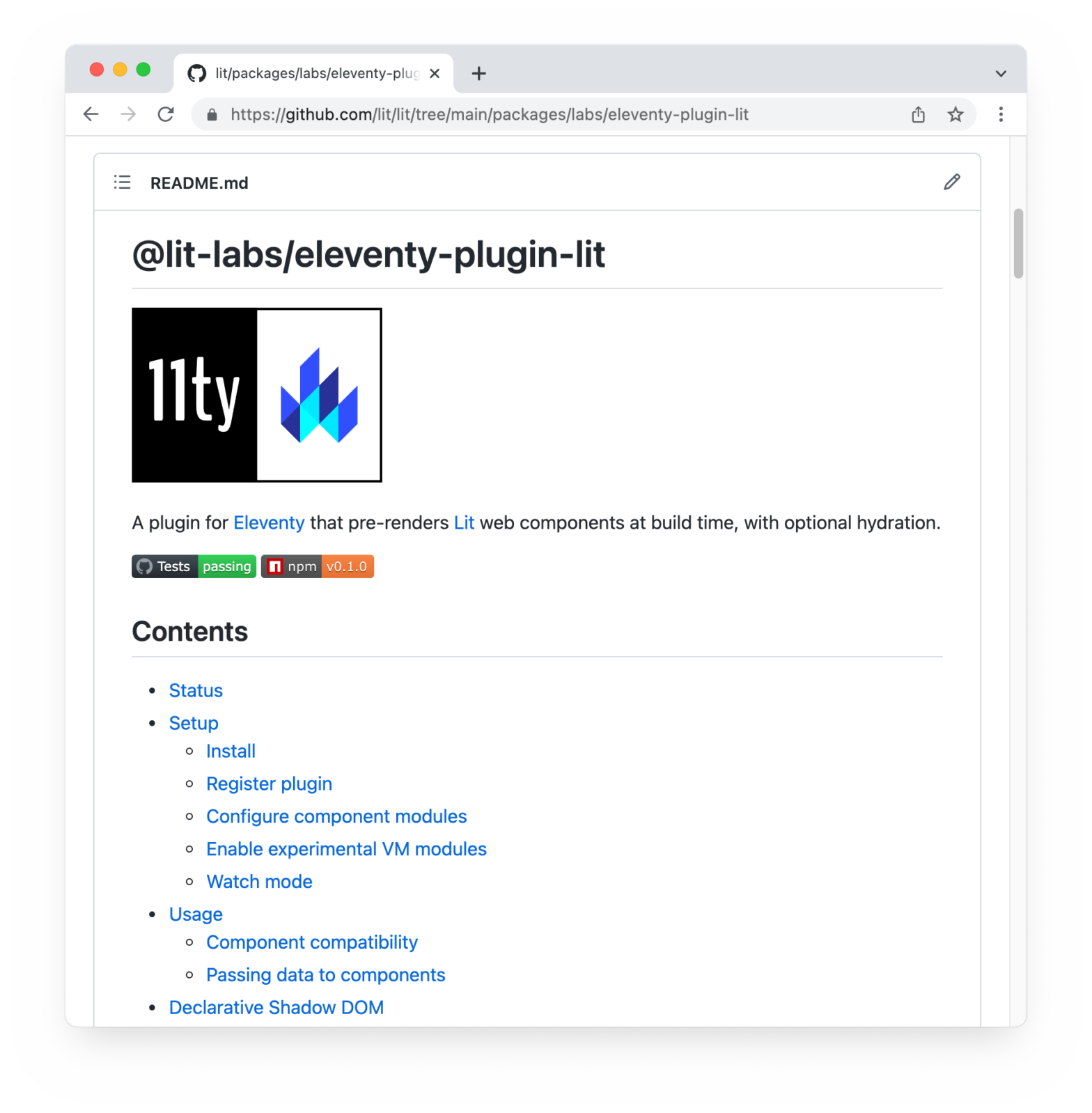
The Lit team is pleased to announce an experimental preview release of @lit-labs/eleventy-plugin-lit, a new plugin for Eleventy that renders your Lit components as static HTML during your Eleventy build, and lets you hydrate them after your JavaScript loads. This is pretty nice, as out comes Declarative Shadow DOM-compatible which Chromium-based browsers can render, while …

Bento Components

Bento is an easy to use component library that helps you achieve a great page experience. Included components are components (such as a Gallery, Accordion, Carousel, …), 3rd party embeds (Facebook, Instagram, …), text-related utilities, etc. The components themselves are (mostly) available as Web Component or a React Functional Component. An Instagram embed for example …

Render styleable Markdown in your HTML with <md-block>

To render Markdown on web pages, Lea Verou created <md-block>. It’s a zero-dependency Custom Element that, unlike other solutions, renders the content in the light DOM which allows you to style the output easily. There are many web components these days to render Markdown to HTML. However, all render the resulting Markdown in Shadow DOM, …

“Web Component DevTools” extension for Chrome DevTools

“Web Component DevTools” is a Chrome Extension for Chrome DevTools that adds support for Web Components / Custom Elements. Web Component DevTools is aimed at all developers working with Web Components. The tooling provided creates a new Chrome Devtools panel, which allows a quick look at the custom elements on the current page, and enables …

<tab-container> Custom Element — An Accessible Tab Container Element with Keyboard Support

Built by GitHub is <tab-container>, a Custom Element that defines an accessible tab container element with keyboard support and that also follows the ARIA best practices guide on tabs. Upon importing the package it will register the Custom Element, so you can use it immediately: <tab-container> <div role="tablist"> <button type="button" role="tab" aria-selected="true">Tab one</button> <button type="button" …

Container Queries with the <watched-box> Custom Element

Heydon Pickering has created <watched-box>: I wanted a simple, declarative container queries solution, and here it is: ❤ Custom Element + ResizeObserver 🥣 Use and mix together any CSS length units 🖼 Orientation supported 🧚‍♀️ ≅1.5KB minified Once imported you can use it as follows: <watched-box widthBreaks="70ch, 900px" heightBreaks="50vh, 60em"> <!– HTML and text stuff …

Rendering Markdown using Custom Elements v1

Inspired upon a v0 implementation, I’ve recreated a Markdown renderer in Custom Elements v1. The result is <custom-markdown>. The code itself is pretty straightforward: other than some (contained) styling the custom element uses showdown to convert the Markdown to HTML. This conversion is triggered in the connectedCallback(). class Markdown extends HTMLElement { constructor() { super(); …

Web Components: Introducing Custom Elements

One of the new features in Safari Technology Preview 18 is Custom Elements v1 (Chrome/Opera already support for it): To define a custom element, simply invoke customElements.define with a new local name of the element and a subclass of HTMLElement. Example Code: class CustomProgressBar extends HTMLElement { constructor() { super(); const shadowRoot = this.attachShadow({mode: 'closed'}); …