Built by GitHub is <tab-container>, a Custom Element that defines an accessible tab container element with keyboard support and that also follows the ARIA best practices guide on tabs.
Upon importing the package it will register the Custom Element, so you can use it immediately:
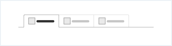
<tab-container>
  <div role="tablist">
    <button type="button" role="tab" aria-selected="true">Tab one</button>
    <button type="button" role="tab" tabindex="-1">Tab two</button>
    <button type="button" role="tab" tabindex="-1">Tab three</button>
  </div>
  <div role="tabpanel">
    Panel 1
  </div>
  <div role="tabpanel" hidden>
    Panel 2
  </div>
  <div role="tabpanel" hidden>
    Panel 3
  </div>
</tab-container>
Installation possible per NPM:
npm install @github/tab-container-element… or import it directly off of Skypack
import "https://cdn.skypack.dev/@github/tab-container-element";