Guidelines for text fields design

Text fields are probably one of the most used interface components; contact forms, payment details, account creation, lead generation. Users definitely need to interact with text fields when using your product. The purpose of this post is to highlight some of the key guidelines which I follow when it comes to designing better text fields. …

Methods for assigning an accessible name to a form control

Adrian Roselli: Too often folks will grab ARIA first to provide an accessible name for a thing. Or they may sprinkle hidden content around a form. In most cases the impact of those decisions is unknown. The assumption that they do the same thing, give the same output to all users, is wrong. In short, …

HTML: The Inaccessible Parts

Dave Rupert: I’ve always abided in the idea that “HTML is accessible by default and then we come along and mess it up. But that’s not always the case. There are some cases where even using plain ol’ HTML causes accessibility problems. I’m going to start rounding up those HTML shortfalls in this here post …

You shall not open links in a new window or tab

Something we already knew, but that’s now written down by Adrian Roselli in a nice post: Regardless of what accessibility conformance level you target, do not arbitrarily open links in a new window or tab. If you are required to do so anyway, inform users in text. Great to see that the statement is backed …

Debunking the Myth: Accessibility and React

Mark Steadman from Deque: React can be an accessible application framework with the right knowledge and the right know-how. The stigma that it is not an accessible framework is simply not true. It has some of the best built-in accessibility functionality there is out there, and a large community of accessibility advocates that are creating …

Why <details> is Not an Accordion

Dave Rupert on why that (wonderful) way of Using the <details> element to create modals and menus is not good for semantics. Because <summary> has role=”button”, it eats the semantic content of elements inside it. So that big <h1> inside of your <summary> becomes just another piece of text, sans semantics. I especially like this …

Making a Better Custom Select Element

24ways – the advent calendar for web geeks – is back! First post is “Making a Better Custom Select Element” in which Julie Grundy tries to create an accessible Custom Select Element: Sometimes, I can’t recommend the select input. We want a way for someone to choose an item from a list of options, but …

Indicating focus to improve accessibility

Great article by Hidde. It totally rhymes with my Building Better Forms™ by not taking away affordances post. It’s a common, but fairly easy-to-fix accessibility issue: lack of indicating focus. In this post I will explain what we mean by focus and show you how focus outlines make your site easier to use. Indicating focus …

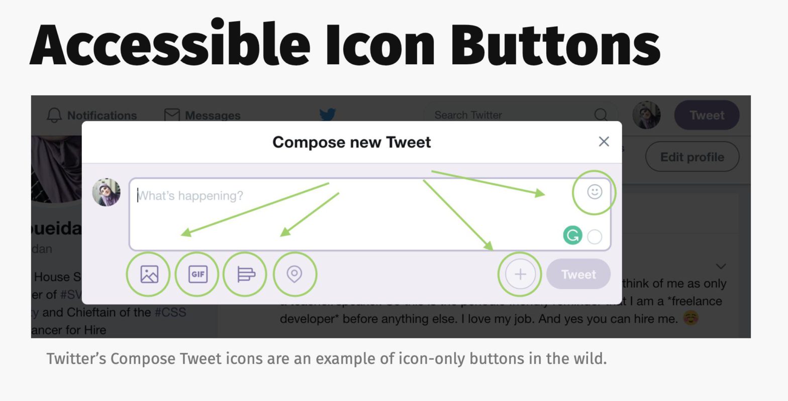
Accessible Icon Buttons

Sara Soueidan: An icon button is an icon that triggers some sort of action on the page. More accurately, technically speaking, an icon button is a button that contains an icon and no (visible) accompanying text. Putting aside the UX side of the coin and whether or not an icon alone is enough to convey …

12 Tips for More Accessible React Apps

If you want to improve the accessibility of your React apps but you don’t know how or where to start, this talk is just what you need. Manuel shares 12 tips that will help you build web sites and applications that can be used by anyone. Each tip fits on one slide and you’ll be …