There are some changes being made regarding viewport units. The additions — which are part of the CSS Values and Units Level 4 specification — define several viewport sizes: the Large, Small, and Dynamic Viewport.
Thanks to these additions we will finally be able to solve that “100vh in Safari on iOS” issue.
~
Table of Contents
~
Update 2021.07.14: Some parts of this post have been rewritten to include the latest CSSWG changes regarding these units.
Update 2021.07.23: 🎉 The proposed changes have landed in the official spec by now. This post has been updated accordingly.
~
# The Large, Small, and Dynamic Viewports
The CSSWG has defined several extra Viewport Sizes and accompanying Viewport-relative Units (spec), in addition to the already existing vw/vh/vmin/vmax ones.
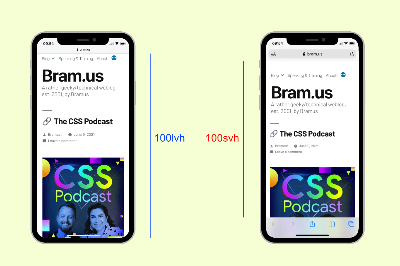
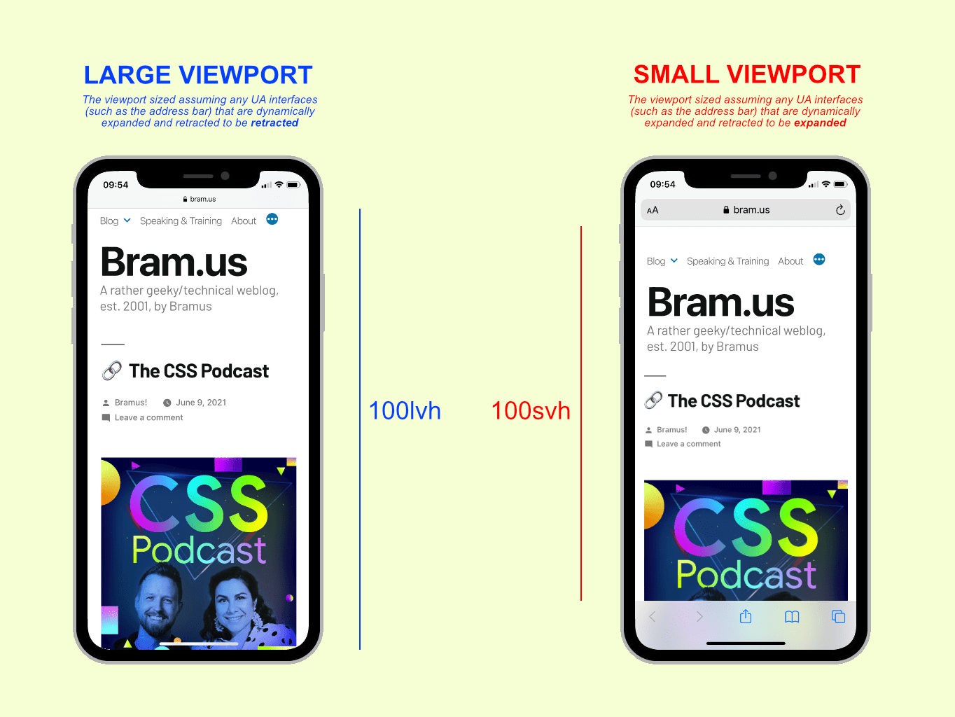
# The Large Viewport
The Large Viewport is the viewport sized assuming any UA interfaces (such as the address bar) that are dynamically expanded and retracted to be *retracted*. It has the l-prefix, so units are lvh / lvw / lvmin / lvmax.
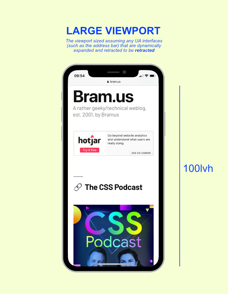
For example: 100lvh stands for 100% of the large viewport height.
# The Small Viewport
The Small Viewport is the viewport sized assuming any UA interfaces that are dynamically expanded and retracted to be *expanded*. It has the s-prefix, so units are svh / svw / svmin / svmax.
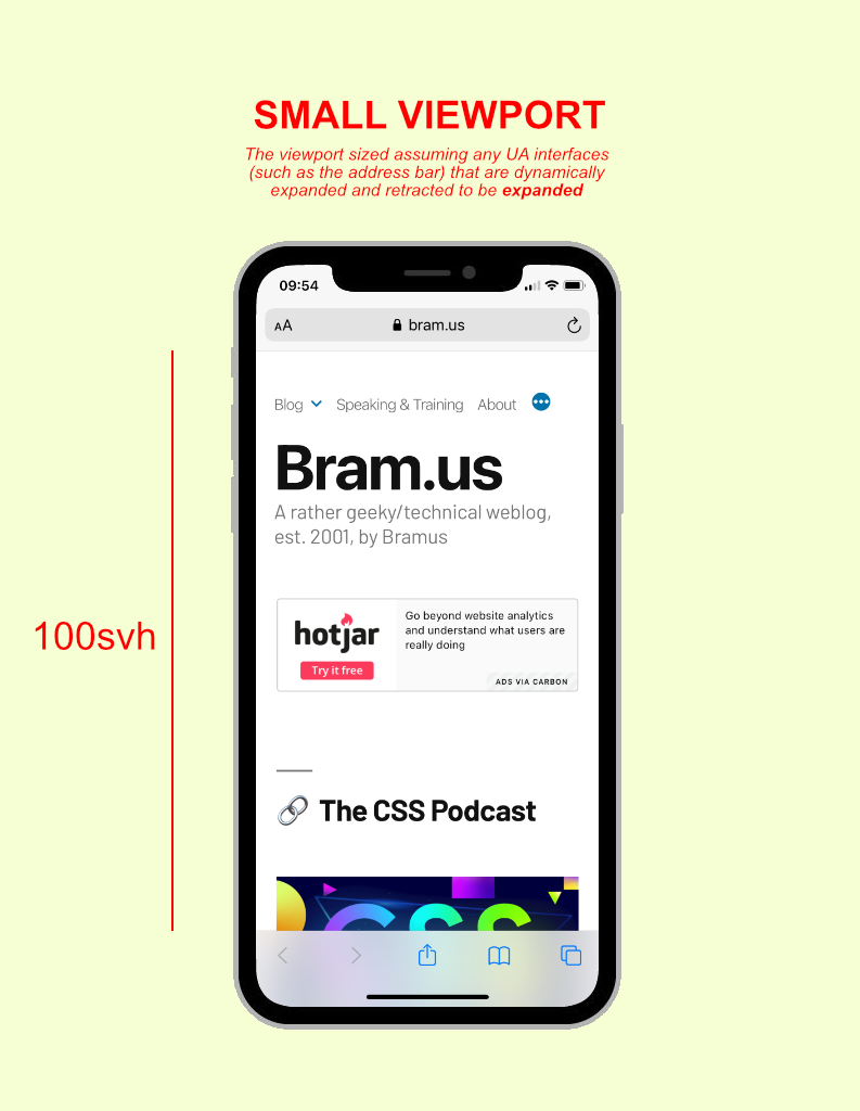
For example: 100svh stands for 100% of the small viewport height.
# The Dynamic Viewport
The Dynamic Viewport is the viewport sized with *dynamic consideration of any UA interfaces*. It will automatically adjust itself in response to UA interface elements being shown or not: the value will be anything within the limits of 100lvh (maximum) and 100svh (minimum).
Its prefix is d, so the units are dvh / dvw / dvmin / dvmax.
👉 You’ll want these Dynamic Viewport Units to have a UI that auto-stretches as the UA interface changes. 100dvh will automatically adapt itself.
body {
  height: 100dvh; /* ✅ Do this! */
}
~
# But, why? Can’t we just use a workaround?
You might ask yourself why we can’t simply rely on this JS workaround or the CSS workaround shown below, instead of introducing all these new units.
body {
  height: 100vh;
}

@supports (-webkit-touch-callout: none) {
  body {
    height: -webkit-fill-available; /* ❌ Don't do this! */
  }
}
Whilst the workaround above does achieve what we want, it only results in “full viewport height” for body. This is because -webkit-fill-available stretches items out inside their enclosing element — here the viewport. For some deeply nested elements that wouldn’t work, as -webkit-fill-available applied on them will look at their parent element — not the viewport. With 100dvh we can easily achieve what we want.
Above that you can’t use -webkit-fill-available to size something “half the size of the enclosing element”, as you can’t use -webkit-fill-available within calc(), e.g. height: calc(-webkit-fill-available * 0.5) is invalid CSS. Even if this were to be allowed one day, we’d again run into the issues when wanting to size a deeply nested element relatively to the viewport (see paragraph above).
So yes, we definitely do need these new Viewport Units 🤩
~
# The catch
As mentioned before these new proposed l*/s*/d* units are additions to the already existing vw/vh/vmin/vmax units. With this, the CSSWG chose to keep these “old” units ambiguous: vw/vh/vmin/vmax have no explicit definition, and it’s totally up to the UA (browser) to define how they behave. Some browsers will have vh behave like lvh (like the current Safari does), while other browsers can make vh behave like dvh.
What also is up to the UA to choose, is the behavior of the Dynamic Viewport. Some browsers may update its value immediately while the interface is changing, whereas other browsers may only update the value after the UI has transitioned … the spec is fine with both.
The UA is not required to animate the dynamic viewport-percentage units while expanding and retracting any relevant interfaces, and may instead calculate the units as if the relevant interface was fully expanded or retracted during the UI animation.
Above that things like on-screen keyboards are not taken into account. For that we have the upcoming Virtual Keyboard API.
~
# Going Logical
Additionally the spec now also defines logical units, and thus talks about vi/dvi/svi and vb/dvb/svb which are the inline and block size respectively of the large/dynamic/small viewport. A small but very welcome addition.
~
# Browser Support
💡 Although this post was originally published in July 2021, the section below is constantly being updated. Last update: Nov 10, 2022.
Here is an up-to-date list of browser support for the lv*, sv*, and dv* Viewport Units:
- Chromium (Blink)
-
✅ Available in Chrome 108 and up.
- Firefox (Gecko)
-
✅ Available in Firefox 101 and up.
- Safari (WebKit)
-
✅ Available in Safari 15.4 and up.
To stay up-to-date regarding browser support, you can follow these tracking issues:
- Blink/Chromium: Issue #1093055 – Fixed (Closed)
- Gecko/Firefox: Issue #1610815 – RESOLVED FIXED
- WebKit/Safari: Issue #219287 – RESOLVED FIXED
The pen below will indicate whether your browser supports CSS Dynamic Viewport Units or not:
See the Pen
CSS Dynamic Viewport Units test by Bramus (@bramus)
on CodePen.
~
# In Closing
It feels great to see things finally move in this area I must say, as the reported WebKit bug about 100vh not being 100vh-as-we-expect-it-to-be dates back from 2015, and the relevant CSSWG Issue from 2019.
As a final consensus on these viewport additions has been reached, I hope that the upcoming Safari 15 — which alters the viewport extensively as you scroll up/down — will make work to include these additions on top of their already supported env(safe-area-inset-*) values (e.g. height: calc(100vh - env(safe-area-inset-bottom));).
~
To help spread the contents of this post, feel free to retweet the announcement tweet:
The Large, Small, and Dynamic Viewports
🏷 #css #viewport pic.twitter.com/z42BuuqvcE
— Bram.us (@bramusblog) July 7, 2021
~
🔥 Like what you see? Want to stay in the loop? Here's how:
I can also be found on 𝕏 Twitter and 🐘 Mastodon but only post there sporadically.
🗣 This post originally was a set of tweets.
It would probably make sense to define what “UA” stands for before using it throughout your entire article. Since even Google won’t give a first-page definition for “ua interface”, it might be wise to refrain from using unknown acronyms…
Good call. I’ve added an abbr element there to say what UA stands for: “User Agent”. That itself basically translates to the browser (the app) itself.
I don’t get the diffence between dvh and svh. Where is the difference between dynamic and small?
We will see if the main problem – Apple – will incorporate the new technique very fast or as slow as ever. If the latter, we will have to deal with the problem for the next let’s say 5 years.
It’s a value that automatically adjust itself in response to UA interface elements being shown or not: the value will be anything within the limits of 100vh (maximum) and 100svh (minimum).
Hope this explains it better. I’ve updated the post to include this snippet.
I think, after reading it three times, I kind of get it. Thanks for the article and the explanation. And in a few years time … 🙂
Do these new units help at all with the 100vw causing horizontal scrollbar issue?
It is still being discussed whether scrollbars of the viewport should affect those units or not. You can follow https://github.com/w3c/csswg-drafts/issues/6026 if you want to stay up-to-date about it.
These are in the official spec now, not just the Editor’s Draft btw:
Official spec: http://www.w3.org/TR/css-values-4/
Announcement: https://www.w3.org/blog/CSS/2021/07/15/css-values-4-viewport-units/
Ah, seem to have missed that announcement. Thanks for letting me know, fantasai. Will update the post accordingly.
what the fuck is svh and lvh? could you please explain those first!
Thank you for your kind words, Sami. They’re explained right here in the post: https://www.bram.us/2021/07/08/the-large-small-and-dynamic-viewports/#the-viewports
Great article!! One question that i couldn’t find the answer to: When we use the dvh unit that is not fully supported in alle browsers, will we need to add a vh fallback for other browsers? Or a @support line for dvh only? What wold be the best practice?
Thanks, Anke! You can do a check using
@supports(height: 1dvh). I’ve done so in this CodePen:https://codepen.io/bramus/pen/QWaBJrv
Using that check, you could change the value of a custom property, in case there is support.
But … you could also do without the check, as browsers discard declarations they don’t understand:
In the example above, browsers that don’t understand
dvhwill discard that declaration, and fall back toheight: 100vh;declaration above, which they do understand.Hi Bramus, thanx for the article. Do you know how the dynamic view unit updates are implemented in safari (15.4)? Does it dynamically update as the url bar starts to move out? or similar to the position:fixed + height: 100% when the bar is fully moved out of view?
for what it’s worth, I tried the dvh on an iPhone 13 iOS 15.4 and the dvh changes in couple of steps between svh and lvh but it is not exactly the height of the visible area, this means if you have an overlay with height:100dvh, then when the url bar minimizes, the content can be visible between this overlay and the url bar. before the overlay’s height reaches the correct value.
Same issue here. Have a background in fixed position, width `height: 100dvh` (also tried `inset: 0`) and there’s a shift on scroll, while the url bar disapears… Driving me nuts… (with iOS 16.3).
In case anyone finds it useful, I’ve created a polyfill which lets you use svh, lvh and dvh units in older browsers that don’t support them yet:
https://www.npmjs.com/package/large-small-dynamic-viewport-units-polyfill
I’ve tested that it works in default iOS and Android browsers but any further testing would be appreciated!
Tried all these new units for the first time.
For a hero image at the top of a page I have a 100dvh div with a background. A h1 title is vertically centered inside of it. As the viewport changes from small to large, the position of the title shunts down. Maybe my use case isn’t really what this is designed for, but I would say having that kind of layout shift is pretty unpleasant.
To prevent the shifting of the title you can add a
padding-bottomset tocalc(100dvh - 100svh). Haven’t tested it, but should work.It’s interesting that mobile Firefox reacts to opening of software keyboard (if dvh units are used) while Safari and Chrome are not.