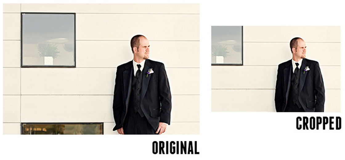
When working with images on small screen devices it is recommended to focus on the subject: don’t just show a scaled down version of the photo, it’s better to remove some of the background scenery and show the person on the photo (see the Obama example at the top of this post on responsive images).

Enter Focal Point:
A small set of CSS classnames to help keep images cropped on the focal point for responsive designs. Using only HTML/CSS, web authors can specify an image’s focal point, which stays as the image’s primary focus, while the image’s available width changes on responsive webpages. Crop and re-size images depending on available width and let CSS to do all of the work, and without any JavaScript
Yes, pure CSS that is 🙂
Focal Point Demo →
Focal Point Source (GitHub) →
Focal Point Article →