On the Full Stack Belgium Slack channel, user @Brammm recently asked how to create a simple image gallery.
Anyone have a favorite way of making an image grid with CSS? I’d like one of those “fancy” ones where no matter the aspect ratio of the image, they all have the same gap between them.
While some suggested existing solutions such as React Photo Gallery or photo-stream, I focussed on only the layout-question and suggested a DIY solution using display: grid; and object-fit: cover;.
Using only those those two props it’s really easy to create a grid based gallery.
- Using
display: grid;you create a grid layout. I decided to create a grid of square cells/tiles. - As I stretch out each image inside a tile, the images can get deformed. Using
object-fit: cover;this can be prevented. Note that you will visually lose some data, as the edges will get clipped, but that was not a concern to @Brammm.
~
Proof Of Concept
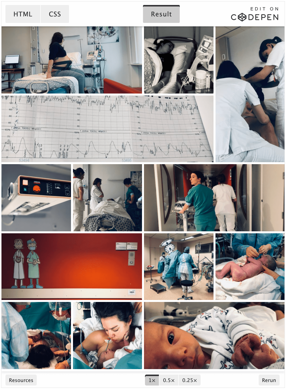
Using photos from the birth of my son Noah I knocked up a small small proof of concept in about 10 minutes. Tweaking it a bit more – by adding some CSS Variables into the mix – I eventually landed on this:
See the Pen
Simple Gallery (display: grid; + object-fit: cover;) V1 by Bramus (@bramus)
on CodePen.
💁♂️ To create a consistent gap between all items I used the CSS gap property, which replaces grid-gap.
~
Making it feel more dynamic
To make things visually more interesting, and also since some photos are portrait and some landscape, the size of the tiles must differ a bit. With CSS Grid in place it’s really easy to stretch out cells so that they span more than one column or row:
ul.gallery > li.wide {
    grid-column: span 2;
}

ul.gallery > li.wider {
    grid-column: span 3;
}

ul.gallery > li.high {
    grid-row: span 2;
    height: auto; /* to undo the height */
}
With these in place, my gallery started to look like this:
There, looks good, right? 🙂
😋 I know, I cheated a bit as I added the .wide/.high classes onto carefully selected tiles, leaving no gaps in my grid. To workaround potential gaps, one can always use grid-auto-flow: dense;, or use the (still under development) Grid Masonry from the Grid Level 2 spec. Note that in those cases the order of the images will differ from their source order.
~
Going further: Zoom / Lightbox functionality
Where I had originally stopped working on the gallery after that, today I wondered if I could adjust it a bit further and give it the ability to show the images at full screen, in some sort of Lightbox. Still using only CSS it’s possible to show an overlay while pressing+holding a tile.
- Using the
:activepseudo-selector you can know which element is currently being pressed - Using
position: fixed;you can put content on top of the entire viewport
Combining the two as follows …
ul.gallery > li:active > img {
    position: fixed; /* Position the image on top of the viewport contents */
    z-index: 11;
    top: 0;
    right: 0;
    bottom: 0;
    left: 0;
    object-fit: contain; /* Make sure the image isn't distorted */
    padding: 1vw; /* Add some padding to make it breathe a bit */
    background: rgba(0, 0, 0, 0.8); /* Dim the background */
}
… will get you this:
See the Pen
Simple Gallery (display: grid; + object-fit: cover;) V3 (WIP) by Bramus (@bramus)
on CodePen.
While the version above does work (on Desktop), there’s a huge problem with it: it’s not (keyboard) accessible at all. In order to give the browser – and therefore user – hints about stuff being clickable we could add a truckload of ARIA attributes or simply use … links. An extra benefit of this approach is that we then start using CSS :target, and eventually create Pure CSS Lightbox.
See the Pen
Simple Gallery (display: grid; + object-fit: cover;) V4b by Bramus (@bramus)
on CodePen.
It’s not entirely perfect though, when using only the keyboard to navigate, you have to do some trickery to close the Lightbox: after zooming in on an image you’ll have to hit TAB to focus the close link and then hit ENTER to activate it — If only autofocus where available on non-inputs …
As an extra I also added some JS to make the ←, →, and ESC keys work, so that it behaves like a “real” Lightbox. There’s plenty more things I could add to it, but that’s something way beyond the original goal of this post so I left it at that.
~
Thank me with a coffee.
I don’t do this for profit but a small one-time donation would surely put a smile on my face. Thanks!
To stay in the loop you can follow bramus on Bluesky or subscribe to the RSS feed.
Have a lot at “Adaptive Photo Layout with Flexbox” from Tim Vandamme (https://css-tricks.com/adaptive-photo-layout-with-flexbox/) There’s a github project if you want to self host your pictures: https://github.com/maxvoltar/photo-stream It looks like this: https://maxvoltar.photo/