Adam Argyle, writing for web.dev:
In today’s GUI challenge we create a responsive, accessible slide out side navigation user experience using CSS and JS. The sidenav works on multiple browsers, screen sizes and input devices. Rad right? Follow as we employ grid, transforms, pseudo classes and a dollop of JavaScript to handle this UX.
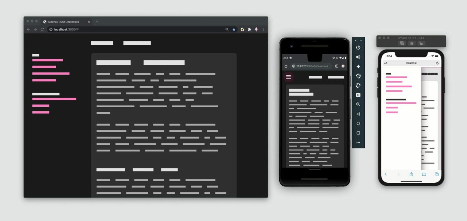
On large screens the sidenav is shown next to the content, but on smaller screens the sidenav is placed off-screen and slides in when needed.
To open the sidenav he uses the :target pseudo-class, a trick I also used to create the Lightbox used in this Simple CSS Gallery.
What was me to me though is the use of min-content in combination with CSS Grid, something I hadn’t combined before.
#sidenav-container {
  display: grid;
  grid: [stack] 1fr / min-content [stack] 1fr;
  min-height: 100vh;
}
The snippet above creates a grid with one row and two columns. The 1st column has a width of min-content, and the 2nd column (labeled stack) a width of 1fr.
On large screen devices the sidebar (<aside> element) is placed in the 1st column, and the main content (<main> element) is placed in the stack grid-area (e.g. 1st row, 2nd column).
#sidenav-container > aside {
  grid-column: 1 / 2;
}

#sidenav-container > main {
  grid-area: stack;
}
The clue to this min-content width for the 1st column becomes clear when looking at the small screen layout. For that layout, the <aside> element is also position in the stack grid-area.
@media (max-width: 540px) {
  #sidenav-container > aside {
    grid-area: stack;
  }
}
Because of that the 1st column will no longer contain anything, yielding a calculated value of 0 for min-content, thus making the column collapse entirely. As a result, the 1fr set on the stack grid-area will now be able to occupy the entire available width.
Add in some extra CSS to shift the sidebar off-screen and you have the result you see.
@media (max-width: 540px) {
  #sidenav-container > aside {
    grid-area: stack;

    visibility: hidden;
    transform: translateX(-110vw);
    transition: transform .6s ease-in-out;
  }

  aside:target {
    visibility: visible;
    transform: translateX(0);
  }
}
Building a sidenav component →
Sidenav Demo →
Don’t like to read? You can also check this video: