20 Ideas for Better Charts

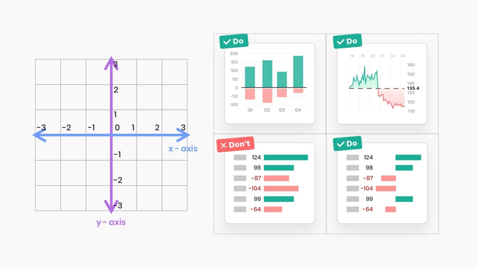
Applications we design are becoming increasingly data-driven. The need for quality data visualization is high as ever. Confusing and misleading graphics are all around us, but we can change this by following these simple rules. I found these tips very snackable and on-point. Don’t entirely agree with “4. Use adaptive y-axis scale for line charts”, …

Synchronizing Fireflies Visualizer

If you watch Fireflies closely, some species will sync up their flashing to eventually blink as a group. Pretty mesmerizing stuff. But how to they do it? So, how do thousands of fireflies pick a leader to follow, a maestro to keep their flashing in time? The answer, the scientists found, is simple: They don’t. …

SpaceX’s SN10 “Belly Flop” Composite

Earlier this week SpaceX’s SN10 rocket took off, ascended to ±10km, and then after a free fall in the horizontal position turned vertical again to successfully land (only to explode a few minutes later). While you can rewatch the whole thing online I’m more fascinated by this composite photo by Jack Beyer, visualizing the trajectory: …

A visual guide to SSH tunnels

Great work by Linmiao Xu: SSH tunnels are encrypted TCP connections between SSH clients and servers that allows traffic entering one side of the tunnel to transparently exit through the other. This page explains use cases and examples of SSH tunnels while visually presenting the traffic flows. Also comes with the commands … handy! A …