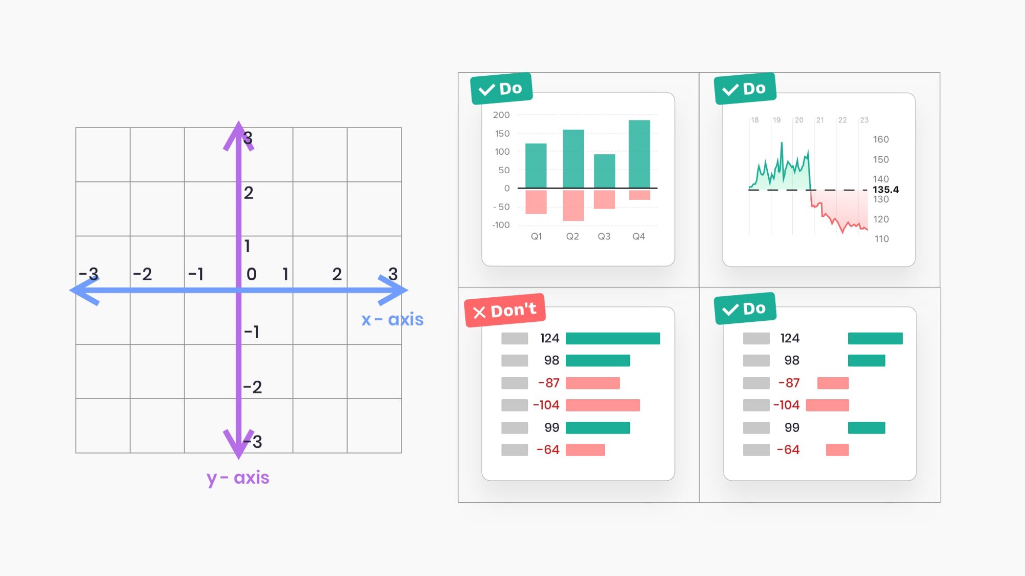
Applications we design are becoming increasingly data-driven. The need for quality data visualization is high as ever. Confusing and misleading graphics are all around us, but we can change this by following these simple rules.
I found these tips very snackable and on-point. Don’t entirely agree with “4. Use adaptive y-axis scale for line charts”, but perhaps I should use a bar chart in that case as “3. Always start a bar chart at 0 baseline”.
20 Ideas for Better Data Visualization →
As for a charting library, I nowadays go for HighCharts. Crazy how many features it has.