Fukol™ Grids

fukol-demo

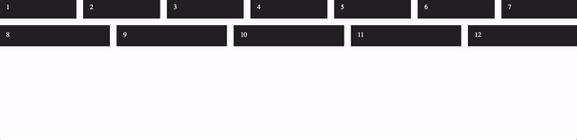
Building a CSS Grid System isn’t that hard really, thanks to flexbox. Heydon has stripped it to its smallest form:

.fukol-grid {
  display: flex;
  flex-wrap: wrap;
  margin: -0.5em;
}

.fukol-grid > * {
  flex: 1 0 10em;
  margin: 0.5em;
}

Fukol™ is a lightweight, breakpoint free, completely responsive, element query driven*, progressive enhancement based CSS grid framework. It is 93 bytes minified, fitting comfortably inside a tweet.

Embeded below is a demo pen:

See the Pen Fukol by Heydon (@heydon) on CodePen.

Fukol™ Grids →

Published by Bramus!

Bramus is a frontend web developer from Belgium, working as a Chrome Developer Relations Engineer at Google. From the moment he discovered view-source at the age of 14 (way back in 1997), he fell in love with the web and has been tinkering with it ever since (more …)

Leave a comment

Your email address will not be published. Required fields are marked *

This site uses Akismet to reduce spam. Learn how your comment data is processed.